Research point
Artists who paint unusual materials or collections
Collections
Julian Walker
English born 1954
 |  |  |
|---|
figures 1-3
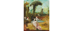
Using a variety of media within his collecting format of photography, video, text, live-art, historical objects (altered or replicated) Julian Walker uses the sense of the presence of the object's activity or space it once occupied and so we question what is prohibited (or not) to touch and so, therefore, more desired (or not so desired).
Touching the past allows the possibility of a direct physical relationship with a concept, story or experience, and the idea of moving across time.
"You can look, but you cannot touch"- This is how we feel in a museum with extensive collections behind glass and that is how I feel when I go to a gallery or museum now too.
Walker was playful when he exhibited walking on eggshells, and there is such depth in meaning, process and making. His realisation that our most frequent physical contact with the natural environment is via our feet.
He asked himself if anyone had walked on eggshells and why—the history and fossil record beneath our feet intrigued him. The fact that the viewer actually gets to walk on eggshells is a brilliant concept!
In an Essay by Jim Waters, Curator, Nottingham Castle Museum, I found it interesting that Jim says;
"Objects can evoke a sense of time and place; they can bring the viewer close in spirit to a historical person or event. It is tantalising for us to be near something touched by a famous (or, perhaps to a greater degree, infamous) historical figure."
This way of looking at objects (specifically the objects I own which come from the four corners of the globe) is eye-opening for my process, in that they have a story, experience or narrative.
References
Figure 1/Essay by Jim Waters, Curator, Nottingham Castle Museum (no date). Available at: https://walkerjulian.tripod.com/id10.html (Accessed: April 2021).
Figures 2 and 3 Julian Walker Collection: Liverpool City Museum, 1999 Mixed Materials/Collection, vocabulary, Railway Stations For London, 1999 Mixed Materials (no date). Available at: https://newcontemporaries.org.uk/1999/artists/julian-walker (Accessed: April 2021).
Fred wilson
american born 1954
 |  |
|---|
figures 4-5
Milroy’s images of objects, for example, Shoes, are just mere images of shoes, aren’t they?
On the other hand, they could be memories of the experience and therefore positioned for a reason?
She paints shoes because they are beautiful, she says. I get that! I have some beautiful shoes too.
The shoes in this piece are the same design, colour and size, just in different positions. Are they dance steps? I can feel the emptiness where someone was, except, in the top left corner, opposed shoes (they would be a difficult position to fill for a human!)
Her objects have a life of their own, they seem to be saying something, but I am not sure what. I need to dig deeper.
Milroy painted lightbulbs quickly and from memory and using only eight colours to mix her paints. Are the bulbs representing something in their groupings? The Tate asks, "Are commodities, perhaps reflecting a concern with mass-production and consumerism?"
I can relate to the fact that Milroy does not paint directly from objects in the studio because she gets overwhelmed with information. I find it easier to take a photo, polarise it or crop it. I can sketch it also, then I can see it, you know, really see it.
I still needed to dig deeper.
I watched this video (scroll down to the video). What did I learn about the artist?
In 2005, she changed her direction from a series of objects and created more significant works, and she broke away from her usual ‘go to’.
She uses paint on canvas and clothes; she also hangs pieces from the ceiling. She uses 3D sketchbooks in her studio, which interests me and will influence my workspace.
Milroy explores the subjects of materiality – by this, I mean her interest in objects of every day and her interest in the actual practice of painting the making part.
The themes that she says are present in her work are:
Presence or absence, the subject of time, lack and loss, global painting, identity, similarity and difference, the individual and the group, on and off here and there, these themes drive her work.
She feels personally connected to the images in her mind, the everyday things around her, and these all add to the editing in her mind’s eye. She tests her still life development; she discovers and experiments with interiors, or Japanese prints, people, places, and combinations of hanging clothing and paintings.
Milroy uses grids, or random scatter patterns to repeat and show the need or acquire them materiality.
Looking, making and thinking about the actual word ‘painting’ as a physical something to look at, or the actual physical process, her work seems to think about grammar and wordplay, opposites, i.e. similarity and difference the different ways of looking and making are essential.
This is going to be very informative to my practice. But how have places and travel have inspired her work?
Culture, diversity and moving between different countries, notions of difference and similarity, i.e. Canada and the UK language being primarily the same, but different. How you negotiate the unfamiliar and the familiar. These thoughts all play a part in her work, how she views spaces and her objects' position.
I feel more knowledgeable generally about her process of making and thinking. It all adds to the subconscious skillset. I am not overly excited about her work visually, but the process could inspire me.
References
Figure 4 Tate (no date) ‘Shoes’, Lisa Milroy, 1985. Available at: https://www.tate.org.uk/art/artworks/milroy-shoes-t06532 (Accessed: April 2021).
Figure 5 Tate (no date) ‘Light Bulbs’, Lisa Milroy, 1988. Available at: https://www.tate.org.uk/art/artworks/milroy-light-bulbs-t05217 (Accessed: April 2021).
Paul westcombe
Scottish born 1981
 |  |  |
|---|
figures 6-8
Westcombe's coffee cups remind me of the doodles I used to create inside my exercise books whilst in my history lessons at school. He was bored too it seems! The drawing was a release for him and an escape, somewhere he could release his feelings.
He worked as a car park attendant on twelve-hour shifts and started drawing on whatever material came to hand receipts, toilet plungers, mop handles, coffee cups, batteries and tins.
Westcombe puts down his innermost thoughts with detail and an honest vision. The coffee cups seem to be his most famous, usually used and stained with coffee remains and just so unique.
West combe’s cups also reminds me of;
-
Monty Python and the visuals for the films they produced (but a more modern version).
-
The pots of Grayson Perry with their sometimes-risky messages to the viewer (not seen until viewed closer)
-
Kurt Schwitters used similar items to create collages.
I do very much appreciate the thought, creativity and time that makes Westcombes work very unusual, the intricate details shading and meaning but they don't rock my world.
I like the message they send and their topics although a little bizarre in places but he really has planned and thought about these pieces. He also produces semi-connected drawings on coloured sheets of paper which stand-alone or a larger connected piece.
References
Figures 6-8 Paul Westcombe (no date). Available at: https://www.saatchigallery.com/artist/paul_westcombe (Accessed: April 2021).
Lee edwards
english born 1981
 |  |  |
|---|---|---|
 |
figures 9-12
Lee Edwards combines media and materials, using sculpture, painting, drawing and photography and his work has developed over time from large abstractions to these personal, intimate moments of nostalgia. Within all his works, his feeling translated to the surface in a very detailed meticulous realistic style.
Edward’s miniature oil paintings on found wood are portraits of the obsessive and all-consuming loves or ex-girlfriends who did not want his affection.
A timeline of his loves and rejections. It makes you feel sad in a way but happy that his painting is his experience and how he wants or needs to talk about it.
The article says his works, loosely based on Elizabethan miniatures relate to the traditional aspect of miniatures of secret admirers.
I looked deeper into this concept. I found those portrait miniatures were popular amongst both 16th century English and French aristocrats and remained popular until the late 19th century when the photographic processes started. A keepsake to carry on one’s person or an introduction for a marriage proposal.
We take selfies now as a matter of fact daily pursuit to share on social networks i.e. profile pictures, convenience to introduce ourselves to other people over distance.
Is small beautiful though? Has Edwards created miniature items that give him the illusion that he is now in control of his emotions?
I remember playing with dollhouses when I was a child, play that was a safe space encouraging total control. These pieces are exquisitely executed and I expect breath-taking at first-hand viewing. I hear a soft piano sound track gently moving the audience to tears ans they read the title and look at the faces carefully crafted onto the natural pieces.
We gain knowledge about this artist and his experience through his work. Like he is documenting his life in a series of works. I like this concept but his work doesn’t excite me.
References
Article-Lee-Edwards-Loredana-Dandrea-notion-magazine-issue-51.pdf’ (no date). Available at: https://www.domobaal.com/resources/leeedwards/lee-edwards-loredana-dandrea-notion-magaizine-issue-51.pdf.
Figures 9-12 Available at http://leeedwardsart.co.uk/2009-2011/a-broken-man (Accessed: April 2021).
Tabitha Moses
English Born.
 |  |  |
|---|
figures 13-15
Tabitha Moses explores personal and collective histories, often through the creation of delicate sculptures that combine stitch and embroidery with found objects. She tells stories of relationships, birth, fertility symbols, infertility, illness, healing and the relationship between the mind and the body.
I have chosen a few sentences from this Go-Between article that I think are important;
"I like picking out the individual stories among the crowd."
"I wanted to focus on the objects we use to make visible our prayers, desires and gratitude."
"The work acts as a communal space for individuals to remember trauma or a lost loved one, give thanks, or make a request for healing and, most importantly, to share experiences."
"Like the chapels and ribbon-tied trees, this work makes tangible the deepest human needs – for health, fertility, gratitude, remembrance – acting as a channel and offering a space for collective meditation."
Her work has meaning and emotional depth. She seems to favour stitching on materials to transform them from overlooked or discarded items. The work is delicate and seems intimate, I mean, the audience can relate, resonate and draw on their own emotions to her work. I’m not sure whether I would go and see her exhibits though, I want more visual stimulation, more energy and uplift, but that’s a personal opinion.
References
Figures 13-15 The Go Between, by Tabitha Moses (2016). Available at: https://thevotivesproject.org/2016/09/25/go-between/ (Accessed: April 2021).
Unusual materials
David Dipré
English Born 1974.

figure 16
David Dipre's images are reclaimed and then remade on bought or found surfaces. The artist uses impasto with broad strokes and each piece of work takes its own particular journey.
Dipre has used old painted magazines (wiped with paint on in his studio) and photographed them to transform them and give them another developing stage. He uses a serendipitous approach and can see clear similarities in style from Frank Auerbach's influence. I like this work it seems random and explorative. The colours are sometimes a little muddy. He paints on furniture, cardboard over photos and sculptures, he uses music with his work and makes faces from found objects.
His work has energy and is different that is what I like about it. Mostly obscured smears of impasto built-up paint having an almost sculptural quality in some works. Is this because he builds up the feeling of the subjects?
If I were to choose words, for these works, they would include;
Messy, intriguing, haunting, textured, scratchy, expressive, gestural and grotesque. He tends to use earthy tones and cool blues. He seems to have a slightly playful manner in some of his works on nailbrushes and found pieces of wood, painting faces or using the found items attributes to enhance his work. I like that too, it shows he has a sense of humour in amongst some of his darker creations.
Overall I love the fact that he clearly loves paint and the process, his pieces don’t have to look like reality. I can relate to that completely.
His work can be viewed here.
References
Figure 16 Equinox Auction - David Dipré, Beardy Face, 2011, oil and spray paint on brick and concrete, 21.5x12.5cm (no date). Available at: http://www.transitiongallery.co.uk/htmlpages/Equinox/artists/david_dipre.html (Accessed: April 2021).
Cathy Lomax
 |  |  |
|---|
figures 17-19
I really liked Cathy Lomax’s Noir bags they have that unique vintage vibe. I like the cropping of the images to showcase the necklines. The bags themselves also have a narrative of their own because of being found. I think that the cool retro girls would carry these bags as a symbol because of the recycled individual style. I used to see the Middle Eastern women on the plane in their burkhas or niqabs proudly flaunting their designer handbags. This is different this is not a brand this is an artist mark on an object.
Although Jeff Koons has taken this surface to a whole new level with a brand. I found this site interesting as it explains handbags and perfume bottles as source material for painting on items associated with femininity.
I found another artist, Boyarde she hand-paints custom Pop Art-inspired creations on her clients' most coveted handbags. In fact, there are many artists who paint on designer bags in a traditional or abstract style.

figure 20
I even found a local artist who screenprints unique abstract patterns onto the leather. Unfortunately due to restrictions, she was unable to show me her process.
References
Figures 17-19 Cathy Lomax - Noir Bags (no date). Available at: http://www.cathylomax.co.uk/pages/year/2013/Noir/Noir%20Bags/ellen.html (Accessed: April 2021).
Figure 20 Meet the Artist Who Paints On Designer Handbags (no date). Available at: https://www.dfs.com/en/artist-boyarde (Accessed: April 2021).
Geraldine Swayne
English Born 11965
 |  |  |
|---|---|---|
 |  |
figure 21-25
I am not a fan of her work because I do not like the subjects, composition or palette. Her sources include her own images, 18th-century ceramics, old photographs, and even some photographs found in a serial killer’s lock-up! (The Black Shape On The Right Is Your Future Demise).
She paints on aluminium and silver features in other paintings too.
Swayne says,
“It’s lustrous and impenetrable and armoured."
Her pieces are a little eerie and dark; I do not just mean the palette but the feel of them.
Some pieces have a bright colour palette but the subject is odd somehow. Her marks intrigue me through the way she layers and distorts the images. Blends and spills of paint diluted and dropped a very varied application in her work ranging from large pieces to miniatures.
When I compare her latest work to Marlene Dumas, I can see a slim connection but I find that this could be for the content i.e. pornographic imagery.
In her video, she talks of her interest in people’s faces and the in-between times, mid-action, when people truly reveal themselves.
There is something unclean and soiled about her work if that makes sense?
Almost as if, I want to clean her work up in some way.
Maybe she wants me to have that reaction. Does she consider her subjects dirty? Great Big Slag would certainly suggest this!
I would like to see her work first hand as I suspect, like Cecily Brown's work I would be in awe of her painterly brushwork and outcomes, especially with the underlying metallic as the support. I like the idea of metallics in work as it brings warmth (copper) and light reflection (silver or aluminium).
References
Figures 21-25 Gallery: a selection from Faust member Geraldine Swayne’s retrospective - The Wire (no date). Available at: https://www.thewire.co.uk/galleries/gallery-a-selection-from-the-faust-member-geraldine-swayne-s-retrospective (Accessed: April 2021).
Marc Scheff
American, born 1976
Marc Scheff uses layered resin. He calls his pieces dimensional paintings.
I love the process, the materials and the 3D layered nature of the work.
Abstract paint pours for the bases and then he plans the layers in a digital format. Sanding the paint and resin in between layers.
His artist statement says;
"In my work (and my life) I seek to reveal unseen layers. Contrary to our subconscious, my layers in resin are fully exposed and vulnerable. I work to reveal the authenticity of what we all hide. Each work is a new set of risks and potential rewards.
I obsess over materials, pushing them to work in unworkable ways."
 |  |  |
|---|---|---|
 |  |  |
 |
figure 25-32
I am intrigued and inspired by this work. The dreamy layered but tangible pieces are paintings but so much more. They shine and reflect light they have metallic elements, developed line and tone with a deepness. This takes time and effort his pieces have a unique approach. It must be demanding to achieve and I want to experiment. I wish I had known about this artist on my many visits to NYC.
Although most of his work is portraiture, I feel that landscapes or still life could be processed in the same way.
Can I achieve an ethereal process with mixed media, layered resin, imagination and use this artist's work as inspiration? I am excited to find out.
References
Figures 25-32 Select Work (2020) www.marcscheff.com. Available at: https://www.marcscheff.com/project/select-work/ (Accessed: April 2021).
Christopher Ofili
british born 1968
Christopher Ofili was known to me for his paintings incorporating elephant dung. He also won the Turner Prize in 1998. He incorporates ideas of beauty whilst including messages about black culture, history and exoticism.
Ofili uses various paints, dung, map pins resin, glitter and small photographs in No Woman No Cry (explained in the video).
What do I like about this piece of work?
-
Bob Marley sang No Woman No Cry, which asks a female listener not to be sad and influenced the piece's title.
-
The painting stands on two resin-coated pieces of dung, and the title is written on them (I love this. It's unusual).
-
It has images of Stephen Lawrence in the tears of the woman; this woman is Stephen Lawrence's mother, Doreen.
-
Every part of this canvas is devoted to the memory of Stephen Lawrence, for example, dates and hidden text.
-
It's multi-layered and has touches of Bridget Riley in circular shapes, small black hearts, dots and pencil markings in the hair, braids and a delicate netting effect that almost floats over the work.
-
It has such deep meaning and emotion, and it's sensual and impactful.
-
The artwork has a translucent quality with its ghostly markings layers and runs of resin. It reminds me of batik art.
-
The artwork is huge and must have an astounding presence at first hand.
-
The pendant hanging from the subject's neck is also made from resin covered elephant dung it brings a 3D tangible element, shadow and creates balance leading the eye upwards towards the face.
-
The vibrant yellow coloured background surrounding the woman blends with a teal tinged green and that green is then in contrast with the powerful red/orange of her (I think) clothing. Her eye shadow is green and a focal draw and her lips are red, but both eye and lip are dull in tone. The blends of media melt around the woman in heartwrenching grief.
In the below video, Ofili explains how he feeds off what's around him. He's travelled and lived in different countries, for example, Trinidad. He uses varied materials to depict these location changes. I can relate to this. The light and richness of colours in these locations are emulated in his work.
I really enjoy the intrigue in his work, the variation, the scale (he likes to work large), the narratives, handmade elements, raised, smooth and delicate because these elements encourage interest. I feel inspired to use various media in my work, say, layers including glitter and resin.
Robert Therrien
American born 1947
 |  |  |
|---|---|---|
 |  |
figure 33-37
Whilst browsing The Tate's website for artists who use found objects, I discovered Robert Therrien, who is inspired by the objects around him. He invites you to look more deeply at the hidden narratives in everyday items.
Therrien is known for his large-scale sculptures. I was interested in his enlargement of everyday objects such as table and chairs, stacks of plates, and his Red Room. had shown examples of the opposite view with micro and macro images during my first part of the course and my collections source photographs.
Why do people see things so differently?
Why is space, perspective or an altered version of an object created?
With the chairs and tables, I suppose walking under them looking up to them alters not only your perspective but your relationship to them. I feel small, teeny tiny in fact, insignificant and childlike when I look at the table and chairs.
In Red Room, there are 888 varied objects in a custom made cupboard, some of which have been actually painted red.
Are they significant to Therrien?
The Tate states
'They either relate to his own past, to his friends and family, or his art-making. He places personal things as his brother’s summer-camp sweatshirt, alongside more generic things. This blend of the personal with the general and the unreal suggests an underlying story every day. Therrien said that when he was creating the room, he ‘began to imagine that a family might live here: a father, a mother, and two children, all with red hair, of course. The electrical appliances – which include an organ, a radio, a telephone, a wall clock and a quesadilla grill – are all in working order so that these imagined inhabitants can make use of them.'
Do objects with personal meaning create better artworks?
Do objects that are all the same colour unify when placed in a collection?
Therrian had sparked ideas and questions for me, and I wanted to experiment to find the answers.
References
Figures 33-37 Therrien, R. (2000–7) ‘RED ROOM’, 2438 × 1956 × 2667 mm 'Untitled' 8920 × 14850 mm
object, each (Chair): 2860 × 1430 × 1730 mm object (Table): 2690 × 4685 × 3620 mm Available at: https://www.tate.org.uk/art/artworks/therrien-red-room-ar00702 (Accessed: April 2021).
Arman (Armand Fernandez0)
british born 1968
 |  |  |
|---|---|---|
 |
figure 38-41
Arman is best known for his "accumulations" and destruction/recomposition of objects. I suppose that the culture of polyester resin and shaving brushes, Bluebeard's Wife caught my eye because it was made of resin.
The use of objects, inside objects, to create another form.
The Tate says;
'According to Arman, this work expresses 'a form of contradiction', since the shaving brushes that seem to float within the polyester female torso 'are usually used by men'. The title refers to the folk-tale of Bluebeard, who married and then murdered several women. It is also a pun on the shaving motif. The female figure is reminiscent of both classical sculpture and fashion mannequins, suggesting another contradiction within the work between high art and mass-produced everyday materials. Arman described sculptures like this, incorporating manufactured objects, as 'accumulations'.
I enjoy the smooth femininity of the Bluebeard's Wife it shines has a glossy appearance. What is embedded inside is intriguing it has a narrative and demands you to inquire why it's there. Bluebeard was said to have married and killed several wives as stated in the lines from Tate's website I feel that this piece has captured the evil within, it's a genius use of materials.
On his website, Arman truly amazed and inspired me with his passion and curiosity. He was inspired by Vincent Van Gogh and because his father was an antiques dealer and cellist this would have had an impact on his career. There are so many mesmerising displays paintings and assemblages on his website that I spent a whole afternoon in awe of his endless creativity.
Arman deconstructs objects in the most inventive ways rather like a mad professor! He places used and discarded perfume bottles as an exhibit, this is something I can relate to. I am looking at some old perfume bottles on my window sill as I type. He uses lawn mowers, typewriters, rubbish, irons, tools, paintbrushes, musical instruments, fans, side lamps and many other collections to make beautiful assemblages of objects. The way they are curated is fundamental to their success. He collects art from everywhere from the street, flea markets and breathes life back into it. His imagination and vision are just breathtaking. I was also interested to find that he changed the content of the paintings he created by using the shadow or contours of objects.
I think that his work relates to Marcel Duchamp because it isn't traditional paint and brushwork. His work goes against the grain even including paint covered brushes stuck to the canvas.
I have a clock that reminds me of Arman it is made of old discarded parts, cameras rollerskates and computer parts. I feel a connection with this artist as I keep old computer parts and 'junk' as I know that eventually, I will use it somewhere somehow in my artwork. I can see the beauty in the pieces of discarded objects. Below are my own images of the mentioned items.
 |  |  |
|---|
References
Figures 38-41 Fernandez, A. P. Various Artworks. Official Arman Website. Available at: http://www.armanstudio.com/artworks/accumulations-in-a-box?view=slider (Accessed: May 2021).
Optional supplementary reading:
Benjamin, W. (1940) Theses on the Philosophy of History
These supplementary papers were complex reading for me.
The first paper/theses Theses on the Philosophy of History states that history shapes and controls current behaviours.
Various factors influence opinion on curated history, for example, politics, cultural identity and class. Opposing views look at objects from history as just accepting them as they are curated comparative to the present time and then a more extensive view delves into the environment they were created, for example by whom, when, where and why.
I think I need to take away from this paper that curation moulds our thoughts and opinions from our own personal perspective. Who I am and how I have arrived where I am will influence my opinion on a curated set of objects.
Freud, S. (1909) Family Romances.
I think that ‘Family Romances’ by Freud deals with children's dreams and how children compare their parents to other adults in society or around them. They put their parents on a pedestal if you like.
The paper describes various phases where a child realises, experiences their own family, and then criticises them compared to others outside the family group. As the children grow, they connect with what they perceive to be more robust, more influential adults to replace their parents, almost like filling a gap possibly?
These thoughts/dreams are then hidden narratives or 'Family Romances'.
Why read this paper?
I think what I need to take from this paper is that through life, we create narratives and through the collection of objects (for instance, in our homes or around us), we reveal these hidden narratives and fill that very gap mentioned earlier.
Will my collections of objects reveal hidden truths that I am, at present, entirely unaware of?
Kurt Schwitters
1German born 1887,
 |  |  |
|---|---|---|
 |
figures 42-45
I don't want write generic text about Merz and Kurt Schwitter's use of everyday throw away or found items. I want to write about his passion for painting, art and making. His creative eye and use of discarded items papers etc that were to hand are simply breathtaking. The precise cuts or arrangements of pieces of magazines or tickets used to make collages are an inspiration to me.
Over the long career of this artist he paints, sculpts, assembles and literally breathes art. Schwitters has to flee countries due to war throughout the journey of his life, and he is influenced by location, assembling parts of his envioroment onto his canvases (for example pebbles, metal, coins, wire and wood). He used what was available because he needed to express himself.
Some of his art is chaotic to me initially, but closer inspection brings me to the conclusion that he just expressed himself with what he had within his means at that time. Tearing, painting, sticking and cutting these materials feeling them layered and supported by each other. Inspired by nature throughout his life and I feel that the materials he has used are all tacktile and have a connection to nature for him, especially raw papers and cloth.
On page 888 of Art in Theory 1900-2000 VIIB Attitudes to form/ 5Art and Language (Terry Atkinson,b.1939)
a paragraph (2) caught my eye;
To add new morphological characteristics to the older established ones within the framework of one object (e.g.as with the advent of the technique of collage), where certain of the morphological characteristics of the object could be recognisedas the type of criterion for assigning the objects of the category 'painting' and other (newer) ones grafted onto them could not be so easily placed (e.g, in the introduction of Cubist collages and the collages made by Kurt Schwitters).
Was his work excepted as Art?
Was it visual play and a voice against the system?
Was he expressing his freedom in his work?
His early 1919 watercolour (in the gallery above) has a Cubist feel with geometrics and scribbled line playing a large part to make this piece full of energy. We see a coffee pot, a figure, a hand and a perfume bottle amongst blends and angled shapes. Arrows and numbers make the viewer appear to be looking upwards. Its quirky and somewhat uplifting compared to his later works.
His collages are layers of papers that are rhythmic and almost painting with paper if that makes sense. Added text and stampings some with meaning and some just compositions.
Throughout his life he was described as belonging to Dadism, Constructism, he made collages, installations abstracts, assemblages and mixed media works and whislt living in Norway he returned to figurative and landscape painting.
I see connection with Duchamp, Armand and that ever present web of infinite assiosiation and influence between artists. I expect that when I research Duchamp it will be a very detailed research area.
I do feel quite discussed with myself when I read my one line post in the previous exercise in relation to Schwitters. His work is and has been such a huge inspiration on so many levels to so many artists.
References
Figures 42 -45 Schwitters, K. (1919) N Watercolor 1. (The Heart Goes from Sugar to Coffee), 1919 - Kurt Schwitters -. WikiArt.org. Available at: https://www.wikiart.org/en/kurt-schwitters/n-watercolor-1-the-heart-goes-from-sugar-to-coffee-1919 (Accessed: May 2021).
Schwitters,K ‘Opened by Customs’, Kurt Schwitters, 1937–8. Available at: https://www.tate.org.uk/art/artworks/schwitters-opened-by-customs-t00214-relief-in-relief-t01259 magic-t12396(Accessed: May 2021).
Genieve Figgis
1Irish born 1972,
 |  |  |
|---|
figures 46-48
Genieve Figgis's art reminds me of how I see and feel about opera I dislike it immensely. She would not normally prepare drawings beforehand and so preferring to complete paintings in one session. I don’t like her colours of pastel pinks, light blues and pale purples either. Her pieces look childlike, a melted nightmare that unsettles me. I can see her influence from Cecily Brown.
I do however take an interest in her paint application, her varied use of blurred, diluted, dripped and smeared paint, there is such a massive variation that it works.
The style still is not one that I could look at for a long time, but I feel that I could look at the brushstrokes and applications forever. Pooling enamel or oil paint onto copper, manipulating wet in wet paint with cotton buds, cocktail sticks, card and brushes, she goes with her instinct with a serendipitous approach. I feel connected to this messy way of working and the 'getting lost in the process of experimentation' appeals to me.
I understand that her pieces are a connection to the past and in particular French Rococo painting but they seem like melted copies of art history to me. Is she trying to replicate history but in her own way?
This is complex artwork for me, trying to understand the relevance of her work and where it fits in to unpin my own is challenging. Maybe what I don't like about an artist is as important as what I do like?
References
Figures 46-48Genieve Figgis - 62 Artworks, Bio & Shows on Artsy (no date). Available at: https://www.artsy.net/artist/genieve-figgis (Accessed: May 2021).
Vik Muniz
1Brazilian born 1961
Vik Muniz is a world-renowned artist and known for his series of work that he painted using Bosco chocolate syrup. Muniz is an artist known for his creative use of various materials including diamonds, caviar, chocolate dust, sugar, paper, sticks, charcoal anything goes!
Muniz’s work transforms the ordinary into the extraordinary and reminds us of the power of art to surprise, delight, and transform our perceptions of the world.
Muniz even used rubbish and junk as building materials for his compositions in his Pictures of Junk and Pictures of Garbage series, he placed his camera on a platform raised by using the open space below as a canvas, he arranged the rubbish into sculptural compositions that re-created scenes and famous paintings when seen from above. The resulting photographs remain the only permanent record of his creations as he destroys the installations afterwards. I do feel intrigued by this artist’s playful style.
In this video, Muniz makes huge drawings on the landscape only visible from the air and the other end of the scale is a castle drawn on a grain of sand!
I feel he likes to make you work for the image he creates, he wants you to see an image but in his way. The digital image of the castle is immediately familiar but when you discover it is on a grain of sand it is so much more, it is incredible and breathtaking.
Vincent Castiglia
1american born 1982
 |  |  |
|---|
figures 49-51
Vincent Castiglia works from human models who sometimes play dead. He photographs them and paints them in blood. He uses his own blood and then dilutes it to different consistencies, using round brushes and specific watercolour type paper. It takes him months, painstakingly building up the layers. His pieces are technically realistic and this probably stems from the fact that he is also a tattoo artist. I wanted to delve deeper, why would an artist use blood?
His childhood was very troubled; his mother, who was mentally ill, became a hoarder and abused him. During a fight, Vincent was cut and bleeding. He used his blood to leave his mother a message on the wall; I suppose a kind of creative release? He was communicating his pain, literally with his own blood.
Initially starting to draw and paint, he would use his blood to highlight areas of a picture. He wanted to express how he felt internally and then started to use entirely blood. With each picture, I think he really believed that his blood, his self on the paper was the poison within, but transformed beautifully, translating his internal emotional world and healing him.
H.R. Giger acknowledged Vincent and hosted his first exhibition. I could see the similarity in their unique thinking. Vincent’s work represents life, death, hope, and rebirth. This unique perspective is inspiring for me. His work is both striking and thought provoking. His use of tone and value create rich macabre pieces, which have that underlying narrative and sensitivity.
People donate blood and they have commissioned personal works created for them. He has used his artistic creativity to overcome the pain and suffering he was unfortunate enough to endure. I have a lot of respect for him and can see the passion in his work.
References
Figures 49-51 Vincent Castiglia - various works blood on paper (no date). Available at: http://vincentcastiglia.com/works/2004-2006-coagula/ (Accessed: May 2021).