Research point
This list of contemporary and historical painters is in subsections of painting style.
Slick, flat paint
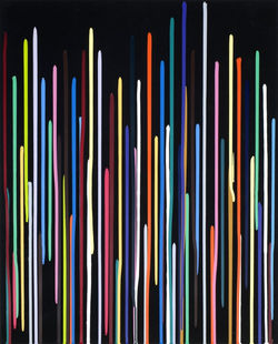
Gary Hume
english born in 1962
 |  |  |
|---|---|---|
 |  |
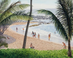
Figures 1-5
Gary Hume's style would be best described as Post-Minimalism, his art current and makes it one of the most enduring types of the last half-century.
All the above pieces are exhibits at the Tate, they are the five most appealing to me, from the 24 works displayed online. The colours he uses are synthetic, bright, flat and seductive with varied mediums and supports. Some mediums are industrial, i.e. the gloss paints used for his hospital Door Paintings that suggest the artificiality of the modern world in which we live. I like the simplicity of the compositions and in particular, the screen print Angel, because it is not symmetrical, the shapes are varied and some organic and it reminds me of my hairstyle as a teenager. Hume seems to paint the outline of the female subject, the divides, lines and spaces are the parts which lead me to the portraits eye. Is this a black eye, is the woman vulnerable? The print is several layers of coated varnish which must shine in real life.
As the OCA brief says 'Hume feels the paints communicate to everyone, as they are instantly recognisable'.
I find his work very linear, geometric, still and a representation of a 'better than reality' image in some cases. He uses line and positive and negative space intelligently. His application is technical, and some of his colour block work is reminiscent of Mark Rothko and his linocuts and printmaking reminiscent of his predecessors Andy Warhol and Roy Lichtenstein.
In the Tate Shots video below, Hume, interestingly explains that the problems that he solves in his work, are rectified, then repeated in his process, he is in fact a slave to the painting.
I like his work it's bright and polished, with a crisp abstraction.
References
Figures 1-5-Tate (no date) Gary Hume born 1962. Available at: https://www.tate.org.uk/art/artists/gary-hume-2403 (Accessed: March 2021).
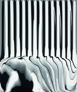
Ian davenport
english born 1966
 |  |  |
|---|---|---|
 |  |  |
 |
figures 6-12
Ian Davenport again would be best described as Post Minimalistic in style. His works are abstract, anonymous in appearance, and have a strong material presence. This isn't surprising as he attended Goldsmiths at the same time as Gary Hume.
The pieces above are from his website, where I was mesmerised by his technique and unique, inventive style. With colourful lines, a vibrant display of elegance meets disarray. The serendipity of the painted line in some pieces is a marvel to see 'pooling' at the bottom of some of his works. The work has rhythm and energy and the poured line works look almost like colourful barcodes. These pour paintings are made by using a syringe!
(They do remind me of the designer Paul Smith's shirts though). This dynamic discovery was due to experimentation, which reinforces the experimental processes artists undertake.
Symmetry and chaos are married together for intrigue and effect. Amazingly they are made in one sitting!
Davenport uses the consistency of the paint to create splashes, gestures, shapes, poured lines (diagonal or straight) by spraying, dripping or carefully tilting lines of glazed paint.
In the below video - ‘Sequence’ Kasmin Gallery - In Conversation with Elizabeth Fullerton, Davenport explains the difficulty of the lockdown restrictions in setting up an exhibition, his process and artists journey.
His inspiration and influences are not only from how materials work but for example, a walk, a building or the colours in the natural world (bluebells in a wood).
He incorporates the colour palettes from sources such as the Great Masters and his favourite paintings, these influences trigger his paintings. His splash paintings interestingly come from an energetic workshop he did with children, working and developing this spontaneity. These paintings aren't planned like the linear pours which must take a very long time to prepare.
I really connect with his process, his passion for the paint fluidity and the outcome of his abstract vibrant and unique pieces. This process has developed over years of research and discovery. His work makes me feel happy and wants to create something similar. The Red Crackle and Sparkler pieces are really energetic and full of life, with their colourful drips and splashes of sprayed paint, simple but so effective making them my favourites. Fireworks can and always will be winners in my book!
References
Figures 6-12 Ian Davenport (no date). Available at: https://www.iandavenportstudio.com/ (Accessed: March 2021).
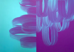
Jane Callister
isle of man born 1963
 |  |  |
|---|---|---|
 |
figures 13-16
I absolutely love these paintings because they are fluid and captivating and seem to be about paint's materiality and manipulation. They are an abstracted and energetic translation of the landscape form through colour, process and surface qualities. The artist has used acrylic pours and tilts to create a movement in her work.
Some of the pieces have geometric focal points which draw you in and imagine why they are there. The organic playfulness of the work intrigues me, and I really like looking at them.
Callister's exploration of place by connecting her upbringing on the Isle of Man to her now Californian home is visible. This develops through her career and encourages me to spend time looking and listening to colour.
In her (figure 16 piece) “Arc of a Journey” from 2017, Callister's work is described as 'Barroco-pop'.
Her sweeping looped brush strokes are dramatic or melancholic gestures maybe? I enjoy the tension, the feel of the dreamlike textures that push and pull my senses across the canvas. It reminds me of a microscopic close up of a looped material, each stroke of the brush formed perfectly. The directional loops are a little disorienting, but they are elegant and against a rich deep purple expanse on one side and a Caribbean sea blue void on the left.
Thank you, Jane. I love your style; I would like to steal some of your processes and experiment with them and my relationship with paint.
References
Figures 13-15 Jane Callister (no date). Available at: https://vielmetter.com/artists/jane-callister (Accessed: March 2021).
Figure 16 https://artillerymag.com/events/opening-jane-callister-baroco-pop/
Loose thin paint.
Cathy Lomax
English born 1963
From her own website Lomax says;
'I am interested in the seductive imagery of popular culture and in particular how it is constructed, consumed and related to. My work assimilates the seductive imagery of film, fame and fashion and juxtaposes it with personal narratives and the everyday. The resulting paintings and installations play with history by combining information from disparate sources to form fragmented stories; new groupings and categories that chart a curious contemporary longing for something unobtainable.'
 |  |  |
|---|---|---|
 |  |
figures 17-21
Cathy Lomax's work has a sensitive, nostalgic feel to me. She uses film stills and cinematic imagery for inspiration to paint the female stars of the screen in oils on canvas or paper.
I found a paper written on Cathy Lomax: Painting the Scene of the Self. By Paul O’Kane Spring 2017
This descriptive prose essay compares Lomax's 'luminosity and a lightness of touch' to Italian renaissance painters. The line which resonates with me is the last in the essay.
'Her selections might appear comparable with the actions of a religious devotee or fan, but closer inspection reveals that the artist is not obsessed with any particular star, director or movie but rather dedicated to exploring a certain tension between the ancient art of painting and what might be the fading ‘star’ of cinema itself, a modern culture and technology that might just have seen its apotheosis come and go'.
I suppose Marlene Dumas's sensitive painting style would be comparable, but Lomax's work has a glamour base with no hidden agenda or political narrative although her work is seductive. I can also see the light touch of Luc Tymans too maybe?
Do I like the work?
Yes, I do, I like the film series work she produces, which gives me inspiration for my Part One work. I appreciate the softness of her muted colours, alluring marks and charming compositions. The delicate realistic approach to express her femininity seems very relatable to me. Most of her works make me feel like I am watching an old black and white movie with Hollywood movie stars.
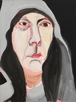
In Eyebrow Slick, we see a close-up of a female face applying pale green eyeshadow to herself. The bright pink nail varnish on the finger's almond-shaped nail that applies this makeup is the focal draw to the viewer.
The eye's gaze is somehow vacant, and I can't but think the lady is being trapped by makeup itself almost as if she has to put it on, she is constrained by the movie she is in or the way she has to look. The piece is painted in oils and has captured the face's contours with the light depiction from the backlit 'other eye'. The work is blended, but you can still see individual strokes of skin tone and shadow, the eyelashes are quite clumpy and reminiscent of the makeup's thick feeling. It makes me feel 'girly' and feminine and makes me wonder if we are slaves to make up!
On Lomax's website, I noticed the ARTY magazine, where she supports contemporary and emerging artists, by publishing this fanzine. I have ordered 'ARTY GREATEST HITS' and am looking forward to its arrival; it may have a little inspiration inside who knows?
(It has arrived) I made a little video of the pages that interested me on my first flick through. I think I will be sitting with a coffee on several occasions and dipping in and out of this interesting selection of works.
References
Figures 17-21 Cathy Lomax - Beauty Grabs (no date). Available at: http://www.cathylomax.co.uk/pages/year/2019/.html (Accessed: March 2021).
O’Kane, P. (no date) ‘Cathy Lomax: Painting the scene of the self’. Available at: https://www.cathylomax.co.uk/Documents/Essay/paintingthesceneofself.pdf (Accessed: March 2021).
Photo-realism
Tim gardner
american born 1973
 |  |  |
|---|---|---|
 |
figures 22-26
I absolutely understand why the viewer would assume these pieces were photographs. They are extremely well-observed and painted (mainly with watercolours) depicting his subjects engaged with the natural and/or urban environment. I understand that he is trying to paint scenes and observe human nature, but they seem to make my mood flat and cold. Maybe that's the point! Has he taken these photographs, is he painting scenes from his life or other peoples photographs? I feel like I am looking through his eyes at the scene in front of me.
Do I like them? Not really, because I could have the actual photograph of these scenes. That's not to say I don't appreciate the quality or creativity it has taken to paint them. The style is really not for me; they don't intrigue me. Personally, the paint doesn't speak to me if that makes sense? I can't enthusiastically relate to the content. I suppose that many people would see these photorealistic pieces as an escape, a transport to another place, but having seen many views like these on my travels they are somewhat run of the mill and I personally need some stimulation with the actual medium, colour, content or texture to hold my attention.
'The tensions in Gardner’s work are of the awareness of slight conditions: ease and unease, desperation and longing, complacency and discontent'.
References
Figures 22-26 Tim Gardner (no date). Available at: https://www.303gallery.com/artists/tim-gardner/selected-works?view=multiple-sliders (Accessed: March 2021).
Art, S. S. (2010) ‘Contemporary Art Daily » Blog Archive » Tim Gardner at Modern Art’, Contemporary Art Daily. Available at: https://contemporaryartdaily.com/2010/12/tim-gardner-at-modern-art/ (Accessed: March 2021).
Mark Fairnington
british born 1957
 |  |  |
|---|---|---|
 |  |  |
figures 27-32
Fairnington observes his subjects with such a passionate and detailed clarity. I chose the flowers in vases because I think they are breathtaking when you study the work closely.
The title of these floral still lifes is called 'The Worm in the Bud' the vases are in nondescript areas. The titles are taken from books that apparently suggest an 'implied threat to the established order, without that threat being specified or understood'. The colours are considered from studied realism and beautifully rendered with oils, reminding me of the still life painters of the 1600s. The shadows in his work seem to play an important part in the composition and add intrigue, balance, and harmony.
I really like them, and that came as quite a shock, as I really don't like the still lifes from the 1600s, although I do like their hidden, symbolic meanings within.
What is so different about these that makes me feel drawn to them? Maybe it's the blended subtle shadows that bring a softness to the pieces or flowers' choice?
I like 'Explosive Child' initially because I like Aurum Lillies (I worked as a florist for some years before I flew as crew) but mainly because the colours seduce me. The shadows are playful and hold my interest. My eye dances around this elegant composition, the negative space, the crisscross of the lily's stems and shades are attractive and lures me in. This particular feels drenched in sunshine, warm and somehow sinister and mysterious. I suppose I am trying to say that these flowers in vases are very atmospheric when you take the time to really look.
The Landscape Room series is a more recent series of paintings of serene scenes observed, remembered and transporting you to the location. The colours are naturalist, and he plays with light and shadow for a
contemporary perception of the landscape. I am not as gripped by these pieces; again, a photograph would hold the same interest for me. I want the same 'draw' from some aspect of a painting. I do, however, appreciate and respect the technical ability of Mr Fairnington.
In the below video, he explains that some of his work is influenced by Museums and tries to teach students that the studio practice is an important part of their development.
References
Figures 27-32Searching for mark fairnington (no date). Available at: https://www.artrabbit.com/search?query=mark+fairnington (Accessed: March 2021).
Black and white
Gia Edzgveradze
Georgian, born 1953
 |  |  |
|---|---|---|
 |  |
figures 27-32
Gia began with large black and white paintings (later creating 3D installations for the Tate).
Whilst browsing the internet I came across an NYC exhibition entitled ;
' The Stolen Blanket And Other Short Stories.'
The artist self describes himself as representing “the condition when someone is left without a chance to be secure, cosy, protected and deliberately forced to be naked and de-territorialized”.
I found the art quite infantile, with black lines of oil on a white oil background. Edzgveradze uses inspiration from Georgian script and oriental calligraphy to contrast the traditional and the everyday features that reoccur.
I do not like the style at all, I find the content of some pieces a little disturbing and there seems to be no feeling in the work no emotion or atmosphere. I'm not too fond of the line's subjects because they seem awkward and the brush marks random in appearance.
That being said, I then I dug deeper into this artist, I found that his life has been challenging, and I see that in his art. His struggle and emotion are there in simple shapes and line. Does this make me feel differently about his art? Should it? I don't know I'm still reflecting on this.
References
Figures 27-32 Gia Edzgveradze (no date). Available at: http://www.stuxgallery.com/exhibitions/gia-edzgveradze/selected-works?view=thumbnails (Accessed: March 2021).
alli sharma
british Born 1967
 |  |  |
|---|---|---|
 |  |
figures 33-38
Alli Sharma's work made me laugh a little at first because I saw her art, objects, or designs sentimentality and with nostalgia, as my Nan had two black cats just like the ones in 'Angry Cats'.
Lots of her work has kitsch, or bad taste feel to it (as we are similar in age I can relate to the poodles and some of the jewellery she paints as they are from our childhood years). In most of her paintings, her soft blended paint feels of romance or love to me. I like the visible brush strokes and fluidity of bleeds. There seems to be a varied approach of dribbled diluted paint and dabbed square marks, sweeps of tone and hostile areas of white. These variations evoke mood drama and feeling in her work. I want to use some of the mark-making techniques and tonal transitions in my work and see if I can adapt them to develop my personal voice. I really like how she uses the direction of the brush marks to best describe her subjects, for example, the flat sweeps of brush technique for the hair, or the soft feathers in the owls.
I am reminded of Marlene Dumas and Luc Tuymans in the paintings' style because of the dilution and techniques.
I find myself directed to the eyes of the subjects and what they are looking at. This is something to think about when painting portraits.
I also noted that Alli had appeared in ARTY MAGAZINE and when I compared her work to Cathy Lomax, I can see softness and muted similarities. Also, the nostalgic feel is present in both artists work.
References
Figures 33-38 Alli Sharma (no date). Available at: https://www.allisharma.com/paintings (Accessed: March 2021).
Colour and pattern
Peter Doig
scottish born 1959
 |  |  |
|---|---|---|
 |  |
figures 39-43
I read a news article where Sue Hubbard describes Doig's work as;
'Drawing on personal reminiscences and found images he has explored the slippage between reality, imagination and memory. The material properties of paint and the expressive possibilities of colour have been used to conjure the opaque, inarticulate sensation of remembering. Maintaining a thin line between abstraction, landscape and the figure, he’s appropriated photographic imagery to suggest remembrances that are both real and imagined. The photos he chooses aren’t he says ‘ always that interesting or distinguished. That’s deliberate – I like the fact they’re bland: they leave much space for invention. Painting is about working your way across the surface, getting lost in it…’.
Honestly, some of his work I really love ( and some I really hate (Bather (Sings Calypso)). The reasons are because of the content and composition primarily.
I love his general use of tone, colour and pattern and the way his colour palette appeals to me through those textures and shapes, especially in ('The Architect’s Home in the Ravine’) with the branches and twigs which dominate and cause a lattice overall effect which I think is extremely useful as a technique. I would guess this has been achieved by a small rigger brush and many layers of technical detail. I think there is an amazing sense of depth in this composition which is remarkable for such intricate linework.
(Bather (Sings Calypso)) disturbs me because I see a heavy painted middle section, dirty looking water and sky, a male figure with feet dissolving in the sea, with an anxious expression and a grey vision of a man being attacked by a sea snake. What is happening here, I feel like I'm in a horror movie!
I note that Doig uses found images and memory to use as inspiration for his work. In fact, Bather (sings CalyIpso) is taken from an old photograph of the actor Robert Mitchum, on a beach in Trinidad whilst filming.
It took a while but I think I found the image Doig used, as I wanted to see how/why he had been influenced.
In an article in the Guardian news article, it reveals some answers but not all. I see now that Doig uses parts of photographs and melds them into whatever he wants to convey and that is something that I can be inspired by, to make an image my own.


The more I read about Doig, the more I want to view his work first hand. Like many other artists seeing the work for myself, close up, and personal, I want to see the surface actively. I tend to move around the canvas or support when I view a painting, looking for texture and variety of finish etc., that is exciting to me as you can't experience this digitally in my opinion.
References
Figures 39-43 Hubbard., S. (2020) ‘Peter Doig, White Canoe 1990/1, Significant Works Sue Hubbard’, 2 August. Available at: https://www.artlyst.com/features/peter-doig-white-canoe-1990-1-significant-works-sue-hubbard/ (Accessed: March 2021).
Figures Available at https://www.ft.com/content/707fddea-4d2c-11ea-95a0-43d18ec715f5 (Accessed: March 2021)
Movie photograph tcf (2017) A day at the beach with old Hollywood stars - Gallery - The Chic Flâneuse. Available at: http://www.thechicflaneuse.com/a-day-at-the-beach-with-old-hollywood-stars-gallery/ (Accessed: March 2021).
Bather (Nightwave)Sherwin, S. (2019) ‘Peter Doig’s Bather (Night Wave): an unsettling dreamscape’, The Guardian, 13 September. Available at: http://www.theguardian.com/artanddesign/2019/sep/13/peter-doigs-bather-night-wave-an-unsettling-dreamscape (Accessed: March 2021).
Tal R
Israeli born 1967
 |  |  |
|---|---|---|
 |
figures 44-47
Tal Rs works don't really excite me. Blocked bold colours colliding with colours, shapes divided and abstracted. I suppose I am reminded of Rothko by the colour blocks in layers. Hidden narratives for you to finish, doors and leading paths or staircases to where though?
In Pyjamas we see a figure, probably male in striped pyjamas walking away from us, going to bed maybe or sleepwalking? It's charming and childlike markings look like memory or copy of an actual child's imagination. The pastel marks look like a felt tip pen almost, and the piece guides me with the yellow hues towards the open door. It isn't until you look closely at the work that you see the figure's feet are pointing towards you and the head of the model looks almost like an African mask. Does this begin to show the sleepwalking figure is having a nightmare perhaps?
When I watched the video below, I saw the artist painting, and I think it is important to see the process that he takes as it clearly defines his work, this was exciting to see.
He has a psychosomatic process with the large canvases (in the video) using paint on a roller on a pole, aerosol spray paints and large flat brushes to overlay layers of colour. In the video, he makes a series of railcar paintings, all different coloured depictions of the same concept. The main focus is the word Habakuk a pet name for his father. This reminded me of Antoni Tapies, a Spanish artist who uses symbols and initial letters of his family in his work.
Tal R's imagination and meaning take a large part in his making and creating for his pieces' content. If I take away anything from listening and watching this artist, I must experiment and lose myself in the paint, from my experiments and failures, I will develop. The curious and unplanned part of a painting is what makes the image interesting. Also, If you find the painting intriguing, then the viewer will.
I think some of his work's content stems from his moving from Israel to Denmark and his family's struggles with that move. There seems to be much personal hidden content in his work that you would not necessarily identify with until you research further, i.e. Habakuk.
His art seems to be a freedom for him, and he wants you to remember some part of his expressive visual art and take that away and reflect.
I read the review of another series of small pictures House of Prince Review March 1, 2005, which grabbed my attention (because of the course work I was about to undertake). I can take influence from the illuminated parts of the series of painting (maybe for a concept to play with for the presentation), and that these sections of works are abstract of his works in miniature, I also like the idea of this.
References
Figures 44-46 Tal R (no date). Available at: https://www.victoria-miro.com/artists/16-tal-r/ (Accessed: March 2021).
House of Prince (no date). Available at: https://www.talr.dk/exhibitions/house-prince/installation-images-0 (Accessed: March 2021).
messy
chantal joffe
american born 1969
 |  |  |
|---|---|---|
 |  |
figures 48-52
Chantal Joffe paints works that visibly show her brush strokes, loose and messy. She hates acrylic paint and enjoys the rich feel of oils. Her subjects are catwalk models, porn actresses, mothers and children, loved ones, literary heroines, portraiture, motherhood, passing time and art's relationship to history. I'm not too fond of her style; it's too raw and harsh for my liking. Her style reminds me of Cecily Brown's and, like Cecily, she is influenced by her love of the historical 'Masters,' i.e. Degas.
I understand the painterly strokes are her access to her thoughts channelled through a tool, and I appreciate the quality again. Still, I am not a fan of the colour combinations, the fleshiness of the figures' skin, or indeed, the sadness I feel in some pieces.
She uses apple green or creamy pink base grounds for her works, which may add to my dislike, I'm not entirely sure. I find that some of her palettes clash and that irritates me.
In a Car, Brunette is probably my favourite because her palette is more seductive and more to my liking. The composition is a reclined lady in a car, one hand over brow, a swooning pose, the other hand pulling up her dress, is she seducing the viewer? She reclines in the car with red seats echoed in her luscious scarlet lips; this contrasts with the white and delicate dress she wears. The focal area is the umber tone around one of the brunette's eyes. In fact, quite a few echoed triangles in work, the lapels of the dress and the shape of the bent arm and head, and a grey triangle of colour in the bottom right corner.
As Joffe likes to use photography, books and images to influence her work, I think the brunette composition is from a photograph. It conveys a sexually enticing image of a glamorous woman for a photoshoot or modelling session to me.
In 2018, Joffe started a series of self-portraits one every day for a year. She played with the scale, different times of the day and looking at other artists who had completed this concept. At different times, each day, making a painting of herself, and they are all so different compared to her mood or stance. Some are quite horrific, and some literally bare all her emotion. In fact, when I research more, she seems to have a very emotional attachment to painting, it makes her human and I can very much relate to this. In a way, her process is a release and making a painting every day gave her motivation and purpose.
The one technique I do like that Chantal use is the painterly sweeps of buttery oil over oil where the colours shine through and then swirl off the canvas. I also like the drips that happen when she is painting add to the feeling that you can see her process, feel her actually making the piece. This, to me, is very expressive and exciting.
I listened to a podcast where Joffe talks about her paintings and her love of Degas and the National Gallery.
I also note that she asks some of her models to pose in the same positions as historical paintings that she likes. This is another concept that could be an influence on my work.
A Brush with...Chantal Joffe
References
Figures 48-52 Chantal Joffe (no date). Available at: https://www.victoria-miro.com/artists/19-chantal-joffe/ (Accessed: March 2021).
A Brush with....Chantal Joffe. https://www.theartnewspaper.com/podcast
Carole Benzaken
french born 1964
 |  |  |
|---|---|---|
 |  |  |
 |  |  |
 |  |
figures 53-63
Yes, yes, and yes again, this was very inspiring work! Finally, I think I have found an artist whom I can really relate to completely.
Carole began by painting flowers (tulips) in France and then moving to Los Angeles in 1997 took influence from her immersion in the day to day world of a bustling city, magazine photos, the TV, street posters and films, the movement of things and of the crowd on the gigantic scale of that city. I can relate to this and feel very fortunate to have experienced this too from my global travels.
One of her subjects is the blooming of magnolias a series, 'YES, MAN IS A TREE OF THE FIELDS' painted with India ink highlighted with colour crayons and placed on a glass support.
My heart sings when I see the velvety, translucent, transparent blends and layers of the works. I can almost see an Asian influence from the inks calligraphic black branch markings causing atmospheric abstractions. I find the pieces are ethereal and breathtaking. The video below explains she started the works in 2013. After a two-year break, she returned to the series with new lamination techniques and superimposing. A layering and creation of space between the media used to cause entangled marks that I think are so intriguing.
In her 'Skin screen' series she relates to aerial views from aircraft (can you see where I am going with this?) and how she translates this to her painting. The fluidity of the ink translates to a river on the landscape and with the introduction of other concepts like animals or the body she merges and experiments to bring the pieces to fruition.
Her passion and enthusiasm for the actual process of making are clearly present.
'Ecclésiaste' is a work that uses ink on tracing paper on a lightbox with I find an unusual means of displaying the image this also applies to 'Midokpe' where the image os lit inside a tondo box. I would very much like to try this out at some point. I expect the images would become more translucent. This brings a new visual experience.
I also find with research that Carole had been commissioned to make artwork for the MISS DIOR – LOVE N’ROSES EXHIBITION. She describes the perfume as a landscape, from the ground, full, rich and translates this into an installation or work. I find this really fascinating and food for thought. Why can't scent and smell the feel or touch of something be just as powerful as a visual?
Carole develops and takes forward new approaches and techniques. These new media makes use of three-dimensional space sometimes. Still, I fear I am getting ahead of myself, so I will continue to be inspired for the present time with the two-dimensional approach she displays. These two-dimensional works are something I would like to work on, with my reflection on supports/surfaces, i.e. glass and making the images seem as if you are looking at them through a filter. Her view of perspective is similar to my ways of looking, i.e. aerial views and using layers.
References
Figures 53- 64 Carole Benzaken (no date). Available at: http://www.carolebenzaken.net/works.html (Accessed: March 2021).
ANNIE KEVANS
English born 1972
 |  |  |
|---|
figures 53-55
Initially, my first impression is that Annie has a delicate touch within her portraiture pieces. I browse the first series, Boys, which depicts the young faces of some of the world's worst dictators. She seduced me with the innocence of the young portraits and I looked and saw the sensitive marking styles of Luc Tymans and Dumas. Then the titles of the works punched me in the stomach! How clever.
I have a lot of respect for the meaning behind all of her pieces and what they communicate with their political and social narratives.
The below Newsnight video below Annie discusses the role of women, icons and why the success of female artists hasn't been more celebrated in the past.
I'm a paragraph. Click here to add your own text and edit me. It's easy.
References
Figures 53-55 Annie Kevans (no date). Available at: https://www.danzigergallery.com/artists/annie-kevans?view=slider (Accessed: Mar , 2021).
Peter Dreher
german born 1932
I had found Peter Dreher, who is one of the artists in Vitamin P3 New Perspectives in Painting who had painted the same drinking glass in his studio every day since 1974, he sadly died last year at age eighty-seven. I was happy to include him and mark his commitment.
 |  |  |
|---|
So why do artists paint the same image?
Is it like a warm-up for them?
I can understand that, in fact, it makes sense. It also occurs to me that this is one big series and performance. A performance that lasts a lifetime.
I can see the differences in the light reflected in the glass, the subtle differences in the time of day, small shifts in colour and tone but none in the material. All are muted and subtle in tone and of the exact same empty glass.
Would it be like an opera singer warming up through her scales every time she or he sang? Did Peter need to perform this ritual to enable him to shine or was this the performance? Was it his way of documenting his entire journey as a painter, the way he saw this object from day-to-day?
Peter painted many items in series and images of some of his exhibitions are here.
There is a series of puppet heads, skulls but nothing really compares to the remarkable series of over 5,000 empty glass paintings.
annabel dover
english born 1975
 |  |  |
|---|
figures 56-58
Annabel (another artist who made small oil-on-board pieces for her one-a-day series) also creates silverpoint drawings that tarnish, age and get darker over time as the silver oxidises. Her drawings are objects that relate to people's memories, taken to a psychic or filmed in a different light and the stories associated with the objects.
Her work is delicate, fragile and has a remembering/nostalgic feel to me.
Do the drawings look like they should be illustrations in a book a fairytale maybe?
The images are still and sweet, muted and diluted tones. Not really my sort of thing but still appealing to look at. The meaning behind the work has more interesting to me. Making work that tarnishes over time creates an ongoing intrigue. Dover recreates memories in a graceful and elegant way.
References
Figures 56-58 Annabel Dover (no date) https://www.axisweb.org/p/annabeldover/. Available at: https://www.axisweb.org/p/annabeldover/ (Accessed: March 2021).