2.1 Unusual painting media
- martine75
- Apr 23, 2021
- 16 min read
Updated: May 29, 2021
Make paintings of any of the collections you’ve collated using three (or more) of these materials. All of these media have been used by contemporary artists:
coffee (e.g. Paul Westcombe)
Coca Cola (e.g. Marcel Dzama)
Marmite on a white plate
jam
nail varnish (e.g. Nadia Hebson)
make-up (e.g. Karen Black)
food colouring
chocolate sauce (e.g. Paul McCarthy)
resin
ice (e.g. Liz Ballard, Francis Alÿs)
Humbrol enamel paints (e.g. Geraldine Swayne, Genieve Figgis, George Shaw)
egg tempera (e.g. Andrew Wyeth)
sand
graphite
marble dust (e.g. Antoni Tàpies)
icing
household paint (e.g. Gary Hume)
ink drawn with a stick or the wooden end of a paintbrush.
Useful tips
1. At the moment keep these paintings quite small, A4 or equivalent at the most. This will help you to gain control of the media you use in a limited space.
2. You might also want to use paper/card/a paper plate/metal/found packaging/doilies as a surface to make the paintings onto.
3. If you use Humbrol enamel paints, you can dilute them with turps or the thinners that are made to go with them. You can paint them onto canvas, board, card or paper, or onto ‘oil-primed’ paper.
4. Photocopying objects can be a useful way of making them more manageable to depict. These painting materials may be messy so you might have to document them with photographs and then print the photograph out to create a physical record. The photograph might then become the piece of work.
I made a few experiments in my sketchbook with some unusual paint materials. I wanted to discover and reflect on the variety of media.
(Larger images in my Sketchbook Part two page)
Sketchbook experiments.

Hair dye - basically no different than a pigment on paper.
Ground coffee - tonal values that could be built up.
Nail varnish - absorbed by the watercolour paper (I need to choose a more non absorbent support)
Spices- grainy with similar properties to watercolours.
Spice and coke mix- accidental mix causing washes of mixes pigments with pleasing granular washed outcomes.
Lily pollen- similar to the spices without the grain, a water activated pigment.
Resin- pooled resin can be difficult to form into shapes. I was unable to use brushes because of the media having a hardening and setting quality.
Vinegar and Green Tea- insufficient strength of colour pigment.
Chocolate powder - thick and gloopy, grainy and diffusible.
Ink and tea- no visible difference in comparison to just ink alone.
Gravy- sticky and pale.
Gesso and coffee grounds- Very textured and dries to a pale mocha colour.
Foil and acrylic- foil brings immediate texture, metallic shine and the acrylic can be painted over to produce matt forms.
I made several sketches of the collections in my sketchbook. I wanted to work from photographs directly, sketches and also real life. I think you discover the feel of the composition by experimenting and investigating. I can explore and be selective with colour, line and tone for the experiments in the brief.


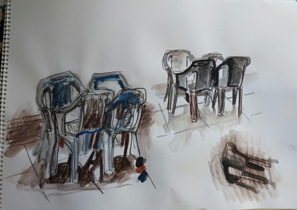
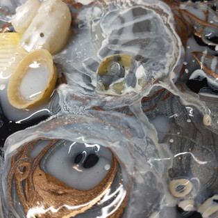
The collection paintings.
I used the white collection, set up in front of me, and a photocopy of the photograph pinned on my wall cork board.
The White Collection.
What are these white objects?
Random objects around the house chosen because they are predominately or entirely white.
A disposable plastic paint palette
An artificial orchid
A pearl bead
A found shell from a Caribbean beach.
A metal heart embellishment
A piece of lace ribbon
A push pin
A plastic bottle
A Lego stormtrooper.

Make Up.
Various eyeshadows, foundation, liquid eyeliner and mascara.
A4 Watercolour paper.

Advantages
The overall look is shimmery and dreamy because of the pigment.
The objects are hard to distinguish due to the materials used and their application (with unusual tools i.e. mascara and eyeliner/shadow brushes) and therefore this creates some intrigue.
Disadvantages
Difficult to gain control of the material.
Difficult to blend areas and create definition with tone.
My brushes needed resuscitating afterwards because of the powdered eyeshadow!
Result
The outcome is blurred and awkward. Some marks are gestural and even childlike. If I hadn't seen the original photo I wouldn't know what I was looking at.
Ink and stick
Ink and a stick/end of a paintbrush on watercolor paper.
Water in a spray bottle.
Acrylic ink pipette (from the top of the bottle)
A4 Khadi paper


Advantages
I really enjoyed the flow, fluidity, drips, bleeds and scratchy marks with the inks.
I can develop these marks as in previous exercises as a base layer with thicker paint applied over the top.
An easy to use medium and very satisfying marks (but not defined when I am using a stick).
Using the water spray encouraged the ink to take its own path.
Layering ink makes pleasing outcomes, shapes and creates depth.
Disadvantages
Dipping ink into a bottle with a stick is tiresome and time consuming.
Using the end of a paintbrush picks up more ink but makes larger marks.
Using a pipette makes it difficult to control the amount of ink released onto the paper.
Pushing ink and water with a stick makes pleasing irregular marks but they don't depict the objects. It was difficult make defined marks with little control.
Result
Not a complete disaster I could work over into these images and make them the first layer if I wanted to develop them as I said with thicker paint. When I work with ink I seem to be able to create energy within my mark making. I feel comfortable with ink, the marks are overlapping, intriguing loose and free. I understand the medium, its potential movements on a dry or wet support. I feel a connection with ink and as this course is called Understanding Paint Media I think this is a good sign. I feel excited when I use it and I am enthusiastic to discover how far I can progress with it.
Using the mugs.
A snapshot of my collection of mugs (from most of the countries I have visited).

Coffee.
Ground coffee, instant coffee and coffee coloured gel pen for the outline.
On A4 khadi paper.

Advantages
The smell - I love coffee!
Using coffee with varied sized brushes I could paint as I could with watercolour. I could add spices etc to the mix, as I had in my accidental experiment in my sketchbook with the tumeric and coke mix, I chose to keep this entirely coffee because of the subject of coffee receptacles/mugs.
I had an infinite supply of coffee it was fairly inexpensive and I wasn't as precious about using it or wasting it as I am with paint.
Disadvantages
The ground coffee was watery even though I used a double espresso!). I had to buy a small sachet of instant coffee to get the darker tones.
I needed definition so I used a gel pen to outline (which I am not sure works).
The coffee tends to bleed more than a water based paint, for example watercolour.
Result
Yes the image depicts the mugs, but it's boring and flat. The Miami mug looks like it's floating rather than placed. I needed more tonal depth in places like under Miami and above China.
On the upside it still smells great after drying!
Nail Varnish.
Various nail varnishes, air dry, UV light dried and household paint.
A4 Clear acetate.


Advantages
The texture of the nail varnish against the household paint gives a luxurious glossy finish.
Using the acetate assisted the varnish application as the varnish had been absorbed into paper in my experiments.
Disadvantages
Not the easiest medium to use because it's claggy, gluey and difficult to apply with the brush applicator in large areas.
I feel sick with the smell of the nail varnish, even though I have the window open!
Blending is difficult. I even tried mixing in nail polish remover to dilute the varnish which did not work.
Result
I think the images on the acetate have brought to my attention the appeal of working on a transparent support. The light shines through and you can change the feel of the piece by placing various coloured paper or light underneath. That's interesting.
Using the white flowers.
I had been sent a bouquet of white flowers, I love all white flowers.Typically a symbol of peace and forgiveness in Western culture. Whilst I was a florist they had a purity meaning for me and were often ordered for funerals or wedding bouquets.
Several blooms have decayed over time creating interest and variation.


White acrylic & Blue/black Ink (Quink) pipette and a stick.
A4 Khadi paper
Water spray bottle

Advantages
The khadi paper made the blends more muted and diffused than before. I really liked the blending with small bleeds of Quink feeling their way over the paper.
The subject was more organic and therefore I could define the shapes with more understanding of what the medium was capable of acheiving.
Using white acrylic ink with a pipette in the second layer brought life to the piece with a depth and contrast.
Disadvantages
Using the stick wouldn't be my tool of choice for the entire piece, although it has made some delicate markings. Using the pipette again released too much ink and the marks are somewhat clumsy.
Result
Overall I quite like the diffusion mark making. I like the focal point of the lily stamen and the little painting has a delicate, sensitive feel, without being twee. A quiet reflective piece that needs a glaze of diluted layers added to bring out the beauty of the natural elements. The piece is too flat and needs a consistent direction in the shadow areas. I can see it has potential.Could it be worked into with line and diluted muted green ink to multi layer and add shadows with green tones?
Nail Varnish
Nail varnish (painted and drizzled)
A4 Clear Acetate

Advantages
Using the varnish straight out of the bottle and drizzling made a more fluid organic line. This was more relevant for the flowers.
The finish is raised where the varnish has been drizzled.
Disadvantages
Again the varnish was difficult to apply
Removing and dabbing the varnish with a kitchen towel made a complete mess of the defined petals beneath.
Result
I was disappointed because the work is dull and seems lifeless but where possible I look for the positives. The top right (carnation) has a flowing petal shape with line and because of the layers beneath, it seems to flutter almost if that makes sense? Some of the Gerbera (centre daisy like flowers, for those who are unfamiliar) markings have a pleasing texture. These are experiments and play to help me understand the media and I can use this method for raised areas of glossy random line work on a harder support.
Using aircraft
These are ornaments,toy aircraft or wall plaques. My boyfriend has his pilot's license so we like aircraft in this house.


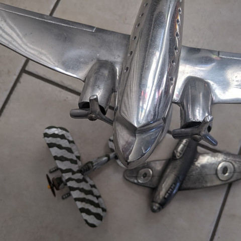


The bottom right image is a cropped and edited black and white filtered picture of the planes. I preferred the crop as the lines of the wings take your eye across the image. The body of the toy plane gives a feeling of movement.
Resin
I am so excited to use resin. My eyes lit up when I saw it listed. I have used it before but I have no confidence with it. I did some research and have ordered some different consistencies. Who knew there was so much choice?
I had some resin from a couple of years ago. I found out that resin discolours over time and mine has done exactly that- yellowed. No matter, I am experimenting.
I ordered a mould. You can't paint traditionally with resin as such, I knew that. You can pour abstracts and create marbled effects, but how could I make something unique?
I had been inspired by Marc Scheff and his layered approach. Looking at Chris Ofili and his variety of mixed media and elephant dung coated in resin, I had a few ideas floating around in my head, elephant dung wasn't one of them though!
Resin & Mould 25cm x16cm
Nail file
Gouache and acrylic paints
Eyeshadow
Cotton Bud
Kitchen foil
Photocopy of aircraft


I considered the idea of using the cactus collection, but dismissed the idea as I wanted to use kitchen foil for the metal fuselage. I prefered the composition of the aircraft it was more impactful.


The mould worked well and the resin dried overnight. The outcome is a quite flexible oblong tray of resin, I expect it will harden over time. I scratched the surface with a nail file to create a tooth for the media. I used eyeshadow, gouache and acrylic and a cotton bud for my background layer.


I applied another thin layer of resin and let that dry overnight.
I cut out a template from the photocopy and then used it to cut out the aircraft shape out of kitchen foil. I stuck this on with Pritt Stick.

I built up layers of paint details over the foil. I added the other aircraft with acrylic paint (although in different positions).


'Model aircraft'
Silver foil, acrylic & mixed media on resin mould 25cm x16cm
Advantages
It's an unusual oblong support for mixed media and transparent so you can change the background (which shows through)
It can be used in a variety of ways; support, coating or added mixed media submerged or applied to the surface.
It's glossy and smooth and can be poured into moulds for various shaped supports.
Disadvantages
It is toxic. Ventilation is fundamental.
It takes time to produce the work.
It's an expensive option.
Result
The composition of this piece is a little stiff and literal for my liking.
Is this because I felt less free because of the expense of the materials I was using?
The metallic glow from the foil has pleasing tactile results with glossy resin. Being able to change its background or shine through colour/light from underneath brings different outcomes (difficult to see in the images).
This media brings a industrial feel and could be used for metallic, architecture or hard surface depiction.
Wires
This entanglement of wires inside a drawer is I suppose how I (and many of us) have felt during lockdown. The chains laces and straw all contribute to a feeling of restriction.
Resin & Mould 25cm x16cm
Nail file
Gouache and acrylic paints
Chain, shoe lace, straw
Liquid acrylic paint.
Heat gun.
I used the same process with the mold but this time I submerged a chain, a leather shoe lace
and pieces of straw into the resin. I had been researching Arman (Armand Fernandez) and was inspired by Bluebeards's Wife . Arman's sculptures incorporate manufactured objects, he describes them as 'accumulations'.
I added some ochre liquid acrylic paint and the heat gun made some amazing patterns in the resin when I used it to take away the air bubbles.
The first photo shows the mould (upside down) and the chain etc submersed into the resin. The second photo shows the set mould removed from the mould and turned over to reveal the outcome.


When the mold was dry I weighted it with heavy items and left it for another 24 hours to set as I am finding the mould is still flexible and prone to twisting.
I printed off a photocopy and used it to guide me to paint the plugs and wires.
Advantages
Using the mold with added chain, lace and paint made it a great support with depth and intrigue. I really enjoyed the process too.
You can add and submerge almost anything into resin for a unique design element.
Disadvantages
If you aren't happy with the support it's too late really I suppose you could paint over the top but then what would be the benefit of using the resin?
Result
This for me this piece achieves intrigue, depth, variation and a chaotic entangled feel. The use of mixed media seems to layer well and create variety. It's quirky piece, unique and with tangibility.


'Entangled'
Lace, chain, straw, acrylic and mixed media on resin mould 25cm x16cm
I wasn't completely happy after a period of reflection. With fresh eyes and looking at the outlined red area (highlighted below) I was unhappy because this area was drawing my eye with its incorrect perspective.

I scratched off some of the paint with the edge of a palette knife and with diluted Artgraf made my adjustment.
Why is it better? It's more ghostly and muted and the background shows through.
Better, much better no distraction.

More in depth resin research.
I found a resin supplier online and intrigued by various several types of resin (videos below). I purchased and researched casting, coating and hi- build resins. They also promoted crackle paste. I had seen a painting by Antoni Tapies at the The Museu Coleção Berardo in Lisbon whilst on an OCA study trip (my own image below) and it would be an 'unusual material' to experiment with for my cactus collection because it reminded me of arid landscapes and dry cracked earth.
The shapes of the painted cracks make interesting marks with texture and with mixed media application was worth exploring. I knew that Tapies used marble dust but in the piece below (my own images) it seems he has painted on metal panels using crackle medium. At first hand this piece was stunning, it looked like chocolate, smooth and rich but also with an industrial feel.
I wasn't sure if my thinking that the crackle paste would be suitable for the cactus collection but it was worth discovering that myself. Also my enthusiasm to use the crackle paste just couldn't wait!


Shells
These shells have meaning to me as I have collected them from various beaches on my worldwide travels over 23 years. I have quite a few. It brought back memories of the feel of the heat, sand between my toes.
Resin & Mould 25cm x16cm
Nail file
Gouache and acrylic paints
Chain, shoe lace, straw
3D paint.
Heat gun.
Glitter glue.
Stick.
I made a resin mould and added white tint to it for a change! I painted the base with dark paynes grey acrylic paint mainly because the shells in my collection picture have a dark background but I might want to scratch into that later.
I mixed the Hi-build resin (no toxic smell yippee!) It felt strange to drip the resin and it to remain where I had applied it. Usually the resin pools and spreads as it is more liquefied.
I decided to push some actual shells into the resin. I really don't know why, but my subconscious mind had collected several artists who mould resin and use it with objects in different ways. I wanted to create a focal area perhaps a more 3D piece?

The process images.


I used the photo on my mobile phone as a guide for the shapes.The resin could be made into strands if I poured it slowly or from a different height. I managed to draw the shapes of the shells.I added white tint, silver tint and metallic powder. I layered over the resin and stopped. I don't know where I'm going. It was oozy and gloopy, glossy and satisfying to use. The strands and layers made drizzled, fibrous stringy markings and I may have become a carried away with the process.
I would let it dry and then leave it for a few days I would reflect and look at other artists who worked in this way.
My thoughts were to work over the resin as I had in the Entangled piece with plugs and wires. I think I wanted to achieve a realism with a couple of shells and the intrigue with others in a more painterly way, This way the viewer would have to work hard to see which were the real shells and which were not. Rather like how we all felt at the moment with a global pandemic. The actual picking up of shells from a beach, the painting of those shells and the memory of them all located in a small resin mount.
I found that I needed more texture. What could I use? I had a draw full of 3D paints which I discovered where successful in the application of the shells edges. They were pearlised 3D paints and I could blow them around once applied, causing a ripple to their paint edges.
I layered over and over. Leaving the piece and returning to it over days. I added diluted paint, scratched parts with a stick to cause satisfying textures. I blended acrylic to form shell shapes and I was aware to keep the glossy shine in parts of the piece to signify the sea/water or pearlescent shells.


Advantages
The high build resin was easier to control.
I could create more varied outcomes with stringy application or gooey blobs of the resin.
I could form shapes. Layers of media were applied to these forms building the marks.
Disadvantages
There is an element of chance with how the resin sets (less so with the high build resin but still present) and you cannot change that.
Planning is key and I need to be aware of this.
Result.
The result is what I can only describe as a sculpture painting I suppose Marc Scheff would describe it as a dimensional painting. It's certainly unusual and captivating for me to look at. The background is a dark tone and I may want to make that a sea blue or a sand colour?
The resin shines and brings the piece to life. Its tactile and your eye visually dances over the shells. I want to apply another layer of resin but am reluctant to cover some of the more successful details, for example the moulded shine of some of the interiors of the shells.
I reflected and realised that I couldn't feel the sand between my toes.
I added the sea with blue, teal and white ink by spraying and running the ink around the shells. I guided it with a mop brush and also tilted the resin support to make the liquid ink behave like water. I prefer the outcome because it does now feel and evoke the seashore.
Certain areas excite me. The layers strings of resin, the glassy shine and textural quality when resin and paint are applied together. I have a much greater understanding of what is capable with moulded and sculpted resin. There is much more to discover though.


Beachcomber
Gouache, high build resin, acrylic, 3D paint on a resin mould 25cm x16cm
Cactus/Cacti
I want to use the crackle paste to achieve an arid atmosphere in this piece. Experimenting with the properties of the medium.
Found canvas 16 x 12 ins
Crackle paste
Gouache and acrylic paints
Moulding fibre paste
Pearlised gouache.
Gold aerosol paint.
I followed the method in the video and decided to use green for the colour of the cactus a base. Gold aerosol seemed to contrast and would be a mid tone.


I worked outside and left the crackle glazed canvas overnight to dry completely.

I really liked the result. It certainly evoked an arid atmosphere.
I used a round blending brush to swirl over some lighter tones for the background.
I worked from a photocopy and put in the basic shapes and tones with acrylic. I used the upside down technique from the previous exercise as I found it easier to form the shapes that way.
I was running into difficulties with the cracks because they hinder the painted lines. I used fiber moulding paste smeared on with a credit card to fill in the cracks and form the pots. This overcomes the problem and makes the pots come forward and adds depth. I used this paste to dab the white cactus and formed peaks, it looked just like the real thing and I was overjoyed with this result.
I used paynes grey and white acrylic with various brushed for the application of the cactus spines.


To compliment the green I used red for the focal flower and worked around some of the cracks making the piece seem alive with branches of pearlescent green foliage.

Crackpot
Mixed media on canvas 16 x 12 ins
Advantages
The crackle paste has the wow factor. it has a powerful punch and is very atmospheric.
It's easy to apply and relatively quick to dry.
I can use it to evoke aging, terrain, organics or simply crackle texture.
Disadvantages
You can only really use the crackle paste on a hard support.
You can't really plan or be concerned about how the cracks will be formed.
The formation of the cracked pattern is chance and I really like that fact.
The outcome is individual and unique.
Result.
I think I have overworked the piece if I'm honest. Has the crackle paste method taken precedence over the painting?
The atmosphere is certainly arid, the cacti feel perky and cheerful because of the green cracks emulating a, perhaps, reaching for the light feeling.The gold spray base coat is present with an underglow of metallic warmth. I feel that I want to darken the shadow between the pots, but I am undecided. There is a foggy blend beneath and between the pots which is quite satisfying. My instinct tells me to leave it alone. The bottom of the white cactus seems to have a thick white line of paint which is distracting me. I want to leave that too but why?
Maybe leaving the quirky mark making that has been an expression of my painting is more interesting than making it all seamless. This medium is more modelling with paint, a structure building exercise and something to literally build on or with.
Whist researching artists who use unusual materials I discovered the below video. This 'alchemy' Miquel Barcelo talks about what does it mean in art?
Definition- the medieval forerunner of chemistry, concerned with the transmutation of matter, in particular with attempts to convert base metals into gold or find a universal elixir.
I had heard the word used before with Anselm Kiefer and had researched him in my previous coursework.
Alchemical Art is a process that utilizes the principles of alchemy — experimentation and observation— for inner exploration and development. I think I want to be an alchemical artist!


Comments