2.2 Large-scale line painting
- martine75
- Apr 27, 2021
- 6 min read
Updated: Aug 8, 2021
Create a line drawing in paint on a large sheet of watercolour paper or lining paper (A1 or larger). Choose another one of your collections to paint using any of the materials listed in Exercise 2.1 or acrylics, watercolours or inks. You don’t have to paint the whole of the background colour in unless you want to.
“A line is a dot that went for a walk”
Leonardo da Vinci, Van Gogh, Egon Schiele are all masters of line. In each of the below images line has been used to depict form and structure.
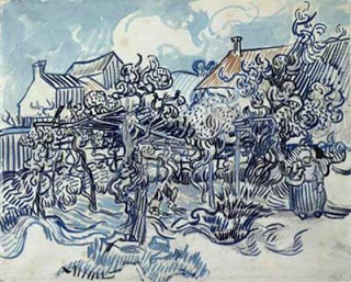
Van Gogh's line creates energy with organic circular swirls. I read a chapter, Out of line how Van Gogh made his Mark from the book The Drawings by Vincent Van Gogh, which informed me that he picked up ideas for drawings from texts pictures and his visual memory and he used Armand Cassagne's detailed drawing books for studying motifs through perspective. Van Gogh was inspired by Rembrandt, Delacroix. Daumier, Millet and Japanese art. Together with his passion, dedication and artists influence this contributed to his mark making and line skills. Van Gogh admired Rembrandt for his fluid contours and delicately hatched lines. His drawing was the root of everything.
Leonardo Da Vinci's line is clean cut and scientific and his primary artistic activity. He used drawing to think and explore the world around him. He uses his drawings to develop his other artistic pursuits they are among the most diverse and technically skilled in the entire history of art.
Egon Schiele's line work has emotion and tactility. Schiele often took contours and made them harsh, sharp and angular though. Schiele took inspiration from Gustav Klimt who I also greatly admire. Schiele regarded drawing as his primary art form, appreciating it for its immediacy of expression. In his paintings these essential drawn characteristics, contour and line are revealed.
Each artist has a purpose for the lines they have drawn, they are the primary source and starting point for their paintings. Line can be used for shape, pattern, form, structure, growth, depth, distance, rhythm, movement and a range of emotions.


Figures 1-3
I can produce large line, dry brush line, diluted line, thin line dotted line, wavy line, diffused line amongst thousands of variations.
Initially I chose ink because I have confidence and understanding with this medium. I knew that the artists I had researched used line in such different ways and styles. I wanted to achieve this exercise with my instinct and independence.
Necklaces
I have a collection of necklaces some are received gifts, some from the markets of China others the sides of roads in South America. During lock down I haven't felt the need to wear jewelry as much as usual, the necklaces are hanging in my bedroom ready to go out with me into the world once more.
Materials
A1 Watercolour paper
Black ink
Various sized brushes
Water spray bottle
Drawing gum

I photocopied the necklace image and made a very small 5 minute sketch in pencil and ink.

I didn't want to overthink this piece so just started mainly by flicking between drawn image and photo copy. I drew the first lines of the lightest areas in drawing gum.
I turned the image upside down also, developing on tutor feedback;
"this technique is to be encouraged as you move forward when copying further images. Lots learnt here, so remember to build on what you have learnt as you move forward."


Lots of varied line and dilution, large bristle brushes small delicate rigger for thin line, different pressures and water spray before and after the line was applied.
I let this dry and then removed the drawing gum.
The result was pleasing but needed refining around certain parts, beads and chains.
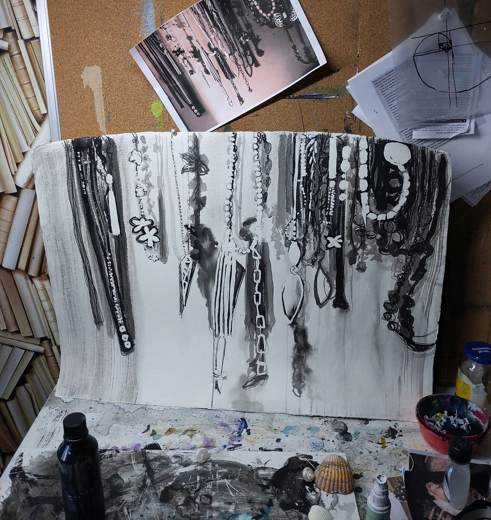


I refined all the areas with deeper shadow, refinement of the objects and hanging chains.

Hanging around
A1 ink on watercolour paper
Result
I really like the image, why?
The variation of the lines maybe?
But have I fulfilled the brief?
My lines do lead the eye from one part of the work to another, there is a light tonal area in the middle section which creates space.
Forms are defined with structured line, contour or tonal variation and I can see jewelry hanging against a wall with shadows
I think I have made the image too tonal.
Each and every line is formed with a brush, be it a large brush or a small brush.
Sometimes the lines are so close they cause a block of colour.
Some lines are in a diluted ink some in concentrated.
The work is in black and white but has a depth.
The feeling of hanging and being pulled downwards is present.
The artwork, if it could speak would say, 'Can I go out yet? Can I adorn a body, any body?'
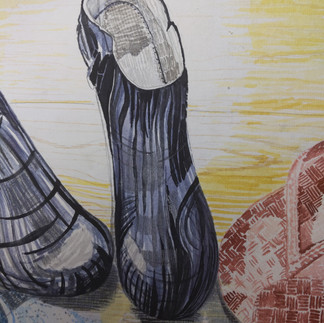
Shoes
Second attempt, because I was unsure if the line work was too tonal in the previous piece.
These shoes have been selected because I bought them in various corners of the globe.
They have a connection to my travels. The have a sense of place to me. I have arranged them in a circle because they all came from places and now are together here in my home.

I photocopied the image and polarized it then printed it again. Mainly to see the darks and lights more easily.
I used the grid system to enlarged the piece to A1 size.
Process images.


I looked back through my Drawing Skills One sketch book to ground myself and go back to basics the basics of drawing line.
I looked at Van Gogh's line work and variation.
I mused over the shoes in my sketchbook pages. I made small experiments of the patterns, line variation and colour. The shoes were from the Caribbean, Spain, South America and Italy. Should I paint them in the colours of the flags of those countries?
I used drawing gum (in line) to mask the light areas of the work.

Materials.
Artgraf pigment blocks, yellow, red, blue, graphite and deep umber.
Fan, rigger round and flat brushes
A1 Watercolour paper
8 hours of drawing and painting!


This took quite a while, some of the detail is delicate, patterned but I feel effective.
I arrive at the stage below, masking tape removed and the base layer if you will all applied.
There are areas I hate (blue shoes) , areas I love (flip flops) and areas that I can't make up my mind on (the rest).
How can I improve this?

I converted the image to black and white so I could assess the tone/values.
I compared this to the original image, it was wishy washy and needed some dark values especially in the shadows. The wood flooring was non existent.
Onwards with enthusiasm and the thought of Van Gogh and his persistence!

Images of the progress and sketchbook entry.


Globe Trotters
A1 Watercolour paper and Artgraf.
Result
I have achieved variation of line and I am very pleased with the flip flops because of the pattern and texture of the linework. The blue shoes were a mistake I think, they seem out of place in that colour, I should have used an earthy tone possibly.
The wood work took such a long time, using a rigger brush with fine strokes, that I eventually lost momentum and interest and I think you can see that lost enthusiasm.
The shadows with small cross hatched line work well and the shoes have structure but seem a little quaint. The overall yellow hue annoys me that was a mistake. I should really wash over it with an orangey umber.
The light in areas of the shoes and shadows has created form well in most areas of the work.
I'm really not sure about how the piece makes me feel. If I were to remake the piece I would crop to the flip flops area and make the other shoes contour lines.
Something like the below crop. I feel this works better there is an intimate feeling, a secret meeting or rendezvous of shoes. They are telling each other tales of their experiences.

Rendez-shoe
Cropped version of 'Globe Trotters'
I still wasn't completely happy I knew I could achieve a better result.
My last piece and in my opinion the clear winner is below. I used the same method but instead of Artgraf I used watercolour and gouache.

Rendez-shoe
A1 Gouache and watercolour on watercolour paper.
How might someone from a different culture interpret this work?
Shoes are taken off in Asian cultures before entering a home are a mark of respect. Is this piece respectful?
How would I describe this artwork? Quaint, inward looking, a meeting of shoes, intricate (linework).
What's the narrative?
The shoes have come from the four corners of the globe, but what are they talking about?
What do I want to communicate?
This question for me is leading me to think more of a sense of place. These shoes are brought together from my travels. I am drawn to their origin, where they came from and not the actual shoes. This is interesting and inspires me to delve into the reason behind my thinking.
I've learnt that different types of lines create different responses or expressive qualities:
Curved lines suggest comfort, ease and an organic feel.
Horizontal lines suggest distance, calm and shadow.
Vertical lines suggest height and strength
Cross hatched lines suggest solidity or deeper shadow
Jagged lines suggest turmoil, anxiety and texture
Freehand lines can express energy and mood
Mechanical lines can express a rigid control
Continuous lines can lead the eye in certain directions
Broken lines can express fragility
Thick lines can express strength or structure
Thin lines can express delicacy
Diluted or varied pressured lines can express sensitivity or force.
References
Out of line how Van Gogh made his Mark -van Gogh, V. and Ives, C. F. (2005) Vincent Van Gogh: The Drawings. Metropolitan Museum of Art.
Figures 1-3
da Vinci, L. (no date) Wing Construction with Engineering Design. Available at: https://www.leonardodavinci.net/wing-construction-with-engineering-design.jsp (Accessed: May 2021).
van Gogh, V. (1890) Old vineyard with peasant woman, (1853-1890). Van Gogh Museum, Amsterdam. Available at: https://makingamark.blogspot.com/2007/02/van-gogh-drawing-media-and-techniques.html (Accessed: May 2021).
Schiele, E. (no date) Girl (Mädchen) The Graphic Work of Egon Schiele (Das Graphische Werk von Egon Schiele). Available at: https://www.moma.org/collection/works/62824 (Accessed: May 2021).


Comments