2.3 Painting on a 3D surface
- martine75
- Apr 28, 2021
- 6 min read
Updated: May 23, 2021
Choose another of your collections to depict. Consider the examples discussed in the introduction to Part Two. Paint an image of your collection or objects from your collection on one of the following surfaces:
• paper cup
• piece of wood
• stone
• a handbag
• packaging
• a conker
• porcelain.
You could also use card, paper or tin foil to make a three-dimensional surface that you then paint on. Acrylic would work well for this exercise.
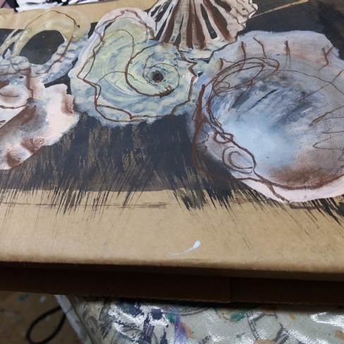
Packaging.
cylindrical/box packaging.
Acrylic and open acrylic with retarder.
Various synthetic brushes
Two cylinders and three boxes.
I realised painting on box packaging, I could take the image around corners otherwise it was just a flat surface.
The cylinder was more challenging as the image would wrap around itself, full circle which was quite satisfying. The acrylic is a fluid buttery paint with creamy application, it slides over and adheres to most surfaces with ease, the addition of glazes or mediums gives gloss or matt finishes if desired.


Advantages.
They are unique and unusual, 3D and more interesting than just a flat surface maybe?
The occupied physical space can be perceived from all sides and angles.
Disadvantages.
The structure of what you are painting on and the material has to be taken into account when planning your work. The surface can create complications if it is textured or uneven.
Results.

Scissors packaging/box lid 10cm x 18cm
The quick sketch inside the scissors has turned out quite well. It was difficult to get the perspective/angles correct when continuing the line of the objects up the sides of the box.


Cylindrical packaging 16cm x 8cm
I could spend more time working into the detail of each different cactus but I actually like the rawness of the visible brush strokes in this piece. I took a close up below.

I very much like the pattern print of the original packaging showing through the acrylic layers. The visible brush strokes are painterly and remind me of Cecily Brown's sweeping gestures, but on a small scale. I like the energy in the work, the spikes and tousled feel of the left hand cactus is connecting the materiality of the paint with the subject. This was fed back to me in my previous assignment and I think I am understanding how to achieve and develop my connections with paint and subject. Although I realise this is not a finished piece I have learnt from it. Quickly flicking my wrist to achieve the spiky marks was fairly easy with a short sharp motion.


Cylindrical packaging 16cm x 8cm
Here again with the second experiment, left image, I have achieved a softer, blended, petal like feel, again this could be developed and work over/into. The colours are more calming and with deeper tones, details and layers could be a delicate and pleasing outcome. I can see potential in this. I found blending and pulling the acrylic paint came easily with a sweeping motion around the curve of the tube.
The second image has gloss glaze added to the quick sketch in paint. I taped the lid of the tube half way up the inside and painted it in black acrylic.
I like the visible glazed stokes of the small enclosed flower inside. There is no depth or detail but it is intriguing, lost inside and forgotten, dying with no light inside the tube.
Painting on glass milk bottles.
Milk bottles
Acrylic paint
Flat synthetic brush

I started randomly sweeping paint over the smooth surface of the bottle, leaving it to dry overnight. I added tone and detail and scratched the paint accidently, this was a happy accident!
I enjoyed scraping little details into the paint as I knew that I could paint over them if not completely satisfied. Some of the paint also peeled off when rubbed with my finger .This would also add texture, layers and added surface interest.
The paint feel like a thin layer plastic, well thats because of its content, which I had studied in my Practice of Painting course.
In the below images I have painted one side of the bottle with a naples red/paynes grey mix and you can see the light reflecting through the scratched area at the front of the bottle.


Advantages.
Glass can be covered in paint and scratched into for added interest.
Light is reflected through the surface.
Glass is smooth and acrylic paint is easily applied to the surface.
Peeled or scratched techniques add interesting textures.
Disadvantages.
Water based paints would not be absorbed into the glass but sit on the glass and pool.
Glass shatters and is fragile.
The cylindrical shape of a glass bottle makes it difficult to work on eclipses/angles.
Results.


I think my connection with milk here, rather than a smooth white creamy liquid, is it's connection to the farm where it originated. I reflected on the dark earthy colours I have used and this was my conclusion.
I could apply gouache over the white milk areas and then glaze them would this evoke a more shiny milk bottle feel maybe?
Have I created a delay with the several layers of glass, looking through each layer?
I ask this question because whilst researching artists that paint on glass I found a paper on
The Large Glass: Richard Hamilton’s Reframing of Marcel Duchamp this led me to The Green Box which is a detailed document of Duchamp's processes. The Green Box is like a mad professors workbook of scientific planning. The lighting the scale and form, materials and thought process was like a instruction book of his innermost thoughts. Hamilton describes it as a recipe book. This was inspiring.
Duchamp writes in his book;
Use "delay" instead of picture or painting; picture on glass becomes de-lay in glass-but delay in glass does not mean picture on glass- It's merely a way of succeeding in no longer thinking that the thing in question is a picture-to make a delay of it in the most general way possible, not so much in the different meanings in which delay can be taken, but rather in their indecisive reunion "delay"-/a delay in glass as
you would say a poem in prose or a spittoon in silver.
I don't fully understand his meaning behind these comments but as I progress I expect that his processes and intentions will become clearer. What I think he means is the glass acts as a sort of shield or protection between the viewer and the artwork.
The paper The Large Glass: Richard Hamilton’s Reframing of Marcel Duchamp states that;
Duchamp started using plate glass as a painting palette and discovered that the transparent surface created flat brilliant colours. At the same time it occurred to him that using glass as a support for his paintings could also reduce the deterioration of oil pigments. Later he stated: ‘After a short while, paintings always get dirty, yellow, or old because of oxidation. Now my own colors were completely protected, the glass being a means for keeping them both sufficiently pure and unchanged for rather a long time’. Duchamp believed that his colours would be protected from oxidation by painting them on glass and then covering them with lead foil. Unfortunately, the shattering of The Large Glass only exacerbated the oxidising process, allowing the lead red paint and lead foil to react. There is an irony here still registered today in the original, which has aged very badly. This red pigment, originally bright and even in colour, has discoloured dramatically. In his reconstruction, Hamilton considered preventing the deterioration by mixing a red using good quality oil paint, substituting red lead for cadmium.
A stone/piece of slate
Slate from my drive
Gesso base.
Acrylic paint paynes grey and white.
Small detail brush.
The pictures collection.
I used an eye from the picture collection image below (middle left plate).

I added a gesso support base layer for a tooth between the slate and the acrylic.


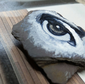


Medusa
Plum slate stone piece and acrylic 5cm x 5cm
Advantages
It was small so didn't take much material.
It's a very portable piece of art.
I can place the art on different background to enhance the composition.
Disadvantages.
Working small is tricky with details and fiddly application.
Your brush and technique is key here, fine small strokes are needed.
Result.
I was quite surprised how much I liked the small stone eye once I had finished. The title is from the curse of Medusa. Athena, so the tale goes, was enraged by finding out about an affair and cursed Medusa taking away her beauty. She turned Medusa's hair into venomous snakes and made her beautiful face so hideous that those who looked into her eyes would immediately be turned to stone.
The plates are reproductions of the artist Piero Fornasetti's work and he has some incredible interior design pieces. He has painted on metal trays, umbrella stands and numerous other 3D surfaces. I will be revisiting his work again in depth.
How could I develop my Medusa?
I could develop this concept by taking the nose eyes and mouth then painting them on separate stones to make up the entire face.
David Dilpre's work had been on stone but the whole face depicted and usually a self portrait.
Lee Edwards was the nearest underpinning influence for this piece though. His small portraits on wood had been my initial thought.
References
‘Marcel Duchamp - The Green Box - [PDF Document]’ (no date). Available at: https://documents.pub/reader/full/marcel-duchamp-the-green-box (Accessed: May 2021).


Comments