Andy Warhol and The Group of Seven- Art Gallery of Ontario Canada.
- martine75
- Sep 15, 2021
- 5 min read
Updated: Oct 27, 2021
I was fortunate enough to visit this exhibition whilst in Toronto, Canada. This was a professionally curated exhibition where each section had been planned and thought about with a meticulous eye. Four vast rooms full of intrigue and large iconic prints from Andy Warhol awaited my gaze, I was excited.
What caught my eye and why?
Primarily the variation of artwork from those familiar iconic portraits of celebrities to inflated floating metallic pillows Silver Clouds (1956-66). These playful silver balloon packets were fun and a far reach from the Warhol soup cans and screen prints I had expected at the exhibition. Warhol was making fun pieces that moved and glinted in the light airy gallery and I liked that.
Warhol being an Eastern European immigrant who was shy, gay, and from a working-class background (which profoundly impacted his life and work), the exhibition began with early line sketches of mostly men from the ’50s. Some are suggestive and of anonymous people, they are full of emotion and possibly his way of expressing his sexual desires.


We then move onto to the early self portraits.
I feel the self-portrait from 1967 is a much more refined and an honest depiction of himself, I mean the colour pallette seems as if the face is in shadow and wanting to emerge. The later self portraits seem to be bolder and more expressive in content and texture, where he has more life experience (and near death) he has become an icon.


The curation was engaging for me, as the gallery was very explanative of Warhol’s life. What I mean by that is, if you had not heard of Andy Warhol, the exhibition gives a great insight into his life and the four decades of input into the art world and popular culture. His budding career from a young painter to a commercial artist is easy to follow visually and with the written narrative and explanations by the works. For example, the plastic surgery he undertook to make himself less ethnic in, Before and After (3), which now makes perfect sense to me.


Warhol and his commercial screen-printing and the rationale behind the process being ‘everybody should be like everybody’ now has more meaning for me because, at the time (1960’s), race, gender and sexuality were readily debated on and about.
In Ladies and Gentlemen, I note that Warhol uses his fingers to mix the areas of paint for this screenprint. Again, I was shocked at how much texture and expression I saw in several of the artist’s works as I had assumed the screen print would be primarily two-dimensional. Has Warhol purposely made these images textured with expression? His use of colour in these pieces seems more 'solid' and heavy when I compare them to his celebrities icon pieces. There is a sense of transformation of the subject. The Museum also produced this video to explain and expand on Warhol's work.
Curator Kenneth Brummel, art historian Kirstin Ringelberg and artist and activist Ravyn Wngz converse about Warhol’s Ladies and Gentlemen 1975 portrait series of New York’s Latin and African-American drag queens and trans women. This video opened my eyes to the fact that some of the women depicted in this commissioned series, died in poverty whilst their painted images by Warhol, were sold for thousands of dollars.


Warhol was also interested in strong, powerful women and the relationships between their public and private lives, and this manifests in several icons portraits, Dolly Parton and Debbie Harry. These took me back to my teenage years and feeling of nostalgia. I also felt this way with the objects of coke bottles and soup cans and did not feel a significant difference between object and portrait.
I noticed the images of the celebrity icons are all square in format and above the shoulder crops. Warhol makes each image with dark mid and light tones of the eyes, lips and nose and hair almost in a formulaic way, like they are products. These celebrities are brands for the consumer.


Moving on to the Oxidation painting of poured urine on a mixed paint and copper primed canvas and the chemical process that caused stunning effects on the surface caught my eye.


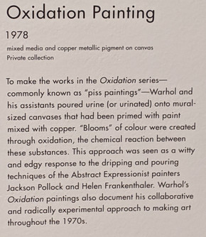
This process reminded me of the Abstract Expressionist painters and their experimental approaches. It was quite a standout piece for me as I enjoyed the fluidity and mark-making along with the colour palette and sheer ‘piss take’ (pun intended!).
Apparently, Warhol wanted to make a parody of Jackson Pollock's throwings or drippings of household paint across the canvas and Warhol and his assistants would throw buckets of urine at the canvas. This piece and some of his Cum paintings relate to the body's elemental functions and are more process based works.
Overall, I was quietly impressed with Warhol’s work.
Many of the paintings had meaning behind them, for example the Campbell's soup cans stemmed from him having a poor childhood and eating 'salt and pepper soup' (hot water and salt and pepper) and Campbell's soup for 20 years. Making art out of the everyday consumer objects and the commercial environment.


The Statue of Liberty having personal meaning for his family as immigrants to the USA.


Flowers is one of my stand out pieces from this exhibition. Its vibrant and bold, each flower a slight variation of a fluorescent orange hibiscus, screen-printed on a neon green and grassy base. I love the simple effective complimentary colour pop and contrast of the piece. Can I take inspiration from this simple but effective use of print for my work and develop it somehow?


Karen Kain is my final stand out commissioned piece. I like the way Warhol has taken the graceful line of the ballet dancer from Polaroid negative photographs and developed these into the final piece. Simple and overlaid multicoloured geometrics in pastel but bold colours of sea foam green, lilac and tangerine. The palette does not take anything away from the dancer's face because, the peachy oblong shape is the most prominent, directing the viewer to the left focal eye. We see line, tone, glitter and layered luminous paint in this elegant and classic image.


Leaving the Warhol exhibition I wandered into another gallery and the sign below caught my eye as I have researched The Group of Seven before in an earlier module.
These painters were interested in depicting their natural environments and this may assist my final course work.

One of the original members was Lawren Harris. The Autumn Forest with Glaciated Bedrock work was breathtaking and glowed with autumn. The vast landscape with an icy feel, boundless depth of field and in 1914 this would have been quite an original and unique piece.
The main event is glaciated rock and lichen and scattered leaves.Two side panels, one with some birch trees and the other side has a sort of twisted pine tree. Way in the background there’s a group of birch trees with golden leaves, which obviously implies it’s an autumnal setting. And there’s a distant view of Georgian Bay in the background. I like the colour palette of golden autumnal hues mixed with a bright blue sky and the deep crimson/black shadows in the distant trees. The cracks in the glacier are leading you in and through the painting whilst making you eye dance over the uneven ground to find fallen leaves.
Harris's work reminds me of the French Impressionists depictions of the landscape in style and colour hues. I like the 'pull' and tension of the foreground something that I want to bring into my landscapes.


The artist which made the most impression on me whilst visiting the art gallery was Tom Thompson, although not a actual original member of the group but a friend of Harris.

After the Sleet Storm, Winter 1915-1916

Silver Birches, Winter 1915-1916
I found an article on Thompson's work which made me want to see more of his work first hand.
His works are textured and tactile, with visible raised oils and I wanted to immerse myself in more. His clear passion for the Canadian landscape was evident. I found the Tom Thompson Gallery in Owen Sound not far away and decided to take a trip to see more of his works.


Comments