Assignment Five-Depicting your environment.
- martine75
- Sep 30, 2021
- 29 min read
Updated: Dec 12, 2021
For your final assignment on this course, you’ll produce a group of paintings, drawings or other images that describe aspects of your environment. The number of images will differ from student to student, depending on the nature of your work: discuss this with your tutor.
Your final work might include a combination of any of the media and materials you’ve already used.
Here are some ideas:
using pieces of pottery or things you find in your garden
pin rubbish out onto a piece of cardboard or paper so that it lies as flat as possible and looks a little like a Victorian etymological display
ink tonal sketches of the town, village, city, countryside where you live
a ‘journey’ around your room.
your pets or the animals in your neighbourhood (look at David Hockney, Elizabeth Blackadder and Stella Vine)
painting something from the TV (e.g. Natalie Dowse)
You could start by making a quick photo/drawing/painting of:
faded bits of wallpaper or patches where the sun has faded the surface
under your bed
writing in steam on the bathroom window
shadows/light photos
houses in your neighbourhood lit up at night (e.g. Barry Sykes)
a photo of you each day as soon as you wake up
a fly on the windowsill (can you paint the sound?)
the view from your window
the food you eat
a streetlamp going on or off
changing light or the way light hits a wall/ornament inside or outside your house
found images in your house: photographs, the paintings or pictures on your wall, etc.
rubbings of the textures around your environment. (You could then make paintings of the rubbings. This is one of the techniques that Hayley Field uses, along with documenting the changes in light of her studio.)
Even if you don’t use images from these quick drawings/paintings in your final collection they may affect the way you work and you may return to these methods in other projects. The broader the range of materials you use, the greater the choice you have for selecting the perfect combination of media to communicate your ideas in the most articulate and self-aware way possible.
You might want to ask a neighbour, flatmate, or family member to collaborate with you. The artist Barry Sykes asked his dad Kevin to make work for him for the series The Dad Directives.
Here are some ways in which you might choose to depict your subject matter:
any painting media already used on this course – or a new one
photographs
drawings
monotype
layering paintings into drawings
film on your phone
coloured pencils
silverpoint drawing
rubbings
monoprint.
Use one of the range of surfaces listed in earlier exercises and assignments. Or use envelopes that come through your letterbox or paper/newspaper/packaging you have in your house.
You’ll need to edit and curate your work to produce your final assignment collection. Think about:
How do the images work together? Do they tell a story?
Does one look out of place? Why? What, if anything, should go in its place?
How do you want the collection of images to look – harmonious, barely there, striking, overwhelming, subtle, discordant, child-like, complex, tonally similar?
Pretend you haven’t created the objects but have been told to ‘curate’ them, i.e. give them some sort of coherent context. You might want to try this a few times to see how works in a collection can gain very different meanings when presented in different ways. Photograph each presentation and make some brief notes in your learning log.
You might want to try a few locations for presenting your final selection. Try to steer clear of using props or anything too ‘twee’. Maybe find a wall or walls in your house where you can group your paintings – your bathroom, kitchen, bedroom, sitting room or loo.
Look at the way Marie Eastman, Andrew Mania, Nadia Hebson and Karen Kilimnik present their work: propped up, grouped, and often exhibited outside the ‘white cube’ gallery.
Send to your tutor by whatever means you’ve agreed:
a portfolio of work from this assignment
your 500-word essay on a specific painting medium
a selection of work from the exercises in Part Five
the relevant pages of your learning log or your blog url.
Reflect on your different displays.
What aspect(s) of your environment were you seeking to depict?
Which media did you choose for this, and why?
How could you develop this work further?
Which artists have influenced you and how?
Think about how you’ll depict these things – photographs, drawings, paintings, written descriptions, spoken descriptions, films on your phone or camera, ink sketches, oil studies, coloured pencil drawings, felt-tips – and how you’ll use the material you collect.
It is important to identify this in your learning log and to try and get to the essence of what it is that really motivates you.
Which three words might describe your practice at the moment?
On reflection, which parts of this course might you continue to develop?
Look through your learning log and consider the images and ideas that you’ve collated. Have you fulfilled them all?
Do some of these ideas and images merit further research and development?
Assignment Five - Depicting my environment.
Before I begin my final assignment, I want to address some of the questions below,
What aspect(s) of your environment were you seeking to depict?
Possible ideas;
The travel theme of my environment and/or those objects that surround/remind me of those travels.
How I see my environment from an aerial perspective which feels normal to me.
My love of nature and 'being grounded' and the familiar settings that feel like home around the world.
My appreciation of the ability to open a window for fresh air and not being confined in an aircraft or hotel room.
Which media will you choose for this, and why?
Which artists have influenced you and how?
Initially, I think I will use some of the learnt techniques and new processes that I have developed. For example a few possibilities are,
The cyanotype process with sunprint paper. (Anna Atkins) because of their simplicity, elegance and ethereal effects, I want to develop these somehow.
The screen-printing process. (Andy Warhol), adapting this way of working, I mean, the block printed mark making into my pieces.
Monotypes and monoprints for the variation of painterly print.
Acrylics and their versatility- flat applications with consideration and planning (David Hockney) - free fluid strokes of paint (Genieve Figgis & Abstract Expressionists)
Thick impasto applications of paint (Tom Thompson & Tori Day)
Composition/perspective - (Francis Bacon and David Hockney).
Cross hatching- but in paint (Giorgio Morandi).
My mind is full of possibilities. Maybe, I can fuse the newly discovered and more familiar processes and artists to gain the best outcomes for my choices of subjects.
I want to push and drive my experimentation and desire to understand further and expand my knowledge.
I want to explore acrylic paints texture, surface material handling and composition and see how I can still experiment to gain new ways of painting. I need to be mindful to tailor my investigations to the kinds of practice that interest or excite me. My tutor feedback was ringing in my ears,
"Try to reduce when things get muddied rather than add, add, add, which can be an easy trap to fall into.'(Lock, 2021)
Which three words might describe your practice at the moment?
Enquiring, developing and explorative.
Research, concepts and experiments.
At the moment, I had four main areas for the concept for my final environment assignment ;
Travel, aerial perspective, being grounded and fresh air.
Now retired, but having travelled within a cabin crew career for 23 years, I perceive my existing home in Banbury as a base where I continue to begin my travels. It has impermanence from which I roam, either physically or in my imagination. However, this home base environment is only supposed to last or serve for a limited time.
Can this thought be a concept for my assignment piece?
I made a mind map of ideas, notes, words and artists. I looked back through my blog notes and again through all my tutor feedback.

I made a colour wheel of complementary colours, glueing it to my mind map for reference and maybe some inspiration. I wasn't entirely sure where I was going. My mind was full of ideas and racing at full pace.
I needed to reflect, plan, experiment and play with paint.
In addition to my mind map, I made concept sketches playing with what I wanted to create and how these concepts would sit together once curated.
A1 sketchbook page concept drawing.

How do the images work together?
I feel the images work together because they are all parts of me. Each part has its place in my environment.
The possibility of having a continuous line in each piece was a concept I was also playing with (see above).
In the sketches my concepts are to make,
The 'grounded' piece is natural and uses my landscape, i.e. pressed flowers and leaves from my garden/Canadian woods, cyanotypes of those natural items. The natural earth is my base but only for a limited time. After that, the leaves fall, die, fade into the ground, and make up the earth.


For the 'aerial view' the idea is developing one of the Aventitious series (below) that I worked on in exercise 4.2 but in acrylic paint, with a Morandi style cross hatching or burnishing/blending maybe? The aerial view is normal to me looking from above on the environment as I travel.


The 'fresh air' piece would develop the Frank Stella circles (concept sketch below). The viewer is pulled in and out in different directions. The colours are both fresh and warm, contributing to the intermingling feeling of warmth and coldness in the air. You arrive into the space and then entangled within it somehow. It reminds me that I can open the window now in my environment with a feeling of freedom. I could not open a window on an aircraft or in a large city hotel room. The perspective is a confusion of spaces, rather like David Hockney's view on perspective and shifting viewpoints.
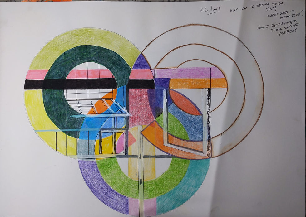
The 'travel' piece is of the aircraft coat hook in my hallway and is a metal shaped aircraft. It reminds me of my travels and the jetlag I experienced for so long. I want to make this piece in a limited palette to evoke that drained feeling. However, it also reminds me of my love of continued travel and that it won't be long before I choose to fly away again.

'Grounded'
My love of nature and 'being grounded' and the familiar settings that feel like home around the world.
I knew I wanted to include the cyanotype process of Anna Atkins. How had other contemporary artists used this process in a more modern way?
Diana H Bloomfield had created a book of cyanotypes on acetate. (I was intrigued and knew that I wanted to make a book of my garden cyanotypes from my earlier response to Anna Atkins.) On her website, Bloomfiled's books were imaginative and full of stunning Prussian and pale blue images that had a contemporary feel.

Figure 1
Barbara Hazen is another photographer who has revived the cyanotype process for the modern audience. The piece below is enchanting for me, ethereal, dreamlike and beautifully composed.

Figure 2
Both these artists had inspired and fired up my imagination.
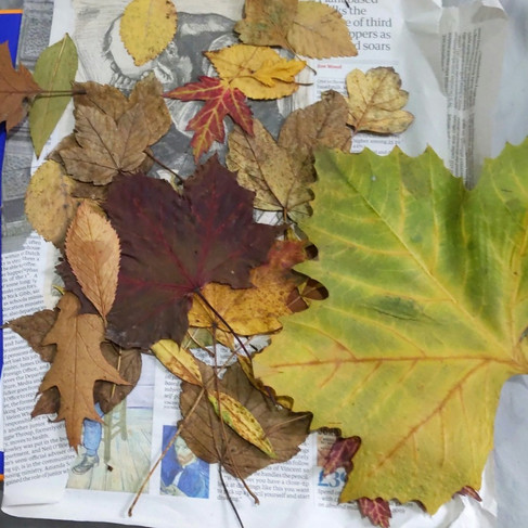
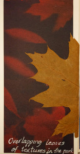
I had the cyanotype images from the garden and made a few more experiments in my sketchbook I used acrylic paint over the leaves, that I had pressed from my garden and, some leaves I had collected in the woods in Canada.
I hand printed the leaves onto my sketchbook, painted block colour around the negative cyanotype but eventually decided I liked the natural dried flowers/leaves, glued over the images. The natural petals/leaves brought a 3D feel to the pictures.

My book expresses my feelings of being grounded, nature and the organic. It was natural items collected from around my immediate environment wherever that had been. I liked the idea and could try to use the cyanotype differently.
I would make the book's pages anyway, as I liked the cyanotypes I had made earlier and wanted to create a stunning piece with them. It was something I could stand at the base of my final curated images.
I trimmed the images slightly to fit and glued them onto some quality watercolour pages. I liked the torn edges of the watercolour paper as it complimented the pictures and had a rough texture that was pleasant to the touch.

The trimmed pieces were so beautiful I couldn't throw them away. I stuck them to the book for the front and back cover as it gave a more modern look fused with the traditional.
I wondered whether they drew my gaze as they remind me of the bar codes I had stuck in my sketchbook from my travels.
Barcodes and onboard doodles from my A1 sketchbook.

Cyanotype book pages.

I did some experiments with printing wording on acetate for the front cover. I also wanted to experiment with the flowers in a vase concept of Barbera Hazen's.
I found an image of an empty jar on the internet and printed it onto acetate and the word 'Grounded' for my title. I was unsure if this would work as the light in November was dull. With some research, I used a UV nail lamp I had used earlier in the course, which brought the desired result.


The results were great for the jar and flowers. The image is fragile, fine and dainty.

And the wording for the book, just legible,but acceptable.

I experimented with the jar cyanotype a little more.
Did I want to use this image for my 'Being Grounded' piece'?
I had an unopened wooden board still in the plastic wrap, and I used it to balance the dried flowers, leaves, cyanotype and brightly coloured paint. My mind was creating and looking at shapes, colours, possible compositions, but nothing was correct or exciting. I needed to introduce some colour but was unsure how to.

Further research led me to discover that cyanotype (sunlight paper) is produced in different colours. I ordered some larger, varied colour sunlight paper this would enable me to experiment.
In the meantime I made my book.I measured the stitch holes, sewing it together with blue and white cotton.


'Grounded- Cyanotype Book'
A5 cyanotype watercolour paper book.


Video of the internal pages of the book.
I like my book because it has a delicate and ethereal quality to it. It was a collection of the earth, my earth, my ground, my garden and my Canadian garden. My stitching needs some practice, though!
Let's try some more cyanotype pieces with some unusual colours.
I did a few coloured cyanotype experiments. In one of these experiments, I painted a piece of acetate with mud from the garden, broad brush strokes then added leaves and flowers from the garden. I had read somewhere that I believe Andy Warhol had used this technique in screen printing, although he probably did not use mud! I chose a relatively broad flat brush, and although not Franz Kline's straight strokes, I had him in mind whilst sweeping the mud over the surface.
Anyway, I let it dry.
Brushes strokes on A4 acetate.

Drying cyanotypes (after washing).

The green pieces had not worked at all. The sunlight wasn't great in November in the U.K. I was getting more silhouette images of the subject, but I would use that to my advantage and look for the positives.

The mud caused painterly marks and, looked promising. I also liked the colour of the cyanotype, although it would eventually dry to a different blue hue.
Ideas;
Adding some of the dried pressed flowers over the top and make a border of varnished leaves maybe?
Using yellow leaves or paint or print over the top, to compliment the purple colour pallette.
Painting some areas of the cyanotype.
The coloured papers reminded me of the seasons, maybe I could depict each one?
The red cyanotype piece was captivating and evokes Autumn to me. Also, when I added dried hydrangeas over the top, there was contrast was this a factor I needed to consider?

Would a circular tondo be more appealing and signify being surrounded by nature? Using an old wire florists frame (for wreaths) I bound it with masking tape and used it as an outer frame.
Concept process/sketches for possible circular cyanotype


I stopped and reflected. I am experimenting but unsure of where I am going.
I looked at the brief and some of the questions were unanswered. How would my planned pieces look together ?
Reflection
Do they tell a story?
Yes, I feel the planned pieces tell my story, but I need to curate them differently, perhaps?
Does one look out of place? Why? What, if anything, should go in its place?
I need to make more sketches and plan, think and research more.
How do you want the collection of images to look – harmonious, barely there, striking, overwhelming, subtle, discordant, child-like, complex, tonally similar?
Is there a lack of harmony in my pieces?
I looked at David Hockney's unusual shaped canvases again. Hockney has been such an inspiration for me and I bought another book Hockney- Van Gogh The Joy of Nature which showcases these canvases. (my own image below)

I made some more concept sketches. Maybe using interlocking shapes would work?
A1 sketchbook concept drawing with suitcase as a base.

The suitcase you see at the bottom of this drawing is a storage unit I use for paint (and now the cyanotype papers in a protective bag).


I think it will act as a base or shelf for my pieces. I am unsure if I will use it, but I like the idea that other artists I found with similar concepts 9 artists who make art out of suitcases.
The text in the article reads;
Beyond being a symbol for emotional baggage, the suitcase is an emblem of mobility, evocative of all kinds of journeys, from the glamorous escapes of a jet setter or the bourgeois comforts of the family vacation to the forcible movement of exiles and refugees.
Duchamp's Boîte-en-valise was inspiring but I needed a bigger case, it just so happened I had several. I was going to use one of my work cases, they had travelled the world with me. These cases had been in each environment with me carrying my possessions. My artwork could be contained or unpacked from the case (another normal action within any environment I was in, the unpacking/packing).
I found the artist Yin Xiuzhen and her work entitled "Suitcase" (1995) in which she sealed with cement her own clothes from a period of over thirty years in an old suitcase made by her father. Representing her experiences, memories and marks of time the clothes started the artist pondering themes such as memories, transience, departure and instability.
I liked the idea of using a suitcase to showcase my work it was personal and meant something to me.

I have more unification of my concept. Happy to continue, I was excited about the natural, grounded piece.
'Grounded' (continued).
When I went to see Mary Newcombe's exhibition I wrote,
Small sketches and text are essential to remember scenes, and paintings can start from the most miniature doodle or piece of text. Visual images also develop from text, build on and apply emotion with colour hues, and use variation to evoke a sense of place. Pause and look at the smallest detail and build on that. Details matter and your passion and enthusiasm to communicate these details in the paint will make your art sing.
I like the idea that an experimental piece of art can be the art itself and so I chose to experiment on a small 9.5 x17.5 cm concertina sketchbook.

I used cyanotypes pressed leaves and flowers from my U.K and Canadian environments.

More research told me that, in the 1830s, Anna Atkins began to assemble her collection of preserved/pressed plants.
Anna supplied her Herbarium sheet specimens to renowned botanists at Kew Gardens. She named the plants under each cyanotype.


Figures 4 and 5
I wanted to include some words influenced by Richard Long as reminders of my garden, Canada's woods, and the general natural environment. For example, I wrote the names of each tree the leaves had fallen from, the flower types and little thoughts about my natural environment.


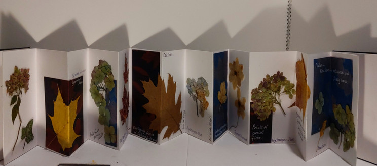
'Grounded'- Concertina sketchbook.
Concertina sketchbook each page 17cm x 9 cm total length 122cm.
Cyanotypes - various colours - pressed flowers and leaves.

Again, I was pleased with the outcome of the sketchbook. I like the feeling of the earth within its pages, the memories and representation of longevity and immortality—the grounded feeling when I looked through the pages, remembering walks and being in touch with nature. There was also a nod to Anna Atkins with the cyanotype content.
Aventitious - (Aerial perspective)
How I see my environment from an aerial perspective which feels normal to me.
I had good tutor feedback for my 'Aventitious' (scroll down the page) tondo's and wanted to develop them in an imaginative way with paint. I chose the cactus plant images.


I reflected on the exercise on painting a series of circular paintings and what I had learnt about underpainting.
What information would I take forward for the assignment pieces?
I had already made my sketches for this pieces in the earlier exercise so I just needed to work in a new way with paint i.e.cross hatching and hatching.
I wanted to use a bright palette for this piece so I chose a lilac/purple for the base it contrast well with green and yellows.
The underpainting is fundamental to the textures that can be underlying in the work and seen through layers.
The base colour can shine or 'peep' through to warm or cool the over layers.
I wanted a smooth base layer as the overlayers would be more textured.
Materials.
Reused 40cm cake board tondo
Acrylic paints
Various brushes
Process images.


I blended and hatched the paint using the same techniques as I had with coloured pencils. I used a round stipple brush for its blending flat bristle head and even used a ruler combined with a rigger brush for the lines.
Again, using Giorgio Morandi's influence and his hatching and cross-hatching mark making with pencil but this time with paint.


Figure 6
I found that Hockney also used this technique with inks on paper in a more technical and careful approach.


Figure 7
I used an acrylic metallic shimmer paint over the top for the final layer of hatching because I liked the way it catches the light. I also used a thin marker to gain some outline lines and cactus spikes.
Process Images


The shimmer paint can only really be seen from certain angles and is translucent.
Aerial Perspective.
Acrylic on 40cm cake board.

I liked the tondo. It was from an aerial perspective and had a Hockney feel, maybe due to the brighter colours. The blending and colour choices had worked, and the transition of light and shadow worked well. However, the hatching was not like Morandi's or Hockney's drawings, not carefully considered, but my interpretation with their influence. The hatching was subtle, almost hidden, the light had to be in the correct angle to catch the marks.
The piece makes me feel as if I am looking from above and
It's normal for me to see things from an aerial perspective.
Reflection
Before I moved on, I was concerned that there was no visible connection between my pieces so far. I looked back over my sketchbook plan. I had considered 'a line' in each piece but was this enough?
Was a suitcase enough to unite my work?
What else could unite my pieces?
Which pattern or colour might work in each piece?
Did I need to unite them?
Did I want to unite them?
Should I have considered this before?
Does every series or collection of work need to be carefully planned?
What is a constant in my environment?
I saw this remark in my notes. I had used cut lines of the cyanotypes for my book and had written that they reminded me of barcodes. Could this be the unification I needed?

My cyanotype book looked like barcodes. The lines in my aerial perspective tondo looked similar, but did I need to make the barcodes more prominent?
Barcodes are a constant in my life, travel is a constant in my life and therefore including them in my work would be part of my environment.


Should I add barcodes or cyanotype cut out strips (to look like barcodes) to my 'Grounded' concertina book and also think about how I could add them to my aerial perspective piece?
Bridget Riley used lines in her work, and I had seen her exhibition in Edinburgh a few years ago, would her influence help?
I watched Bridget Riley 'Painting the Line' on BBC i Player. The video didn't help me with my dilemma, but it helped me in my confidence as Riley was classically trained, and the work that she is famous for is far from her student work. The video explains how she was influenced by Georges Pierre Seurat, a French post-Impressionist artist, because of his painting techniques known as chromoluminarism or pointillism.
Her works matured over the years and the failures in earlier years led her to her famous pieces. Her results concern how it feels like to look at the elements, the perception. The interview with Riley would be of more help in my next piece, 'fresh air', because some of her work connects to the rhythm the air makes as it passes through trees, leaves and branches.
Unsure and unconfident about barcodes, I would consider them and not make any hasty moves. I am learning that reflection can be a useful tool. Thinking about something for a period of time, mulling it over, considering and questioning are all new skills in my tool box.
Fresh air.
My appreciation of the ability to open a window for fresh air in my home environment and not being confined in an aircraft cabin or hotel room.
I started to make a experimental piece to play with colour using the sketches I had already made in my sketchbook. I also thought about making an interlocking shape to connect to the aerial tondo.


Do I need to restrict myself to the shape that interconnects with the tondo?
Will this bring curation difficulties?
I decided to go ahead and experiment on a piece of foam board.
Materials
Foam board cut to interlock with the tondo piece.
Acrylic paints.
Various synthetic brushes.
Screen printing equipment.
Masking tape.
Monoprinting gelli plate and piece of perspex.
My initial thoughts are to fuse Andy Warhol's screen printing technique, some monotype printing and to use Frank Stella's measured geometry technique using masking tape.
Stella had chosen his colours not for the simple Op art shades but carefully considered them to reflect his love of Jazz in some cases. In the book The Techniques of the Great masters of Art (page 516) it says in regard to Stella's Hyena Stomp.


Figure 8
"The work was probably planned on graph paper, but the sheer scale of the canvas would have transformed it's appearance. The impact can be contrasted with Matisse's L'escargot with it's spiral of saturated colour, strangely both creating and destroying space".(s.n.1986;516)
I looked at Matisse's L'escargot and started to plan in my sketchbook to use some coloured paper collage in the piece.
I liked the negative spaces here the spaces in-between they seemed like the fresh air to me. The coloured shapes/pieces floating on air and moving almost. Those in between shapes where just as important if not more than the collage.

Figure 9
I played with collage and line in my sketchbook.


Were there other artists that used line I could get inspiration from?
I thought again about Bridget Riley's use of line colour and their relationship to each other. I thought about using the book paper to collage, I had used it in my Assignment three piece, Time Zones (below).


The collaged books are war stories and I found them interesting because my Grandad had flown B 52 bombers (an American pilot whom my Nan had had an affair with, the consequence was my mother, she never knew her biological father). This fact again added to my personal voice. I wanted to carry this through in my final pieces and try to include the pages in my environment pieces. I wanted to be influenced again by Njideka Akunyili Crosby's use of mixed media and complex layers.
I cut pieces of the book and added them to my experimental piece. I cut up barcodes and added them to the window shapes.

The colour was too harsh so, I added a white glaze, using titanium white gouache and glazing medium. This would tone down everything and bring the piece together.
The 'fresh air ' piece fitted and connected with the aerial piece but it needed more work.
It needed to be simplified and somehow connect to the natural world of the grounded piece/s. My tutor's words again ringing in my ears "try to reduce when things get muddied rather than add, add, add, which can be an easy trap to fall into"(Lock 2020)

The concept had no rhythm or feeling. Could I feel the fresh air?
I made a few doodles in my sketchbook.
I wondered how Bridget Riley would depict the fresh air. Her lines causes rhythm and a feeling, they caused the eye to flick between them. In Riley's patterns she makes movement with shape and line that mimics the natural world.

Using a black felt tip pen, I added the 'air' and the lines of the breeze. Now I could feel the fresh air wafting through my windows.

It needed refining but I was getting somewhere. I wanted to play with this piece and then refine and reduce it. I made the decision not to make the piece interlocking as it would limit my positioning of the final curation.
I like the overlapping elements of movement in the sketchbook doodle below. I was 'airing' (no pun intended) towards this as a composition with the addition of the aircraft window, rather than a third lower circle.

I researched David Hockney and liked a piece of his work titled Sur la Terrasse (1971) because of the lines of cast shadow and light streaming through the french doors. I could blend the sunshine streams, making them darker in the foreground, with warm oranges and yellows.

Figure 1
Initially, I wanted screen printed circles to bring texture to the piece and maybe a glossy sheen?
To use a variety of mediums, watercolour, ink, screen print, collage but subtle layers and using some of the staining techniques I had learnt from Cathy Lomax in my first sketchbook entries.
Use watercolour paper so I can diffuse inks (Marlene Dumas)
Use collage and monoprint to form shapes and the background.
Images of the screen print process, stencil and result on watercolour paper and brown card.


The screen-printed circle in white works well and has that distressed texture with a glossy finish. (I want to use a pencil over the top and draw lines over it).
I have mono printed the two smaller circles using brushed acrylic applied on a perspex sheet. These again worked well and were diffused and ethereal. But, again, I wanted to build up multilayers over them.
As I progressed, I added the pencil design, ink and collage. I used the same mixture of ink pouring medium and block print ink to make the window frame as I wanted the frame to stand out. Frank Stella had used masking tape to gain straight lines, so I practised this in my sketchbook. I also practised the feel of the breeze using the Abstract Expressionists for influence. Using gestures and hand movements whilst I painted the waft of breeze.
Sketchbook experiments for the window frame and gusts of the breeze.

Masked up frame (below).

I added more pencil detail and more collage, it was exciting seeing the layers build.
Process images of the layers of collage, ink, coloured pencil, biro Artgraf, acrylic and glaze/varnish.


Sketchbook page of photocopied monochrome image (to check tone and values) and the foam board experiment.

Varnish/glaze application over the window panes.

Close up details.
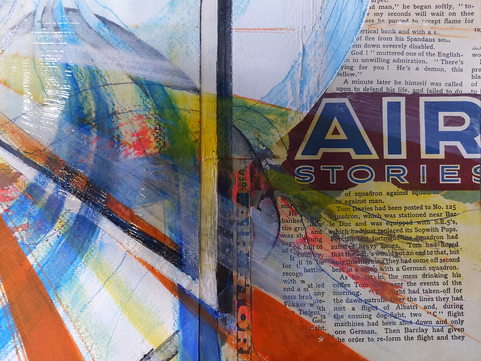
I liked the addition of the title of the book 'Air Stories' as it was the title of my picture and the story 'I' wanted to tell about the air.
Biro and coloured pencil lines to portray the flow of air.

Circle shapes signify the circulation of air and the different overlapping and skewed perspectives for my feelings about the atmosphere in different environments that I occupy.

Final piece.
Fresh Air (Air Stories)
Mixed media on watercolour paper/brown card 60cm x 44cm.

Certain aspects of this piece work and certain elements do not.
I used the complementary colours of warm oranges with the cool blues for the fresh and warm air.
The perspectives draw you in and out, and the more minor details of the circulation of air and layered waves of distressed paint are pleasing.
Overall it's not for me my best piece. I should have limited the colour palette to monochrome and maybe added punches and pops of colour. The overall concept is good, but I haven't used my inner Stella to make straight lines that compliment each other.
Does this piece work if it is cropped and made into a monochrome piece?
Again I am going to reflect and see how the piece 'sits' with my final collection.


Travel
The travel theme of my environment and those objects that surround/remind me of those travels.
I have so many objects in my environment that constantly remind me of my travels, and I showed many of these in my collections exercise.
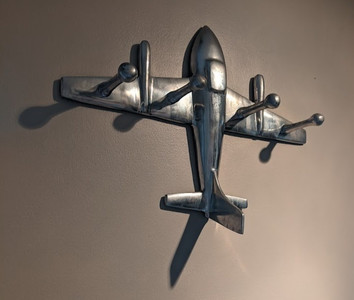
One object that depicts travel and movement in my environment is the coat hook in the hallway. Constantly used, unused and always reminding me of that jet-lagged feeling.

For this piece, I want to use Genieve Figgis for inspiration. Why?
Although I am not a fan of the content of her work, I like some of the techniques she uses with acrylic paints. There aren't many artists who use acrylic paints with unusual designs that I find pleasing. Most artists that I like use oils.
For example, below her marks are fluid and translucent. I want to try and mimic this somehow with my coat hook (travel) piece, so I would like the background to be fluid somehow because of the constant travel element, the flow of moving from one place to another. I want to continue developing my use of acrylic as I move forward towards my degree, and pouring dripping and more fluid use of the medium excites me.

Figure 11
Materials and process for the base.
Cork board with wooden surround.
Pouring medium mixed with acrylic paint and smeared around the edge with a flat brush.
Blended acrylics with stipple brush.

The way the paint flowed and mixed was exciting and I was enjoying the free way it glided over the surface. The cork boards surface disintegrated slightly and the particles of cork floated in the paint and I like that addition of texture.
I needed to bear in mind that if I had to unify the piece with some text or collage, how would it sit with the others and connect to them.
I also was inspired by Tori day and her use of shadow in her still life pieces.
In A Funnel for de' Barbari Day uses the shadow and light to depict her still life object hanging on the wall. The small highlights and diffusion of the various grey tones is key here. I think a Figgis/Day fusion would work. I like the small pops of yellow ochre colour that bring the piece below some life.

Figure 12
I emailed Tori Day and asked her about her process. She was extremely helpful and the use of the limited palette fitted with my image and meaning.
"When I’m painting I try to use a limited palette, e.g. phthalo blue, payne’s grey, yellow ochre, raw umber, warm white but then I often add yellow lake or scarlet lake etc to add a bit of zing. I learned about limited palettes from my tutor Phil Tyler when I was on foundation at Brighton - he’s an excellent painter and is really prolific and dedicated. Look him up! The temptation to use ‘local colour’ is for me, always very strong and the limited palette is a very good way of getting round this impulse. It unifies the painting and it’s really quite surprising how few colours you actually need to use.
I always use a coloured ground – this gives a lot more depth to the composition.
I explored using textured gesso when I was studying for my MA – often the texture just comes from the application of the gesso itself as I’m always over generous with it, but I did investigate scoring into the gesso with various implements, creating extra interest. I did this to simulate the effects I had achieved previously by painting over old paintings that hadn’t worked. Often when you do this, the resultant surface is more interesting because you have the bumps and contours of the painting underneath showing through, and often the colours too. Examples of paintings where I’ve done this are: Still Life with Small Funnel, A Funnel for De Barbari, and I See The Dead Unbury Themselves". (Day 2020 email)
I experimented in my sketchbook with various concepts. Thinking maybe to use Alberto Giacometti's line as inspiration over a stained base layer.

Should I monoprint over the base layer and use additional fluid markings influenced by Figgis in the background? Am I add, add, adding again?

Process images of the aircraft wall hook.
Making the base layer with a blend of umbers with a stipple brush.
Adding Gesso to the surface and allowing it to dry.
Using the end of a paintbrush to dig into the gesso before it drys completely to gain texture (Tori Day).
Putting down base composition in paynes grey tones.
Adding the book pages/torn boarding cards from my travels to the edge of the frame.


I used Tori Day as inspiration for the aircraft hook. Although she uses oils I built layers of colour using;
Paynes grey, raw umber, titanium white and yellow ochre acrylic paint.
I added a wash of midnight blue ink with a baby wipe (dabbing the surface) to tone down the background and create shadow.
I varnished the frame to coat the book pages and boarding cards and give a sheen to the edge.
Close up images.
Fluid mark making in the background, small pops of colour to create a focal point for the piece.


Final Image
Travel.
Acrylic, collage and ink on cork board 30 x 40cm

I think this is the most striking of my pieces so far. It has a drab and distressed look (which works with the concept of travel and jet lag) The use of dark values for the shadows makes the work three dimensional. The textures, blemishes and uneven surface gives the piece interest.
Does the background work, I am unsure?
More reflection.
What do I want achieve and what do I want to communicate?
I want to communicate myself through my environment and through my art. As my tutor said it was all about me for this assignment.
Does, how I curate my work make a difference to the meaning?
I feel at this time, yes, very much so, because the lighting, the position, the order, the frame or height of the pieces in regard to each other is very revealing (or not). The background is fundamental to imply context for my piece (using suitcases).
What can I paint/create that people will identify with?
Does this matter for this assignment? If the viewer connects then good, if the viewer is intrigued then good, but this isn't always fundamental.
What can I inform people about my environment with my work?
How my environment feels to me, from my perspective. How constant travel affects me/us
and our view on the world around us. How I value the natural world, fresh air and not having jet lag but remembering the feeling from the possessions around me.
Now I needed to curate. Te brief asks us to "Look at the way Marie Eastman, Andrew Mania, Nadia Hebson and Karen Kilimnik present their work: propped up, grouped, and often exhibited outside the ‘white cube’ gallery".
Karen Kilimnik uses a dark gothic backdrop to showcase her work. I was intending to use a dark set of suitcases to showcase mine.

Nadia Hebson's work was varied curated objects and canvases. Items hanging on the back of the pictures. I liked the unusual positions and how she had cured her works.

Figure 14
Andrew Mania has curated his work here exploring identity, sexuality and nostalgia. He uses portraiture drawing with meaning and nostalgia. His assemblages are set on decorative backgrounds such as hanging printed fabrics.
Because his work is monochrome or sepia it sits well on the patterned backdrop.

Figure 15
Further research into curating with suitcases led me to Mohamed Hafez, who uses the cases to create visual models inside the suitcases of life narratives experienced by refugees of war (carrying their life in a suitcase). Refugees travel light not for ease or efficiency, but because their journeys are so dangerous and arduous.
Hafez uses the cases to signify compulsory departure. My cases were the cosmopolitan jet-setter who travels/or not in a globalized world.

Review of my work for curation.
'Grounded- Cyanotype Book'
I have added a cutout leaf from the pages of the Air Stories book to unify the book with the other pieces.

'Grounded'- Concertina sketchbook.
I have added a similar leaf and wording from the book's pages.


Aerial Perspective.
A border of the book pages.

Fresh Air (Air Stories)
Travel.
Collage of the series.


My grounded books needed to at the base of my curation and the three remaining pieces above them because it made sense to me. Ground and air in the correct positions.
I made several attempts and experiments with suitcases and positions. This was fun!
Initially, I chose the garden it was a sunny December day.
I ran a black and white filter over some of the images, I liked the monochrome effect it unified the image elements.
I photographed the pieces from above and looking up to them.
I placed the images on the windows/window sills of the house .
My partner thinks I am mad and the neighbours are twitching at the curtains!


I went inside my house, the landing seemed a good place and I took a few more images of the collection.


Video of the collection.
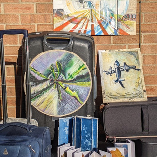
Eventually after reflection I chose this image.
Final piece.
The Impermanence Collection.
Now retired, but having travelled within a cabin crew career for 23 years, I perceive my existing home as a base where I continue to begin my travels. It has impermanence from which I roam, either physically or in my imagination. However, this home base environment is only supposed to last or serve for a limited time. The natural world, being grounded and the objects that remind me of travel, the fresh air and memories of containment all feature within my collection.

If you were to develop this work, how would you do it?
I would make the entire collection in monochrome, or maybe a sepia and cream. I also think that the book borders could have been overpainted with a dark stain to make the pieces 'pop'.
I would take a professional aerial view of the pieces.
I could further develop the work by making an aerial map and using the home base/suitcase to springboard destinations and the feeling of travel.
Demonstration of visual skills: Materials, techniques, observational skills, visual awareness, design and compositional skills.
Through and within the context of printmaking, screen printing, cyanotypes, collage, burnishing and crosshatching with paint, I have processed, developed, reflected on research and learnt the techniques included in this assignment.
I have explored the materiality of paint more and looked at what I have created, and edited colour or composition to create different results. However, my visual awareness and observational skills are consistently in question because of the broad range of resources I have used-for example, exhibitions, Plein air drawing, inspiration from books and videos.
I have considered my tools, materials and design elements to convey my concept confidently-the composition and curation of the pieces underpinned by relevant artist research. My personal voice is continually maturing.
Quality of outcome: Content, application of knowledge, presentation of work in a coherent manner, discernment, conceptualisation of thoughts, communication of ideas.
My communication, content, more vital judgement skills continue to develop. I am consistently progressing by underpinning my work from the inspiration of other artists techniques. Curating my work has been challenging but considered within the brief outline. Numerous sketchbook entries and experiments have coherently formed the communication of my personal voice, theme, and narrative.
Demonstration of creativity: Imagination, experimentation, invention, development of a personal voice.
My personal voice continues to advance through my experimental and exploratory practice. I have the imagination to invent and communicate these feelings into my processes. I have made independent judgements within processes, i.e. cyanotypes and flower pressing, with creative thinking and acting upon artist research. Risk-taking with mixed media pieces, books and three-dimensional elements have pushed my practice, supported by the relevant research.
Context: Reflection, research, critical thinking (learning logs and essay).
Therefore, my research has been more relative to my work, producing the narrative and curated work. I use many artists to underpin my work, David Hockney, Genieve Figgis, Bridget Riley,Tori Day, and Andy Warhol. Seeing their work first-hand gives me more breath of context to support my professional knowledge and understanding at this time.
I have related triptych concepts to my assignment piece. In addition, I have been more specific with applying researched knowledge in my work.
What have I learnt in this course/module and how do I feel now?
The tension between varied mediums or supports and how I create that surface quality is a fundamental consideration in my practice: transparency, layering, and surface texture.
The artists suggested in the reading lists assist me in considering how modernist developments in painting have allowed us to use paint more immediately and directly.
Curation plays a massive role in my process and needs coherent and considered planning.
I feel more confident in my visual and technical skills and am ready for the next adventure.
References
Figures 1 and 2. Kiernan, K. (2020) Winter Blues: Contemporary Cyanotypes at Center for Photographic Arts — Online - Don’t Take Pictures. At: https://www.donttakepictures.com/dtp-blog/2020/3/25/winter-blues-contemporary-cyanotypes-at-center-for-photographic-arts (Accessed 13/11/2021).
Figure 3 . Xiuzhen, Y (1995)The Suitcase At: https://www.irenebrination.com/irenebrination_notes_on_a/2012/06/yin-xiuzhen.html (Accessed 26/11/2021).
Figures 4 and 5. Anna Atkins’s cyanotypes: the first book of photographs/Herbarium sheet (s.d.) At: https://www.nhm.ac.uk/discover/anna-atkins-cyanotypes-the-first-book-of-photographs.html?gclid=CjwKCAiAv_KMBhAzEiwAs-rX1AvqJr0kQZ-GA7E8FRpHKDCL9YKUtspFBL-zakQPbJkC876_HDaTcRoCDN4QAvD_BwE (Accessed 23/11/2021).
Figure 6. Morandi, G. (1931) Natura morta a grandi segni. [Etching, 240x330 mm; 9 1/2x13 inches.] At: https://catalogue.swanngalleries.com/Lots/auction-lot/GIORGIO-MORANDI-Natura-morta-a-grandi-segni?saleno=2507&lotNo=348&refNo=758363 (Accessed 23/11/2021).
Figure 7. Hockney, D. (1971) Intimate, Floral Still-Lifes. [Flowers Made of Paper and Black Ink] At: https://www.phillips.com/article/69272519/editions-london-auction-david-hockney (Accessed 23/11/2021).
Figure 8. Stella, F. (1962) ‘Hyena Stomp’,. [Alkyd paint on canvas 1956 × 1956 mm] At: https://www.tate.org.uk/art/artworks/stella-hyena-stomp-t00730 (Accessed 23/11/2021).
Figure 9. Matisse, H. (1953) ‘The Snail’. [Gouache on paper, cut and pasted on paper mounted on canvas 2864 × 2870 mm] At: https://www.tate.org.uk/art/artworks/matisse-the-snail-t00540 (Accessed 23/11/2021).
Figure 10. Hockney, D. (1971) Sur la terrasse. [Acrylic on canvas.] At: https://www.artsy.net/news/artsy-editorial-david-hockney-painting-unseen-public-46-years-will-star-christies-fall-new-york-sales (Accessed 09/12/2021).
Figure 11. Instagram post by Figgis, G. (2021) [Instagram screenshot] At:www.instagram.com (Accessed 23/08/2020)
Figure 12. Day, T. (2018) A Funnel for de’ Barbari. [Oil on panel 30 × 25 cm (2018)] At: https://www.toridayart.co.uk/photo_16230648.html (Accessed 06/12/2021).
Figure 13. Kilimnik, K. (28 October – 3 December 1994) The Legacy. [White Cube Gallery. 28 October – 3 December 1994]. At: https://whitecube.com/exhibitions/exhibition/karen_kilimnik_duke_street_1994 (Accessed 09/12/2021).
Figure 14. Hebson, N. (29 September 2018 – 14th January 2019) Gravity & Parity &. [Hatton Gallery 29 September 2018 – 14th January 2019]. At: https://nadiahebson1.xhbtr.com/gravidity--parity- (Accessed 09/12/2021).
Figure 15. Mania,A. (2019) Snapshot of a Collection at Spike Island. At: https://www.spikeisland.org.uk/programme/exhibitions/andrew-mania/ (Accessed 09/12/2021).
Figure 16 Hafez, M. (2020) Baggage Series Baggage # 1. [Plaster, Paint, Antique Suitcase, Found Objects, Rusted Metal, Wood, Persian Carpet 24 x 24 x 12 in (61 x 61 x 30 cm)] At: http://www.mohamadhafez.com/Baggage-Series (Accessed 09/12/2021).


Comments