Assignment four
- martine75
- Jul 30, 2021
- 17 min read
Updated: Sep 7, 2021
A circular or oval painting.
Make a circular or oval painting of an area in your house, either from life or from a photograph.
Refer to the work you produced in the exercises to choose a subject and composition that works well. Use heavyweight paper, card or board as a surface to paint onto.
Again, you’ll find it helpful to cut out a circular shape to frame your image so you know how you’ll paint it on the circle.
Think about the following while you’re planning your painting.
• How would you like the painting to look?
• What it is about the image that appeals to you and how can you represent this visually?
• What types of brushes will you use to create your painting?
• What textures/density/hues will you use?
• Will you use gloss?
• Thin/thick paint?
• Will you paint a coloured or a white ground?
Reflect on your tondo.
What were the opportunities and limitations of working within a circular or oval shape?
If you were to develop this work, how would you do it?
Which artists have influenced you and how?
What, if anything, does your tondo say about your domestic life?
Several subjects were possibilities for my assignment piece.
Any of my plants from an aerial perspective.
The ceiling light on a larger scale.
My alarm clock in the drawer.
Any of the possessions I had from my travels.
An open window.
It seemed it was a competition for my possessions, it was almost although I could hear them saying "pick me I want to be your assignment four piece". I felt like my possessions were similar to the toys in Toy Story , coming alive at night and the shells having Carribean beach parties in my bathroom, my mugs full of coffee discussing their cultural differences around my dining room table. The model aircraft were using my landing light for the obvious purpose and many trinkets or items of jewelry were being exchanged in a Bangkok night market in my lounge! These were all concepts and imaginations of course, but possibilities for assignment five perhaps?
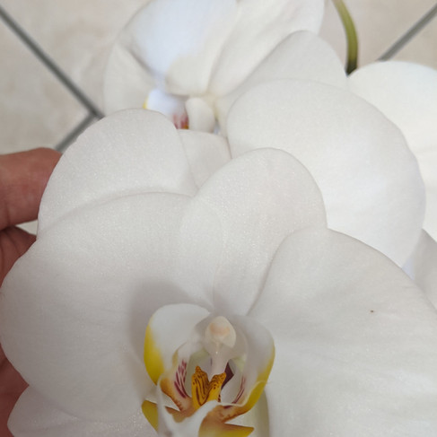
But, I knew I wanted to paint an aerial view of one of my white orchid plants. Why?
Because as I have said before, I love orchids. They remind me of my travels to the far east. So I have many plants scattered around the house. The plants have natural blooms and artificial stems positioned in the soil for an all-year-round flower.
I like organic flowing lines, and something elegant and beautiful would be refreshing. Also, the plant's root system is adventitious, which means the root system may be underground or aerial, rather like how I feel, rooted to the ground now but still feeling airborne. It's hard to explain, but because I spent so much time away from my home environment, adapting to the general daily routine has been a challenge. Even after three years and two lockdowns, I don't feel quite ready to keep my feet firmly rooted to the ground.
The white orchids were serene and calm, the feeling of home and comfort for me. I wanted an abstract background, achieving effects using shapes, colours, and textures because I hoped to express my separation from both ground and sky. Am I in Limbo?
Orchids have long history of being associated with love, fertility and elegance throughout various cultures and time periods. Orchids are delicate, exotic and graceful, they represent love, luxury, beauty and strength all words that I associate with my environment. I am loved and feel strong when I am at home. My home is beautiful, and luxurious, to me, and I feel extremely fortunate.
The concept of the aerial view has been explained during the course, I feel that this is a normal view for me, one which I can relate to and feel comfortable with. I feel that this concept of the plant/flowers growing up towards the viewer, will translate well into the tondo as it did with the coloured pencil drawings of plants. If the image I have in my head translates to the canvas I will be happy. I have dreamt about the orchids, I have written notes about the orchids and I am excited to paint something that I could hang in my home.
How would you like the painting to look?
I want the painting to look contemporary, elegant and stylish.
I want it to be from an aerial perspective.
I want it to reflect more of the style I like, so I want it to have an abstract element to it.
What it is about the image that appeals to you and how can you represent this visually?
The beauty of the orchids.
The perspective and the depth I can create from this angle.
The meaning of being in limbo between ground and sky.
What types of brushes will you use to create your painting?
I want to incorporate an abstract element for this piece.
I will use various sizes of filberts, fans, flats, mops and rigger brushes.
What textures/density/hues will you use?
I want to create a background that is unusual and eye-catching.
I want to create intrigue with the layers of orchid petals and a variation of translucency mixed with opaqueness in their appearance.
I know that dense thick application of paint will make the orchids seem closer.
I know that lighter brighter highlights will appear to be nearer and the blurred background will be thinly applied to create a feeling of depth.
The size of the objects bigger nearer to the viewer and smaller further apart will add to the colour hues to create the aerial perspective.
Will you use gloss?
Yes I think so to create areas of interest with other areas in matte. I will experiment.
Will you paint a coloured or a white ground?
Definitely! A coloured ground or abstract striking base. I know now that this brings the richness and underlying feel of my work and carefully planning what colours is of great importance to my work.
Assignment Four
This assignment was such a massive learning curve for me (as you will see). I actually made three pictures along the way and still managed to miss the brief;
Use heavyweight paper, card or board as a surface to paint onto.
My apologies for the mistake, as I have painted two of my pieces on canvas.
I placed the orchid plant on the floor of the kitchen. I also left it in situ on a shelf in the corner of the room and stood above it on a chair to gain an aerial perspective.
I took photos on my mobile phone and ran them through filters for that contemporary edge.


Checklist
Feelings and expressions associated with the piece.
Beauty, elegance. A feeling of being high above.
Am I in limbo?
Floating but connected to the ground through the plant.
Natural but artificial.
Abstract and quirky maybe slightly surreal.
View point angle.
Aerial, looking down from above.
The story or narrative of the piece.
Because I feel more comfortable looking down from above and my orchids plants remind my of Eastern work trips, this piece is a fusion of both elements.
I feel both connection to the air and to the ground at the same time as if 'in limbo'.
Is the the art interesting to me?
My experience and view of the world with an abstract twist and more of the mark making I prefer.
1.COMPOSITION
I played around in my sketch book with compositions. I did not take time to be consider my subject enough or thoroughly research. This is part of the learning curve I mentioned.
I am not on a time frame, like working on an aircraft ( there is no landing time). I am not in a rush, I can take time to reflect and have more research time. I am always excited to paint and I rushed into the assignment piece.
As I take you through the other two pieces I made for this assignment I will show you more of the composition studies I made towards the final piece.


2. SIMPLIFY WITH NOTAN / THUMBNAILS/ DRAWING
My sketchbook had been a source of many ideas again, looking through the concepts, for example Frank Stella and the shapes within circles. Damien Hirst for the spin tondo paintings. I used a plastic plate to try out the spin painting concept. I used a hairdryer to simulate the spin and force the paint to splash, as if it had been spun. I was happy to use this idea for the base of the picture.


I wanted to use the real plant and black and white photographs for my notans.These were sufficient at that time and I carried on. This was a mistake I should have planned and considered my concept in greater detail.


3. VALUES/ SHAPES
This is where I didn't have a certain design for shapes and values. I had the idea in my mind and a couple of small sketches.
4. BALANCE AND HARMONY/ FOCAL POINT /COLOUR LIGHT
I wanted to use the base layer to form a directional focal area by using the hairdryer to push the paint from a central point.
5. VISUAL UNITY RHYTHM
I knew the abstract spin in the first layer would bring energy and the curves of the orchid stems together with the flowers would give balance and harmony.
6. DEPTH
The depth would be created by the perspective of the opaque paint at the foreground and the light source from the left.
7. RULE OF THIRDS / GOLDEN RATIO
This was a tricky one for the tondo but I felt the composition I had worked well.
8. EXPERIMENTAL SKETCHBOOK/ MEDIUMS FORMAT SUPPORT
I knew I was using acrylic, glazes and a circular canvas (as mentioned before this was not what the brief stated)
9. INFLUENCE FROM ARTISTS/RESEARCH
Damien Hirst and the spin tondos process, were going to deliver my abstract ground or base layer.
I wanted to use Giorgio Morandi's technique of outlining with the warmth underneath. The glow that Caravaggio had obtained included through my piece. The choice of colour for the ground was fundamental in a piece of work I now knew that.
Could I somehow incorporate Frank Stella's geometric rings?
I couldn't find many artists who had painted orchids, that I liked, or many aerial views of flowers. I had remembered an artist I had researched in a previous course Paul Nash.
I had been interested in his later work for its combinations of interests some of which show war-torn landscapes and damaged machinery/aircraft, yet always remain dreamlike in their appearance. With further reading his pieces are reflections of his perceptions of the sky.
The series that held my interest, was 'aerial flowers' and in particular
Flight of the Magnolia -its Gallery Label states;
'Not long after making this work, Nash wrote an essay entitled ‘Aerial Flowers’ in which he discussed his long fascination with flight, from the imagined flight of childhood dreams to actual experience in an aeroplane. He also described how his view of the sky changed with the threat of aerial bombing during the war. Rose of Death, his first picture of the war, was of a parachute. Perhaps this image of clouds metamorphosing into a white magnolia flower relates to the expected end of the war. As a spiritual symbol it recalls the imagery of William Blake'.
(Tate, 2016:9)

Figure 1
Nash uses more muted colours in this piece, but it's his imagination that intrigues me. Unsuccessful in finding a legible copy of his essay online, I will perhaps ask for a copy as a gift. I know that most of his work revolves around life and death, but his fascination with flight and the sky and aircraft and flowers, is one we both share.
Attempt ONE
Using;
Diluted acrylics with water or pouring medium/acrylic paint/acrylic inks of various colours.
Canvas covered board (16 inch)
A hairdryer to push the base layer of paint outward.
I was happy with the base layer because the spin from the focal point made the paint appear directed to the centre. I used a glaze varnish to cover the entire base layer to make the colours vibrant and smooth surface for the next paint application.
I even used the end of the brush to score playful loops and swirls of line into the piece which, you can see in the video.
I chalked marked in the shapes.
As I write this, I reflect, and ask myself, why I have used yellow paint for the entire underlayer?
I can answer this by saying I didn't research or think about what I was doing and why! I think I was preoccupied with the background maybe?
I had the knowledge that yellow would bring a warm undertone but, I needed to dilute or fade the hue into the distance.


I have been quite fortunate, even to gain a feeling of perspective at all with the piece, with the colours I have used.
I added;
Glazes with naples yellow for the floor beneath the plant, erasing and distressing with a baby wipe. This worked well and I liked the result.
Phaltho green leaves for the underneath leaves (which actually brings them forward not back).
Brighter fluorescent paint for the underlayer of the orchids.
Layers of thicker Titanium white paint, swept with a filbert brush for the orchids nearest in view.
Naples yellow acrylic for the lower orchids.
Opaque lilac heavy body acrylic for the square beneath the pot.


The result.
In Limbo (1)
Mixed acrylic media on 16inch canvas tondo

I like;
The background concept and some of the fluid strokes on the petals in the foreground.
I don't like;
The orchids on the right-hand side (2 o'clock) and hadn't experimented with a technique or process enough.
The lilac square looks out of place and weird.
The colour combination was too varied maybe?
I wasn't happy so decided to attempt another piece.
Attempt TWO
In Limbo (2)
I wanted to make a slightly bigger picture and thought this might help with broader strokes.
I cut some canvas and stapled it to a used canvas 20 inches square.
I made another sketch, in paint and experimented with colours and process.
I used a real orchid and started to really look at the surface of the flower.
Again I used yellow for an underglow, this was a mistake and doesn't use the rules of depth of field with colour.

I tidied my art room (which is quite messy) believing that organisation would aid my creativity.
I used;
My colour chart to consider tones and hues I was determined to make this piece better than the last.
The previous piece as a reference and pinned the real orchid, and several photocopies in front of me on a cork board.
My sketchbook was nearby to refer too.
Artist influences of Alphonse Mucha Byzantine head of the brunette and its overlapping of the tondo edge, because this was unusual and I liked it.
Artist influence Katie Moran Whistan (scan below) from flicking through my Phaidon Painting Abstraction: New Elements in Abstract Painting for inspiration. I had been trying to find mark making I liked this piece is of interest because of the blended flat background and then smeared textured strokes that looked similar to petals to me.

Figure 2.
My workspace images.


I used;
Acrylic paints (open and standard) diluted with retarder and water.
Broader brushes of various sizes.
Less colourful hues in the background, more variations of orange and copper tones.
Charcoal to map out the design.
Excitement, determination and imagination.


My process;
Broad strokes with Titanium white acrylic and a large toothed flat brush.
Titanium white glaze over the petals to gain a feel of the placement of the petals, erasing and distressing them with a baby wipe.
Wedgewood blue and phthalo green for the mid tones.
Built up the petals gradually.
Became frustrated with the background and mixed a Wedgewood blue glaze and went all over the background with it!
Added fluorescent yellow highlights.
Added chalk fragile lines for the edges.
Created the tondo by using Paynes grey for the border.

Reflection.
What was wrong with me?
Why was this not working?
I liked the mark making at 5 o'clock, glazed blue over the deeper background, these were very satisfying marks.
It was flat and had no aerial perspective.
Where were Hirst, Stella, Morandi and Nash, or indeed any influences at all?
I had read somewhere that David Hockney used technology to experiment with his artwork. I researched which application he used.
I downloaded a similar app on my phone and tried to consider and critique my work.
I asked for opinions from friends and fellow students and tried again to find aerial views of still life.
Here is my attempt at digital editing of the piece on my phone. It was difficult because the phone screen was small, and my finger's strokes (with various effects) could not create the desired result.


I knew that the background needed attention. Where was the light source? The piece was also very dark. I didn't feel as if I was looking down.
I went ahead regardless. I was changing the piece to be similar to my digital creation.
I added a dark Paynes grey and primary blue mix to the background of the piece.
The result.
In Limbo (2)
Open/ standard acrylics and chalk on 20 inch canvas

Reflection.
Oh, dear. This painting is not what I was expecting. I felt pretty disappointed with myself and wanted to try and find the positives. I had overworked it and it had become almost grotesque!
The mark-making (that I have covered over at 5 o'clock, see below) was great practice with glazes, and so I could take that forward at some point.

I know that my composition is wrong because the first piece was more of an aerial view.
Can I critique In Limbo (1 and 2), extract the good from both, and make another combination piece?
I need to work out, why I am not achieving the desired effect.
More research and experimentation with this composition in mind.
I am determined to make this work. Even though my boyfriend says, I have been grumpy for the past few days! (I'm rarely grumpy!)
I used my sketchbook and loose leaves to think about the rules of aerial perspective. Then, I used YouTube and various drawing books to contemplate and consider changing my composition for the required result. Finally, I researched how to paint orchids and which colours made aerial perspective work.


I was more certain of the fundamentals of the light source, shadows and colour hues.
Red undertones in the foreground and blues in the mid/background would create depth.
Opaque paint in the foreground, translucent in the background.


What had I decided?
Not to get grumpy! Paul Nash had been in the war down the trenches and I am grumpy! Get things in perspective Martine.
The abstract background was influenced by the spin paintings of Damien Hirst and that was intriguing and more of the style I want to include. These marks need to radiate from the base of the orchid plant.
I want some sort of spiral or ring glaze, influenced by Frank Stella. This also expresses a spiraling towards the ground.
The base of the plant on the square table/shelf need to be smaller in comparison to the flowers to create depth.
The orchids petal colours need underlying red in the foreground and slowly fading blue in the background areas.
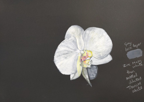
I had been using Titanium white and diluting it to create what I thought was a semi opaque finish.
Using mixing white or Zinc white was a revelation it gave me the opportunity to build up and blend over the beneath layers of colour more easily.
Layers of size were the key. Larger orchids in the foreground and gradually smaller in the lower areas.
The colours need to be tertiary a mix of primary and secondary to express the mix of natural and artificial elements and an 'in between' or 'in limbo'.
The thickest textures should be on the top layer of flowers to again create a depth of field.
The shadow and light sources needed to be stronger, to give shape and structure to the composition. I need to be certain of the direction and not just guess.
I reread my research and the principle of Yin and Yang is that all things exist as inseparable and contradictory opposites, in this case, aerial and ground. The Labyrinth represents a journey to our own centre and back again out into the world.
I paused, I gardened, I cooked, I walked, I drew.
I reread and considered my work and I enjoyed life.
I felt in a better place to start my final attempt at Assignment Four.
Assignment Four
In Limbo (3)
Materials
Acrylic ink
Open acrylics and retarder
Standard acrylics with water dilution.
Charcoal
Baby wipes
20 inch canvas (again apologies for not hitting the brief)
Pencil and biro and a ruler for sketching the under layers of the composition.
Glaze varnish.
Varied sizes of flat, rigger, mop and filbert brushes.
More determination, imagination and positivity.
Process images.

Blocking in the background before I started the image made me concentrate on the tondo rather than the distraction of the outer marks.
Adding the spiral made the background more intriguing. Inspired by Frank Stella and also the tondo I included of Esher's Sphere Spirals in my research (a sort of fusion between the two).

Converting the image to black and white made me aware of the values of the work.

Using the digital app to experiment (badly!).

Adding red and blue undertones to the flowers creates depth. Making the pot/stand smaller gives receding depth.

I used a glaze of dilute Wedgewood blue and Zinc white to block the spiral area with a large flat brush and sweeping strokes in a circular direction, giving a glossy finish over the matt background. This has a Fibonacci sequence feel also.
Building up the flower petals was so much easier with the Zinc white.
Using a dilute mix of Titanium white for the upper layers and then texturing with thicker paint.
I have two cross marks in the piece for balance. I had David Hockney's grid drawing in mind from the Portrayals Exhibition I visited a few weeks ago and Frank Stella's pencil marks left showing. I feel the marks also credit and bring a 'geometric nod' to some of the tondos I initially researched.


The Result.
In Limbo (3)

Reflection.
I am content with the final piece. Not entirely but enough to move on.
What works?
The overall narrative and composition gives a feeling of being in the air looking down. The piece has a dreamy Paul Nash's Flight of the Magnolias feel but with a contemporary twist.
The whole background in general is strong, I believe, with the added spiral with glaze and Fibonacci sequence shape and flow.
I enjoy the feeling of the orchids popping out of the edge and the colour combinations.
The flow of the shapes and harmony of the piece.
What doesn't work so well?
I am not content because something is not sitting right, the structure of the orchids maybe? I want to splash or soften the bottom left edge somehow, (there is a happy accident which remains of two drips of paint, I like them a lot) but I am reluctant to fiddle with the piece until I have my feedback.
Is it too realistic?
Do I need to add the fine fragile lines around the petals again?
What were the opportunities and limitations of working within a circular or oval shape?
The tondo has been a challenge for me but an enjoyable one. I have learnt a lot from the compositional elements, spatial depth and the flow of the painting within the shape of the tondo. I have learnt to overlap and merge forms within this final piece with the use of glazes.
The tondos shape is commanding and the initial draw for the viewer.
Which artists have influenced you and how?
Answered above.
What, if anything, does your tondo say about your domestic life?
I feel again this has been answered within this blog post. The expression of feeling aerial and grounded within the context of the orchid plant makes sense to me but will it translate well? My domestic life and environment is grounded (or rooted) yet aerial.
If you were to develop this work, how would you do it?
I could take this piece and make several overlapping lace like cut outs in black paper or card.
You would turn these 'pages' like a greeting card. The first layer would only reveal the largest orchid, the second the layered orchids behind it, and so on, until finally you realised you were looking from above. A kind of page by page reveal in a sense.
I could also make a series of flower paintings which relate to flying, like Nash, but more of a communication of culture, say cherry blossoms for Japan, and cactus for the desserts of South America etc. These would all be form aerial perspectives of course.
Demonstration of visual skills: Materials, techniques, observational skills, visual awareness, design and compositional skills.
Through and within the context of the tondo, I have explored acrylic paints and how to use them to flow over forms with glazes and their applications, for example thickly or with dilution.
I have used my instinct, visual awareness determination to overcome difficulties. I have returned to the basic rules, to aid my progression and challenge myself to develop further.
I have researched and been influenced by artists techniques and compositions (and even their imaginations) from a variety of sources. I have used technology to aid my experimentation with designs again with influence form artists like David Hockney.
Quality of outcome: Content, application of knowledge, presentation of work in a coherent manner, discernment, conceptualisation of thoughts, communication of ideas.
I have applied knowledge from various sources and used selective parts of artists work or processes to apply to my own work.
My preference to paint my interests of travel and florals continues to inspire my contexts, expressing and considering feelings to create these atmospheres inspires me.
I document my notes at all stages and can see continued development. I am learning to fuse my realistic work with more semi abstracted style. I feel I am showing progression with my critique and making more considered independent judgements.
I am recognising when I need to slow down and have a more controlled and coherent thought process.
Demonstration of creativity: Imagination, experimentation, invention, development of a personal voice.
Within my continued theme, I have discovered and developed concepts by applying knowledge from artists and used experimentation. I have brought together ideas and have used my imagination to inspire my practice. My personal voice is becoming stronger.
Context: Reflection, research, critical thinking (learning logs and essay).
I feel my confidence growing.
I am demonstrating a willingness and understanding of how artists practice along with research influences my processes. I use this research to broaden my thinking, consideration and observation within my learning, helps me make personal connections with specific artists and how they resonate with my practice. I am building on my contextual knowledge and awareness.
My problem solving and critical thinking skills are developing with each exercise.
David |Hockney has been inspiring for me and I feel he would be a good subject for my essay. A comparison with a contemporary artist and Hockney and the use of acrylic paint, perhaps?
I know now that when I express myself, in the written word, from my heart and soul that my results soar higher and higher. I am still in the initial climb, the cruise will be a long journey to aspire to but one I am prepared for. I know the turbulent nature of the creative road ahead but I'm ready for the final stage of U.P.M.
References
Figure 1- Nash, P. (1944) ‘Flight of the Magnolia’,, 1944. [Oil paint ton canvas. 511 × 762 × 22 mm] At: https://www.tate.org.uk/art/artworks/nash-flight-of-the-magnolia-t07552 (Accessed 07/09/2021).
Figure 2 - Moran,K.(2008) Whistan [Painting] In; Nickas , B. (2009) Phaidon Painting Abstraction: New Elements in Abstract Painting p. 263.


Comments