Assignment three.
- martine75
- Jul 9, 2021
- 18 min read
Updated: Jul 19, 2021
Monotype portraits.
Now that you have more of a grasp of the monotype process, create three monotypes that encompass the techniques you feel work the best to create the kind of self-portrait or portrait images you want. Think about what you want to communicate with these images and how your use of paint will enable this.
Arrange the finished prints in different ways and photograph them. Before you do this, have a look at the work of Annie Kevans, Yuko Nasu, Luc Tuymans, Eleanor Moreton and Chantal Joffe to see how their series of portraits work as a whole as well as individually.
Which is the most successful and why?
How did you manipulate the monotype technique to achieve the effect you were after?
If you were to develop this work, how would you do it?
Which artists have influenced you and how?
Reflect on the ways you’d like to develop your work and the essence of what you hope to communicate.
Artists Research
Looking at the work of all the above mentioned artists (Annie Kevans, Yuko Nasu, Luc Tuymans, Eleanor Moreton and Chantal Joffe) I asked myself the questions;
What do I want to print and what do I want to communicate?
Does, how I curate my work make a difference to the meaning?
What can I paint that people will identify with?
What can I inform people about with my work?
Can I paint memories and experiences?
I watched the video below with Chantal Joffe and felt inspired by the meaning in her work. It was her personal experience and she discusses memories that aren't always seen and how she conveys these in her painting. Her work is therapy in a way and makes her feel alive.
I noted that her works in the video are either very large or very small there seems to be no 'inbetween' work. I like the striking colours in her pieces against the white walls.
I feel that her use of pattern in her larger pieces brings the work together somehow.
Annie Kevans seems to have made paintings that are simple line drawings of famous women artists or notorious people as children, they have little or no background, but are linked by a theme.
I like the idea of painting with very little background like Tracey Emin's trace monotypes or with Annie Kevans in mind. I also note that Kevans used the same sized prints in her Boys series pictured below. I quite like the uniformity and how it is presented, no piece is more important than the other, all linked by frame, size, placement and tone.

Figure 1
BOYS ‘Paper’, Saatchi Gallery, 2013
Yuko Nasu presents her portraits in a block in her CoExist Arts exhibition. This makes a big impact with the vibrant colours, 'a crowd of art' with a more powerful impact perhaps?

Figure 2
Yuko nasu CoExist Arts Exhibition.
I'm unsure of how to curate and present my work until it is made, but seeing the options of how a series of portraits relate to each other in a gallery opens up many possibilities. Each presentation has its own narrative to convey, each carefully curated to draw in the viewer, this, I suspect comes with years of practice.
Thoughts and experiments for the assignment.
My experiences of travel and being a Cabin Service Leader are generally thought of as being glamorous and a lifestyle travelling to destinations that are almost unobtainable for some.
What people don't see about crew members, is what I would like to paint.
The jetlag, the exhaustion from time zones, the loneliness, the feeling of being so far from home, the responsibility and expectation for you to be consistently professional in a confined environment. These are the feelings that no one would imagine a cabin crew member would feel. These thoughts should never even cross the mind of a customer conversing with a uniformed member of airline staff because crew are the safety officers, medics, waiting staff and the entertainment on board, all rolled into one.
These are a collection of hidden feelings that are behind scarlet lipstick, a red, white and blue uniform or tricolour tie.
Much like the paintings of Boys by Annie Kevans initially you see a group of images but on further reflection with time you learn that what you initially see is not the intent of the work.
I experimented a lot with images of self portraits in B.A uniform and from scanned photographs from books of vintage and present day air stewardesses.
I used my sketchbook for composition concepts, colour, palette, mark making and media experiments. I looked at several artists for inspiration and to underpin my work. The exhibition visit had been a great source of inspiration for me.
I made several profile portraits on black media paper of a vintage stewardess scanned from a book. The portraits all have a sensitivity and evoke that feeling of staring into space or daydreaming.
I suppose, I could submit three of these pieces for the assignment but they are not what I wanted to convey. They weren't contemporary enough they aren't striking and edgy enough and certainly no risk taking!
They are great practice and almost look like First Class stamps which was funny from an airline point of view and the First Class connection.

Stewardess- So far from home 1
A3 Monotype- Oil on black mixed media paper.
This piece has directional brush strokes for the materials in the hat and hair. The emotion is not sadness but that of looking into space thinking, you know when you are daydreaming maybe? A softness and muted application of the pale umbers in the background is contrasted by the think pale skin of the stewardess. Quite a strong image, I think, because of the feeling that comes through with the downward gaze.

Stewardess- So far from home 2
A 3 Monotype (Trace monotype)- Acrylic and collage on black mixed media paper.
This piece was created by laying the collaged silhouette of the profile and then printing. I layed a layer of trace monotype over the first application of large sweeping texture of pale lemon hues, to add variety and used a stick to create lines in the emblem and features. I had read about Tracey Emin's process and liked the idea of the mixture of techniques within a piece.
When dry, I glued the collage to the right side of the print leaving a space, a shadow between the subject and the map.
I touched up and highlighted areas with white acrylic and a small flat brush.
Again here, I feel the gaze is vacant, the pale hues and pallid complexion of being tired and jetlagged evoke a staring into space. I liked the hat and the reversed trace monotype it reminded me of the Tracey Emin Diary, barely there and doodled.

Stewardess- So far from home 3
A3 Monotype- Oil on black mixed media paper.
This is more sensitive, nostalgic and dreamy. I think it is too flat and without variety of line or mark making. The hair's direction works well and I am happy with that effect. I have introduced more colour here and this red white and blue would signify a British airline. Would this be a consideration for the assignment pieces?

Stewardess- So far from home 4
A3 Monotype (Trace monotype) - Acrylic and collage on black mixed media paper.
This piece was just play really with the same techniques and using the old book pages I had bought, cut out in the profile shape again. The erasure of the hair (removed with a baby wipe) works well as it brings the hair forward and the visible brush marks in the face bring some contour and energy over the skin. The line along the profile was just an instinctual flick of the brush. I had seen Agnes Grochulska use this in their work.
A vintage and nostalgic feel possibility amplified by the use of the book pages .Those swished marks around the face are Yuko Nasu's influence but with a subdued approach.

Come fly with me
Monotype (Trace monotype) Oil on black mixed media paper
I took another of my stewardess scans and made a piece with a grid in the background, influenced from David Hockney's drawings at The Portrayals exhibition. The exhibition had inspired me more than I had realised. Seeing the artworks first hand their small details and colour pallete choices were rich I seemed to understand them visually when I could see the textures, if that makes sense?
This piece was slightly different. I had printed it and really wasn't happy with the result. I smeared over the paint with a baby wipe. It was put to one side and forgotten about.
Later, finding it again, I made a trace monotype with titanium white oil paint over the top and added extra red and yellow paint when it was dry.
I liked the outcome, again there was a pensive, spaced out gaze but not the narrative I want.
The grid stops under the right hand side of the hat and I want to correct it and bring the lines down but my instinct tells me not too. Why?
The odd and off balance nature of the portrait is much like a stewardess walking down an aircraft aisle!
I've learnt that leaving pieces and coming back to them with fresh eyes sometimes brings great results.
Why have all these prints helped me towards the assignment piece?
I have considered the brush sizes, thickness of the paint and mediums added and I am becoming knowledgeable in the marks they produce when printed. A variety of trace monotype and mixed media is becoming more attractive for my assignment pieces.
I placed three of the 'First Class Stamps' together and was pleasantly surprised with triptych because it feels sensitive. The narrative would be the international travel and that spaced out look.
First Class Triptych.
Stewardess so far from home 1, 2 and 3


I eventually made the piece below by playing with paint and thinking of how I felt when working through time zones. Your body is out of sync.
On a Back to Back trip I would leave the house on say a Monday morning at 4.30 a.m. fly to JFK stay the night and then fly back for Wednesday, early morning. I would sleep at a hotel in LHR, wake and feel terrible, I didn't know which way to turn. Thursday Morning off again to the East coast U.S.A, the third sector was always the worst all the crew were tired and emotional. Another one night layover, returning back home on Saturday early morning......then the jet lag would hit you. That mussy feeling of empty, disorientation and exhaustion from crossing the Atlantic four times in a week.
I know there is a beginning of a narrative in this concept and the emotion I want to evoke.
Can I make this into a triptych?
The pale lattice work in the background maybe somewhat twee but I know I can evoke the feelings of international time zones and jet lag.

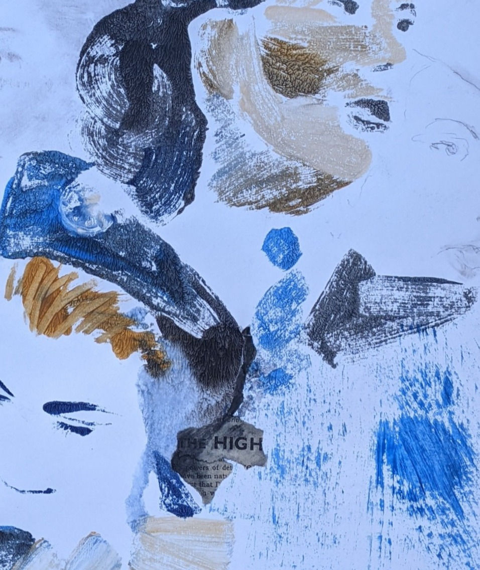
'Playing around with concepts' A4 Monotype with oil paint on wet watercolour paper.
I played around with the concept some more in my sketchbook. Noting the artists I wanted to underpin the work with.

Remembering the pieces that I had made during the exercises that evoked the jetlag I wanted to convey.
I need to fuse these images somehow. Keeping a contemporary approach and outcome in mind. I need to take risks and keep my tutor feedback in the back of my mind.

Jetlag
Exercise -Monotype with diffused open acrylics and charcoal on brown A4 paper.

Exercise 3.1 ink studies A4 Untitled.
This assignment piece needs correlation my tutor said;
"Think more about correlating what you are seeing in the artist’s work, this may be a process, a technique, a way with composition or driven by context. Applying this knowledge should influence some of the work you are making. It is important to integrate your research into your own work as often as possible."
Assignment Three
Checklist
I made a checklist/mindmap in my sketchbook ( I like a checklist) my life has been full of them for so long.

Preparation of words associated with the concept of three monoprints to evoke my career/jet lag and time zones.
Feelings and expressions associated with the piece.
View point angle- triptych, varied looking out/through portraits, directional and disoriented for the international travel angle.
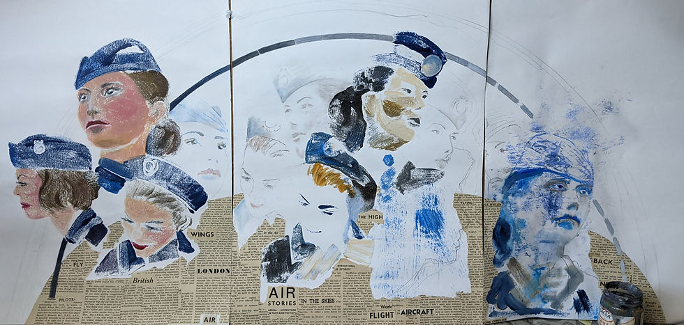
1st picture (left)- Ready to fly, To fly to serve, British, aircraft, work, uniform. More defined and polished marks, thicker more blended paint, warmer colours, red scarlet lipstick. Filbert brush application, thin precise/ flat blends of markings.
2nd picture (centre) - More diffused, vacant, third sector, back to back, don't know which way to turn, movement and direction, time zones. Erased parts using both brush control and baby wipe. More varied marks, large sweeps of dry brush stroke mixed with delicate applications for a confused/disorientated feel. Ochres and blues, not as warm as the first print.
3rd picture (right) - Diluted marks, empty, jetlagged, washed out, tired, exhaustion, home, pale outline, drab, muddle headed. Ink diffusion maybe to include the first exercise? Just pale blue, distressed and random markings.
The story or narrative of the piece (explained earlier).
Is the the art interesting to me?
My experience and trying to evoke those feelings for non- crew to understand.
1.COMPOSITION
I was happy with the triptych concept and three painting getting progressively more jetlagged across time.
2. SIMPLIFY WITH NOTAN / THUMBNAILS/ DRAWING
My sketchbook had been a source of many ideas and sketches along with several monoprints in the exercises. It was challenging to get an absolute defining outline with printing.
3. VALUES/ SHAPES
Portraits of vintage/current stewardesses using the shapes/faces for direction. Values in image would become lighter and paler with jet lag (from dark to light, left to right)
4. BALANCE AND HARMONY/ FOCAL POINT /COLOUR LIGHT
Again this would be challenging with print but I can overwork, erase, use sgraffito marks and add shadow with overworked paint.
I think my colour palette should be blues because of the uniform colours, some red and mixed paynes grey/phthalo, cerulean blue, burnt ochre and raw umber with a smidge of scarlet.
Balance and harmony with the directional elements of face gazes/positions(Francis Bacon's Triptych- Three studies of Lucian Freud piece).
5. VISUAL UNITY RHYTHM
Using a timeline arch to unify my triptych (David Hockney influence from Portrait surrounded by Artistic Devices)
6. DEPTH
Use collage in a base circular flooring (influence from David Hockney, Chris Ofili and Francis Bacon)
7. RULE OF THIRDS / GOLDEN RATIO
Base collage to be one third of each picture and each piece to stand on its own separately.
8. EXPERIMENTAL SKETCHBOOK/ MEDIUMS FORMAT SUPPORT
Paper support , Fabriano paper seems to create the best results with open acrylics for the marks I want to evoke. Retarder and pencil, Argraf and overpainting with thicker open acrylic. Collage should I consider cutting up old uniform pieces?
9. INFLUENCE FROM ARTISTS/RESEARCH
Dexter Dalwood
Dexter Dalwood's thoughts on the interior spaces we reflect on, had given me inspiration to think about how a portrait gazes into space. The jetlag and exhaustion of travel brings with it that vacant glare. Can I achieve this within the triptych?
David Hockney

Figure 3
Portrait surrounded by Artistic Devices 1965 Acrylic on canvas 60 x 72 inch
- for the arch, to ground the piece. The depth within the base pink circular flooring and the shadow cast over the flooring, lighter hue on and off the pink, creates layers of depth and form.
The angular geometrics to form facial features and the way Hockney breaks down the highlights to form a face. The variation in precise, distressed and thick/thin paint application around the whole area of this artwork.

Figure 4
Study for 'Christopher Isherwood and Don Bachardy' watercolour on paper 48.2 x 60.2cm 1968
- for it's pencil grid markings which are visible and in conjunction with the directional looking portraits making an intriguing study. The stained use of tone to form light and form works alongside the former elements.

Figure 5
Study for 'Sur la Terrace' 1971 watercolour and pencil on paper 43.1 x 35.2cm
- for the upper pencil traces of the portrait. When I took the photograph the reflection caused a blended shadow effect (left hand side of image) which will inspired me for shadowed and grey pencil blending.
Claudette Johnson


Figures 6-8
Figure in Blue, gouache and pastel on paper
-for the use of line and paint to create tension or evoke feeling. The raw dry brushed paint in close proximity to the pastel which has a twisted and overlaps it. Varied pressured pastel application which faintly dances around the clothing with areas of erasure or empty, negative space generates tension between the application.
Chris Ofili


Figures 7-9
Popcorn Shells 1995 paper collage, oil, polyester, resin, map, pins and elephant dung on linen and two elephant dung props.
- for the use of collaged portraits and varied mixed media application to convey a concept.
Francis Bacon

Figure 10
Triptych- Three studies of Lucian Freud 1969
- for triptych in a series and the direction of the subject. The use of circular flooring to 'ground' the subject and unify the images.
Kim Edwards

The Old Hare monoprint
-for it's trace monotype effect of a drawing in paint.
The Process
I know that plans can change especially in the printing process and the serendipity with monotypes. I knew where I was going this time though. I had a strong concept and I knew how to put it down on paper. I was excited and a little nervous too.
I played with the concept in paint whilst thinking of all the artists, mark making and feelings I wanted to connect with during the process. I used the large cork board in my art room to reflect on the work I had made, as a whole.

I put three printed pieces together. I added an arched base arch with diluted acrylic paint but it was too high, dark and distracting.

This was a very basic printing and free hand experiment.
The right hand image was pulled paint after printing with a baby wipe and was unsuccessful.
It was too smeared.
I made three base prints on fabriano paper using open acrylics the right hand side piece using trace monotype.
I scanned images from this book, of air crew and photocopied them.

I used sgraffito techniques, a baby wipe and cotton bud to erase parts of the paint, before and after printing. I drew an arch with a large compass in pencil line.
Setting up the images was quite challenging, thinking in reverse and using the gaze to evoke the feelings desired for each part of the narrative.


I had three prints but I wasn't happy with the first print it, wasn't polished or crisp enough. The skin tone colours didn't seem to evoke that preflight immaculate finish to the skin (challenging with print though). The hair was too twee also.

I reflected, for quite some time.
I was going to reprint the first image.
I reflected and mused in my sketchbook. Thinking and looking at artists who had used triptych.

I used thicker paint and more blending.I used warmer tones for that mask of make up.

I was much happier, the erased eye area was a decision I made because then I could add details afterwards, with a delicate approach. I wanted the stewardess to look proud and 'ready to fly'.

I now had three prints to base my triptych on, and evoke those feelings in my narrative of international flight.

I played around on earlier studies with tracing images and was happy to proceed.
Digitally changing the images to black and white helps me to evaluate and see where I want to add and communicate my narrative. Should I have made the prints in monochrome?

I added the college part from the old books I had purchased. I had looked at Bacon and Hockney's work and decided that a lower 'flooring' with an arch overlapping was what I had originally desired in my concept.

The books are war stories and I found it interesting because my Grandad had flown B 52 bombers (an American pilot whom my Nan had had an affair with, the consequence was my mother, she never knew her biological father). This fact added to my personal voice.
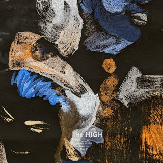
I was using the words within the book cutting them out and placing them in the relevant parts of the pictures- London, wings and British for the first picture, air stories, work and flight for the second, and the last, power dive, back and 'upside down text' for the feelings of jetlag.


Next I pencilled eyes in the first picture and in the arch (timeline). I was apprehensive to paint in the eyes (so the pencil would ease me into getting a feel of the gaze I wanted).
I added the timeline(again in pencil initially) from dark to light, solid to broken, to depict how I felt from preflight to post flight. I started to trace in echoes of the portraits in faint pastel and would gradually build on them, after some reflection, slowly, slowly eh?
I used some water diluted open acrylics also adding retarder for an even more diluted outcome.


I painted over the timeline with blue, brown and white Artgraf mixes blending and breaking the solidity. The mix of blues and browns because there are so many shades of grey I had studied in my POP1 course that just mixing black and white doesn't give you warmth in your palette.
I used a black and white filter to see how the values translated and I was happy (in fact I preferred the triptych in monochrome.

I started playing around with filters and was really surprised at this version(below) of my work. The colours are inverted. Wow! This was really punchy and more modern and contemporary.
Was it acceptable to use a filter and present my work this way?


Cropping the images also gave a new perspective to the filtered pieces.
I'll take feedback from my tutor but these were more intriguing I thought. I loved the teal and umber complemented by the blue collage.


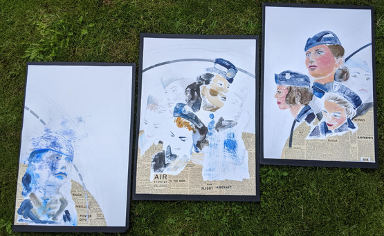
I continued with my original prints. I mounted each piece on black foam mount board. (I made a very bad job of cutting the mount board with a craft knife, I was disappointed with my efforts). Whilst happy with the first two pictures I had buckled the last picture whilst attaching it to the board.
When I looked back at a drawing in the Portrayals gallery by David Hockney I remembered the paper being buckled under the glass, and because this last picture in my triptych was evoking a tired stewardess, buckled under the time zones, I was quite pleased with the outcome after all!
Final Monotype Triptych
TIME ZONES


'To Fly to Serve' 'Back to Back' 'Jetlagged'
3 x Monotypes with collage open acrylics, pencil, pastel and Artgraf (each piece 14.5 x 21 ins)
Arranged finished prints (photographed)
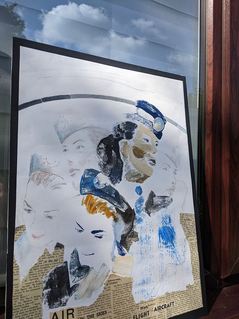
I took one of the pieces outside and thought the reflection of the clouds in the window were significant and relevant to the theme. I knew there were several ways to present the pieces.

Would making the centerpiece higher suggest height and being airborne?

Would stepping the pieces backwards assist with the faces becoming slowly fainter?

I wanted to hang my pieces from the rafters of my pergola to suggest flying and being in the air. I think my neighbours think I am strange enough though!

Laying the pieces on the grass gave a grounded feel. Placing the pictures in a different order wasn't the narrative I had set my heart on, it gave me an idea of each piece individually though.


When I had visited the Casa das Histórias Paula Rego in Lisbon I recall seeing pictures mounted at right angles to the wall. Would this make a triptych come together if you stood at a certain angle and viewed them placed in a similar way?

Figure 12
Casa das Histórias Paula Rego
How did you manipulate the monotype technique to achieve the effect you were after?
This was quite easy to answer.
Picture 1. Thick blended and precise, finished open acrylic paint to print more of a realistic portrait with warmer tones to evoke pre flight.
Here the marks are more solid and with overpainting for shadow and definition I have created the 3D form of a face.

Picture 2. Using more of the erasure technique, unfinished, leaving no paint or unfinished paint on skin areas. Pulling paint with sweeping actions. To evoke abstract or muddled areas.
The ochre hair on the left here has been swept through with a cotton bud, the raw visible stokes with varied brushes bring energy and a disorientation, coupled with the vacant gazes of the faces.
Picture 3. Using diluted ink over trace monotype, drawing and pressing with print rather than painting evoking jetlag. The fragile pencil marks that overlap for the clothing at the neckline work well and the strokes of medium sized stokes, raw and unfinished similar to those of Kim Baker in the bottom left are unstable and diluted. The hat traced part works well and the pressed part of the print brings a mussy headedness to the aura of the stewardess and her vacant disorientated state.

If you were to develop this work, how would you do it?
I would like to make the collage area more luminous, as in Chris Ofili's work as I feel mine is quite nostalgic. Making this more bright might bring a more contemporary feel.
I would also coat the collage part in varnish, resin or glaze to make it glossy.
If I remade the work I would use the digitally filtered colour palette and neon/vivid colour palette as it looks more contemporary.
I could develop the work by making the sequence of images longer, what I mean is more elements of the flight. Boarding, meal time, night flight, long haul, turbulence, air sick, crew rest, safety demonstration, there are actually so many possibilities. Each country also could be an element in the background, a landscape element, something I am missing in this module as the organic nature of the landscape is captivating for me.
Demonstration of visual skills: Materials, techniques, observational skills, visual awareness, design and compositional skills.
Through and within the context of printmaking I have processed and reflected on research and technique in this module. The materials and way they are applied have specific outcomes which I have used to evoke feelings. My visual awareness and observational skills have been consistently questioned. Retrying and experimenting throughout the module during exercises and the assignment piece I have considered tools, materials and design elements to convey my concept. The composition of the piece was underpinned by relevant artist research and my own personal experiences and feelings.
Quality of outcome: Content, application of knowledge, presentation of work in a coherent manner, discernment, conceptualisation of thoughts, communication of ideas.
My communication, content and judgement are developing with each module. I am progressing, improving and have shown my application of knowledge and resources by underpinning my work at each stage. Curating and presenting my work has been addressed and considered within the brief outline. The communication of my narrative with colour and use of material has been formed by sketchbook entries and how I brought together my ideas.
Demonstration of creativity: Imagination, experimentation, invention, development of a personal voice.
I have further developed a personal voice through my experiences and practice. I have the imagination to invent and communicate these feeling into my processes. I have used digital cutting machines, digital filters, mixed media and collage to enhance the monotype technique. Following artist research I have correlated first hand artworks in exhibitions to understand and apply creativity with my work. I have taken risks and pushed myself with mark making, creating unfinished areas and erasure of mediums in my work.
Context: Reflection, research, critical thinking (learning logs and essay).
My research has been more relative to mark making, to produce the narrative I wanted to convey. I have related triptych concepts to my assignment piece. I have been more specific with applying researched knowledge in my work. Using David Hockney mostly to underpin elements of my assignment piece by integrating methods within my practice.
References
Images
Figure 1 Kevans, A. (2021) (s.d.) Annie Kevans ‘Boys’: dictators as little boys. At: https://www.anniekevans.com/boys (Accessed 16/07/2021).
Figure 2 Nasu, Y. (2021) (s.d.) CoExist Arts. At: https://yukonasu.jimdofree.com/works/coexist-arts/ (Accessed 16/07/2021).
Figures 3 - 5 Elliott, M. (2021) Portrait surrounded by Artistic Devices, Christopher Isherwood and Don Bachardy, Study for sur la Terrace Banbury Museum and Art Gallery [photographs] In possession of the author- Banbury.
Figures 6-8 Elliott, M. (2021) Figure in Blue Banbury Museum and Art Gallery [photographs] In possession of the author- Banbury.
Figures 7-9 Elliott, M. (2021) Popcorn Shells Banbury Museum and Art Gallery [photographs] In possession of the author- Banbury.
Figure 10 Freud, L. (2021) Triptych: Three Studies of Lucian Freud. At: https://francis-bacon.com/life/family-friends-sitters/lucian-freud/three-studies-of-freud (Accessed 16/07/2021).
Figure 11 Edwards, K. (2021) (s.d.) The Old Hare. At: https://www.kimedwardsartist.com/photo_5590514.html (Accessed 16/07/2021).
Figure 12 Elliott, M. (2019) Casa das Histórias Paula Rego [photograph] In possession of the author- Banbury.


Comments