Exercise 1.2 Black and white.
- martine75
- Feb 10, 2021
- 5 min read
Updated: Mar 17, 2021
Make five postcard-size black backgrounds and five postcard-size white backgrounds, using poster/acrylic paint on cartridge paper, watercolour paper or cardboard.
When your backgrounds are completely dry, make paintings of one or more of your found images – one on a black surface and one on a white.
Use the following materials, thinned only with water:
• black ink
• black acrylic paint
• white gouache
• white acrylic paint
• grey acrylic or gouache.
Before I started this exercise, I want to 'play' a little with ink, watercolour, acrylic and gouache washes, scumbling, dripping and smearing.
The difference between the media used and the surface support causes such diverse markings. I want to be more familiar with them before I continue.
These are basic, the foundation that I can build on in layers, grow and develop. If they are pleasing, competent and studied, that stands me in good stead for the future.
The science of the paint matters to me.
Gouache;
It can be rewetted like watercolour, while acrylic cannot.
You can spray gouache with a fixative as it reactivates with water.
It has a drier and tackier feel to me.
It has a higher pigment load and more opacity.
The particle sizes are more significant in gouache, so, therefore, it is heavier.
Sable brushes add too much water to the gouache.
Synthetic/acrylic brushes seem to work better and avoid streaks if I don't want them.
You can use it easily on most papers.
You can work both from light to dark and vise versa.
It reactivates and mixes with the under layers so I had to be careful as it could become 'muddy'.
Sketchbook experiments on various papers and cardboard where these observations are shown for all the images below.


Watercolour;
Rewettable, therefore you able to erase after drying and reactivating.
It is opaque, transparent like a stain and drys to a matt finish.
Watercolour paper is the best support.
Backruns or bleeds are very common and I like that affect personally.
Working from light to dark builds layers and the best effects.
Watercolour can be mixed with gouache to create a pastel effects.
Sable brushes hold more water and are therefore more best to release the paint.
Sketchbook experiments


Acrylic.
Drys to a hard plastic finish and not rewettable and it's waterproof.
Satin/gloss finish, semi opaque and opaque.
Easily layered, quick drying, so the underneath is easily worked over.
Binders work well to help the paint stick to the paper.
Similar to gouache dark to light and vise versa.
My stay wet palette gave me a longer working time.
Any support i.e. paper, ceramic, card, wood so it's the most versatile of the three.
Can be applied thickly to create textures.
Sketchbook experiments


Ink.
Ink behaves very much like watercolor and gouache
I prefer using the synthetic brushes as the sable become stained.
I love the diffusion of ink and the sprayed fluid application.
Sometimes if it's thickly applied and dried, it has a glass like finish.
Sketchbook experiments


Exercise 1.2 Black and white
I experimented with a few images initially. I planned my five found images and the media best suited for the concept.
Results.
Abstracted butterfly wing
White base
The ink was easily washed over the acrylic but not much diffusion. The ink sits in the acrylic brush lines underneath and is disappointing, or is it? I'm not sure weather this brings movement/fluttering? A rigger brush easily painted delicate lines of black ink.
Black base
White gouache over the top of the acrylic worked well. Easily applied and matt flat white finish.The negative of a painting seems more difficult to paint.
Found image - abstracted found image- white base - black base.


Abstracted Jet engine
White Base
I like the receding twist of the blades in this piece. I have created a depth and intrigue within the work by deeper tones in the foreground.
Black base
This was more of a challenge trying to determine the parts was tricky with white paint. The negative and positive where becoming muddled. This has a softer feeling with less punch.
Found image - abstracted found image- white base - black base.


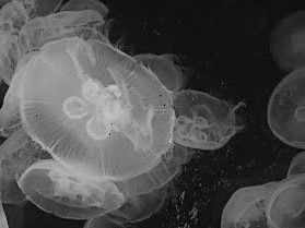
Abstracted Jelly fish
White Base
The grey acrylic for the midtones seemed to make the body of the jellyfish stand out more.
Black ink for the diffusion didn't have a muted effect because of the support. It would have worked better on a porous support. I have chosen the wrong subject matter for the support.
I am disappointed with this image.
Black base
Frustrated with the first attempt, I knew the support was wrong so tried a different technique. I used white gouache on the second piece, mixed with a small amount of grey acrylic. I was even more frustrated and decided to use a stick to make the pattern of the jelly fish sgraffito style. It's ok, I like using the technique but it's not correct for this subject.
I know that I can produce this diffusion as I have in the 'play' earlier.
Found image - abstracted found image- white base - black base.


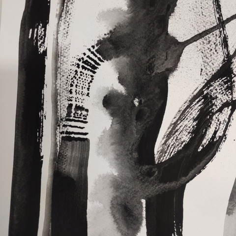
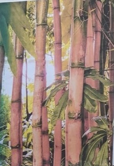
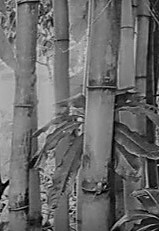
Abstracted Bamboo
White Base
My favourite so far because the painted grain from the acrylic base layer adds to the texture of the bamboo. Using a gloss acrylic in grey adds to the effect, with deep ink for the darks applied with the edge of a medium flat brush. It works as a little composition the leaves seem to pop out at you.
Black base
I used grey acrylic again and built up the layers. This piece is not so effective. Why?
A little more highlight in white gouache is needed, it could be just as pleasing with some tweaking.
Found image - abstracted found image- white base - black base.


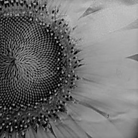
Abstracted Sunflower
White Base
These actually look better first hand. I used grey acrylic over the base. I looked for the grain to allow the petals to have the correct 'line'. The rigger is good for fine details and dots. I didn't want to get too detailed for the centre of the flower although maybe it would enhance the focal area.
Black base
I used gouache in a more fluid approach here. Spraying the gouache with water, obviously makes it bleed, by using grey acrylic to form the edge of the 'ring' around the centre, I achieved more depth. It dried and I added black ink with a rigger brush for details dots etc.
Better first hand again, quite an organic feel with the swept petal strokes.
Found image - abstracted found image- white base - black base.


Final 10 images all together.


(All displayed in my A1 sketchbook below)

What have I learnt?
Planning is key - with regards to the support and what well on it.
Fluid marks change when they dry ( I did know this already but it is still relevant when using new media)
Less is more.
Monochrome helps me focus on tones, without colour distraction.
Experimenting is fun.
Even if something takes seconds, the time taken does not make it less impactful or important.
My abstraction for better composition of the images brings more independence to my work.
Arranging paintings in a grid takes time,trying make the series look balanced and have variety of line and tone i.e. which way up, the direction and the feel of the overall grid.


Comments