Exercise 3.1 Ink Studies
- martine75
- Jun 12, 2021
- 4 min read
Updated: Jul 9, 2021
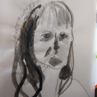
Look in a mirror and make 20 A4 ink studies of your face. Have three cups to hand: one of black undiluted ink, one of diluted ink (with water), and one of water. Use a mid-sized soft brush and spend no longer than a minute on each painting.
Remember to squint to see the tones. Try this in different light levels. Near-darkness can really help you to capture a lot of different tones.
For inspiration you might like to look at the paintings of Marlene Dumas.
HP watercolour paper is good for this exercise but, as these are sketches, cartridge paper, card, photocopier paper, or any other scrap paper, is fine. You’ll use these images as the basis of your monotypes in the following exercises.
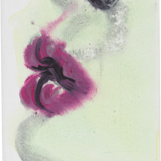
I wanted to research before I started my drawings in ink and I found a series of faces by Marlene Dumas called Chlorosis (Love sick) 1994 (there are actually 24 pieces in total in this series) Dumas has used ink, gouache, and synthetic polymer paint on paper. Chlorosis is derived from the Greek word for light green and describes an anemic disease marked by a characteristic green skin tone and the title lovesick all seem to marry together with the use of diluted media in the faces for a powerful series.
I have researched Dumas before and know she works a lot from photographs. This series was from Polaroids of acquaintances and newspaper cuttings of strangers.
Eerie, ghostly and unsettling artworks, they focus on expressions and as the title suggests being love sick.
I like the washes and bleeds and the use of tone. I like the varied gazes and the way she seems to control the ink but doesn't (if that makes sense) It looks like she has made the faces out of the accidents of the patterns but it's the other way around from my research into her process. She guides the media with soft strokes of the brush, tilting the paper and sometimes working horizontally on the ground.

Figure 1
I found some more images from Dumas and I preferred the 'honing in' on to certain parts of the face in these pieces. The faces below seem to have more character and intrigue for me. It could be the use of colour that makes them more appealing though?
My favourite are the pink pouty lips, because they are so expressive and sensitive. The correct process colour and media has been used. I need to take into account what and how I am using media, to create which effects.


The below video shows her loose free process something that I feel a close connection to because I like the serendipitous approach with water and working on the floor.
Although the time constraint within the brief for this exercise won't make this possible.
I set up the mirror and inks in the early evening and worked through until it was dark with several breaks for reflection.I thought of David Bomberg and his use of the mirror to vary my angle for my compositions.
Materials
A4 watercolour paper
one soft mid sized chinese brush and one mid sized line brush
Khadi Paper
Tracing Paper
Ink, water and water sprayer
Process
The switching between the water and ink dilutions sullied the water quite quickly.
I set about with gestural, sweeping markings, ink blurs and runs with water and quick strokes because of the time limit. I had to simplify large areas of tone to get the essence of the poses. I kept Marlene Dumas and her dilution and free flowing process in mind.
As I progressed through the 20 pieces I realised that concentrating on one area of my face and then being gestural with the rest was the best use of time. I actually made more than 20 images as it was so engaging to think quickly and experiment with all the various ways of completing this exercise.
Results


I tried to vary the poses and application;
glasses on/off
hair up/down
mouth open/closed
profile view
varied expression.
spraying the paper with water.
dry paper
putting down only ink first then diluted ink and vise versa.
ambient bright light and near darkness.
dry brush strokes
fast and slow application of marks
varied pressure with the brushes.
It was exciting to watch the ink bleed and flow over the paper, the different effects were only truly seen when the ink dried. The tracing paper caused small patterned cauliflower like marks which were really unusual and I liked the outcome of those.

The brief was teaching me to draw my image quickly not to overthink it and get the essence of what I saw and simplify.
My favourites are below because each have an element of either variation of tone or a likeness that I feel a connection to. Some have a good composition I think.
I feel extremely drawn to the top left image (eye and glasses) because of the gaze of the eye. Is a self portrait drawing necessarily a face? I think that a self portrait can be what an artist wants it to be and if I'm honest this piece has more feeling in than the others for me.
The bottom left image is eerie and ghoul like and I love it because it was very dark when I created it and I could hardly see to paint. This seems to have made a 'zombie Martine' and reminds me of when I was jetlagged. Could this be a concept for my assignment?


What have I learnt?
Experimentation and quick response brings unexpected marks and outcomes.
Having limited resources, a narrowed focus and a time frame, I naturally found new ways to vary my marks and create. Underpinning my work with research of other artists however small a detail (all the clues are in the brief I just have to look for them!) for example Marlene Dumas's process and the variation of composition from researching David Bomberg. These details will improve and add to my technique and fundamental learning, my toolbox is expanding!
References
Figure 1. Editor (2012) Expressive Faces in the Crowd by Marlene Dumas. Available at: http://www.artsobserver.com/2012/09/03/expressive-faces-in-the-crowd-by-marlene-dumas/ (Accessed: 10 June 2021).


Comments