Exercise 3.2 Monotype Image.
- martine75
- Jun 19, 2021
- 14 min read
Updated: Jul 9, 2021
Choose an image to work from. This can be one of the ink studies you made in Exercise 3.1, a photograph, or a magazine image of a face. Try the monotype technique and see how it goes. It may take you a while to get it right so don’t panic if things don’t go well first time. Don’t throw anything away! While you are working think about the following. Do you need to mix the paint with more white spirit/turps? Or less? Where would you like to remove bits to create a highlight or definition? Which bits would you like to paint onto after you’ve created the print? Carry on until you’ve made five images you are happy with.
Firstly I wanted to get a definition of monotype and monoprint as I was confused with the terms.
Mono prints or monotypes are forms of printmaking where the images created once are unique. Other printmaking methods result in near perfect copies of the image. They are the most painterly of all the printmaking techniques in essence they are printed drawings. The paints application/removal may cause blurred effects or create negative spaces, before printing.
So, what’s the difference between monotype and monoprint?
A monoprint is a unique print that forms part of a series. Each finished print varies to the other, but a common thread or element is present in each.
A monotype is a unique print that will exist in its own ‘unique state’.
I can develop my own skills and find my own style with both processes presenting endless opportunities for experimentation with different techniques. Bearing in mind at all times that the process of making monoprints results in a mirror image of whatever is drawn or written.
I can add, subtract, dilute paint in parts as the brief says. I can also draw patterns, shapes and designs directly onto the painted surface. Lay a piece of paper on top of the surface to pick up the design. So kind of the reverse of the brief.
I can apply the paper, face down, directly to the painted surface and draw out my design on the back of the piece of paper whilst it's in position. The pressure will lift paint from the glass to leave an image of what I have drawn on my paper.
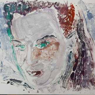
Research into the history of this technique goes way further back than I imagined. It was pioneered by the Italian artist Giovanni Benedetto Castiglione in the 1640’s. It involved drawing on a smooth, un-incised surface with ink or paint before transferring the image onto a sheet of paper. This was done either by hand or through a press, creating a single print that could be worked on or enhanced.

Figure 1.
The head of a bearded man, wearing a turban c.1645-50 31.7 x 23.6 cm (monotype with oil paint) Giovanni Castiglione.
Inspired by the etchings of Rembrandt, Castiglione scratching into the paint to make the detailed markings for the hair and fur collar makes a statement in this exotic profile.
The image has energy because of the lines and gives the impression of aged and weathered skin.These marks are brought forward from the tonal background and have variety and movement. The background too has movement created from the direction of the brush strokes, this causes the viewer to look into the void to the right of the profile and then be drawn by the man's gaze. The solid deep eye is serious and the mouth pouted with whiskers.
The image has weight and warmth due to the way the paint and sgraffito marks have been applied and I need to be aware of this when I make my marks.
Experiments with brushes and tools.
I have never tried printing monotypes so this was a learning curve.
What new marks can I make?
How do I create the marks I want to?
Will I enjoy it?
I used my sketchbook for experimenting. I used a variety of sources, magazines photos and books.
I played with oils, acrylics, open acrylics, varied papers, exploring and printing with them.
I drew portraits and used magazine clippings for inspiration. I copied artists' work and I had fun discovering.
Copying Eleanor Moreton's work taught me to use directional diluted strokes, to form pattern and harmony. Her use of subtle colours of yellow and pale blues brought a fresh feel amid the earthy hues, this was intriguing. The erasing of the strap in Moreton's Gillian makes an impact and this technique would underpin my work.

Copying Annie Kevan's Vamps and Innocents taught me to use the painterly visible brush strokes for hairstyles and then to omit the facial features, adding them afterwards would then bring the best outcome for me.

Marlene Dumas uses an earthy palette in my copy of Evil is Banal (below). Visible brush strokes, dilution of media, mixed with variation of tone creates depth. I also note the gaze of the portrait and the imaginative way you are directed to what is of sight in the artwork.

I used a Gelli Plate and found objects such as plants and leaves to print with.
I have used a plant from my garden for a series of monoprints.
What I found interesting here was the use of paynes grey acrylic paint and a Gelli plate gave me three different images.
A strong image which evokes an old photograph or negative in the printed part. The plant, being present on the Gelli plate, has not allowed any print beneath and therefore caused an offset. I like the border the plate creates too, it's like a frame.
Printing with the remaining paint after the plant has been removed causes a silhouette of the plant on the card. Deep and more delicate in the darker central areas.
The final piece has been created by spraying water on the remainder of the paint and placing the plant 'painted side up' on the plate. A delicate skeleton of the plant is created.
More examples of the play and discovery with printing, making marks and general play are in my sketchbook (Part Three).


Oil paint and magazine cutting.
Materials
Glass sheet
Titanium white, cadmium red, phaltho green, yellow ochre water based oil paints
Zest it
Synthetic flat and round brushes
The end of the brush to cause sgraffito marks
A4 smooth white card/watercolour paper.
Image.

Being outside I was soaked in the sunshine, happy because the oil paint (even the water based one) is quite pungent to say the least!
Thick creamy glorious oil paint, buttery and smooth gliding over the surface of the glass.
When I was content with the initial layer of the painting, I outlined certain parts with the end of the brush. I'm not sure why, instinct took over.
I printed the image by placing the smooth A4 white card onto the painted surface and with a crumpled rag I smoothed over the back of the paper pressing and rubbing down to ensure the surface was coated.
Result

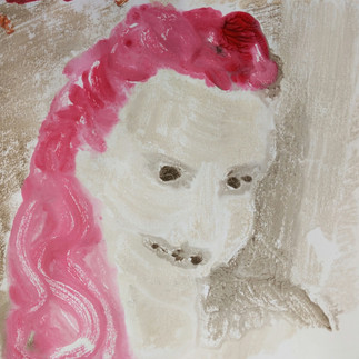
Pink Lady.
What worked well and not so well?
Certain elements came out well;
The handbag, the visible texture of the brush strokes and sgraffito.
Certain elements not so well;
The colour hues could have been darker to create more depth of field i.e. the car, hair and glass lenses.
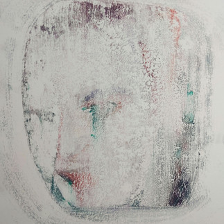
I printed it again on a piece of watercolour paper, as there was quite a substantial amount of paint remaining.
Oh dear!
The dry textured watercolour and oil paint marriage is not a good match. (Unless that was the desired outcome). I am pleased I have discovered this now , sooner rather than later in my process and experiments.
Research suggests that thinner smoother paper is better for this process. Watercolour paper can be used with inks and other media but wetting or soaking the paper first takes away the massive absorption of the media and the rough surface tension.

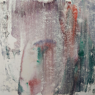
Pink Lady second print.
I made several other prints from different magazine clippings, with oil on the glass plate and used varied techniques of brush work.
I used more Zest it to create diluted but visible marks.
I chose lighter hues for the darker paper for contrast.
I used varied size brush strokes and a baby wipe/kitchen towel to mop up excess media.
Image

Roid magazine clipping.
Results (varied types and colours of papers)


Roid 1 Roid 2 Roid 3 Roid 4
Roid 1 and 2 are showing the visible brush strokes (which I like) on A4 white card. Eleanor Moreton's visible and directional brush strokes influenced these pieces. I have also erased one edge of Roid 2 using a baby wipe to give the area contrast, space and light.
Roid 3 on a black media paper is more intriguing and has a more sinister feel. Using the dark background was underpinned also by the research on Kim Baker.
Roid 4 on a very thin piece of green paper is crumpled and diffused because I sprayed water which was, in hindsight, a mistake. I need to experiment more with between media and the paper absorption qualities. Marlene Dumas's diffusion and bleeding techniques, have been taken into consideration here, although not refined. The incorrect paper has been used and therefore a disaster.
(The name Roid is an anadrome of the designer whose advertisement magazine clipping I have used. The image is reversed, therefore the title is also).
Image

Dude in Jacket - magazine clipping.
Result

Dude in Jacket A4 oil on card monotype.
The image is quite strong the background chaotic and full of energy. Does this distract the viewer though?
I wiped out a border around the figure with a baby wipe to make the figure stand out. I ran the end of the brush again over the paint to erase it and create a texture/rhythm in the material of the jacket.
It needs extra layers of work and does not stand alone as it is, but quite a pleasing outcome, the deep purple hue is a shadow in contrast to the green material of the jacket.
I have underpinned the work created on the jacket by the detail in the Giovanni Castiglione's Head of a Bearded Man Although Castiglione used small marks for whiskers and hair I feel communicates well to the textures on this jacket.
Image

Moving on Up magazine clipping
Results


Moving on Up 1 and 2 - Monoprints Oil on card.
Just for fun, I tried a full figure image because I could sweep the paint along the legs and arms with more gestural marks. I diluted the paint around the figure and made mottled markings for variation.
Moving on Up 1 stands alone and has energy, movement and form, Moving on Up 2 fails (as it is a reprint of the excess paint sprayed with water) as the blue puddled stains which I feel, overpower and ruin the piece.
Image.

Broken Magazine Clipping.
Results


Broken 1 Broken 2 Broken 3 Broken 4
Monotypes - oil on A4 card.
The directional visible strokes, some feathered and sensitive, some diluted and thin seem to convey varied atmospheres.
Broken 1 is sad to me because of the colour pallette and body language.
Broken 2 has more hope, a lighter brighter expanse of empty space, vacant in a way.
Broken 3 is more full, not only of texture but colour and content, maybe this figure is the carried out the breaking?
Broken 4 is my favourite it conveys a sensitivity, a worrying maybe? The colour pallette and use of feathering a large flat brush in the background evokes a delicate but powerful image.
I have used the end of a brush in areas to dig out paint for the textures and lines in the hair and also a cotton bud to erase the arm areas in some pieces.
Generally more playful with lattice marks, horizontal patterns or feathery brush strokes examples in the backgrounds in Broken 1, 3 and 4.
Open acrylics and photocopies of photographs.
Because I can't work with oils in my bedroom/studio as the paint smells and makes me feel sick in the restricted space. I chose open acrylics because of there drying time with added retarders and thinners to prolong the drying time.
I used some photocopies of my own photographs of friends.
Image.
Sasha as a vampire (he loves fancy dress!)

Sasha the Vampire. My own image photocopied.
Results.

Sasha the Vampire 1
A4 Diluted Oil on card.
Great texture and form in the hat with the arched brush lines
The face is too distorted and the media too loose and wet in the other areas.
The ruffles in the shirt are too blurry and the jaw line to heavy.

Sasha the Vampire 2
A4 Diluted Oil on card.
This was quite successful, a monotype and a stronger composition.
With overpainting or charcoal/pastel I may be able to define and darken certain areas to make the vampire 'pop' though?
I seem to have created more varied markings, they have a more grainy feel, for example in the hair. In the clothing a more sumptuous feeling of velvet, paired with the colour of deep crimson.The diamond/geometric background markings created with a flat brush seem to give depth.
Also the colours seem to be more convincing to convey the character of the Vampire.
Image
Victoria (Vix) full of life, love and very mischievous!


Results
A4 white card or scrap paper, different pressures and approaches with oils.


The below three images are the most successful for me personally.


Vix in Pink Vixen Meat head
A4 Card- Monotypes and prints open acrylics on card/paper
I also experimented with inks. I wanted to really explore the media with these images of Vix.
Oils


Inks.


Reflection
I answered the questions from the brief;
Do you need to mix the paint with more white spirit/turps? Or less?
This depends on what I want to convey for example;
Here in the below three 'Dreamy' prints of the same image I have used thick paint which I have scratched into, the next diluted paint with Zest It and then the last print is the remnants of both prints and some water spray. So what is the difference?
A more 'dream like' or blurred image is conveyed in the second and third, can I use this as a background or starting point for another print over the top or to overpaint? Yes, this gives me a 'ground' if you like for the image base layer. I really enjoy looking at the more blurred and obscured faces.
Also the paper's qualities i.e. absorption, thickness and texture need to be taken into account. These factors all have an effect in conjunction with the dilution of the paint.


'Dreamy prints'
Here also in the below images I can see the difference between more concentrated paint and the diluted paint. I can use this in layers to add to or print over with a different media if so desired. The paint dilution means a trace of the portrait/figure is created giving me options.


Where would you like to remove bits to create a highlight or definition?
I think I jumped ahead of myself here to the next exercise as I instinctively negatively painted the arm area of the below centre and right images. I feel the third outcome is the strongest because of the paper colour maybe and the contrast with the white area of clothing.
In my research on Eleanor Moreton I had noticed she had erased parts of her work and it made an impression on me.


Which bits would you like to paint onto after you’ve created the print?
I feel most of the images need either a wash of colour, a layer over somehow, more definition, contrast, depth and balance, harmony or leading lines.
For instance;
The more muted images below are a great base for a line drawing over the top maybe? Or more deeper toned backgrounds or features? I could add collage or draw over with pastels.


The five images, for me, the strongest at this stage without adjustment are;
Vix in Pink - A4 monotype open acrylics on card.
When I look at this piece it's ethereal, the right eye is diffused and almost bruised, the hair is looped and grainy, the gaze is almost like a lovesick teenager. It's delicate and pretty but something is a miss almost? I don't know how I would work into it without ruining it's quality.
Is it a strong piece? Could it be with over painting or drawing?

Broken 4 - Water based oil paint on A4 brown card
This is my favourite of all the pieces I have produced because the background has a tension but is also sensitive. The feel of the piece is conveyed by the facial expression and the body language. Sad, disappointed or broken hearted?
The colours are subdued and even though the t -shirt is blotched with a squished white paint blob, I feel that overall it communicates the sombre mood. Again I don't want to ruin this pieces potential by adding to it, because I feel I don't have the knowledge yet to evaluate it. Does it have potential? I have to remember these are experiments and I can learn from my mistakes and not be afraid to take risks.

Roid 2 -Water based Oil paint on A4 Card
Visible brush strokes give this piece movement and they are balanced by the erased area of space around the head. The hand is stumped and misshaped but somehow works with the image because it leads you up to the tilted head. The woman posed or thoughtful she seems quite vacant.
The colours seem to flow and create the illusion of light from the right hand side. However the neck is too shaded on the left and annoys me!
The blue lines of brush strokes of the clothing sweep upward to the awkward arm and hand. The jewellery is blurred but you know it is there. If I cropped the image it works better and is stronger because of the composition's balance.
There seems to be a sadness in her eyes a longing to be free from the pose. Would adding to this improve it?


Sasha the Vampire 2 - A4 Diluted Oil on card.
The hair of the vampire grasps your attention, you are taken into a trance like state by ice blue eyes. Vampires are supposed lure you in after all!
I think the background works well but needs tidying up, the hat needs more form and the face is too flat. Again I don't want to ruin the potential I see here with my inexperience.
The only way to gain experience is by taking risks and learning from them.
Vix in colours- Water based oils on A4 Card
This last piece is all about the texture and energy from the sgraffito and the visible brush strokes of the background.
The green eyes and line along the face work well contrasting the red hair and the contours created by brush work in the face are painterly and interesting.
The eyes need defining and the colours are too muddy I think. I have chosen this piece because it has a variety of marks within it.

I wanted to experiment more with printing, just play and discovery.
Using paper and objects to print with for backgrounds and trace monotypes.
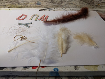
My next experiments where I wanted to experiment with laying objects onto the paper were a disaster!
Feathers and leaves were congealed and stuck into the paint.
The cardboard letters and pieces of torn paper more successful.
I achieved block colours that could be used as a background layered over possibly?
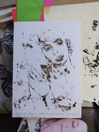
I tried a trace monotype with my Roid magazine clipping. I was inspired by The Old Hare by Kim Edwards in my research because this print looked more like a pencil drawing.
The process images are below for the objects and trace monotypes.
Framing the paper, painting a piece of tracing paper in dark acrylic with a roller and tracing the image by placing the painted paper face down.
I liked the results they have a more contemporary feel.


I kept reviewing and reflecting pinning my work up next to each other on my cork board wall.

I decided to play , taking a photocopied and enlarged image of Jared (a friend) and a more gestural approach. Squirting raw globs of paint from the tube spreading random areas. I used plexiglass and mixtures of trace monotype and prints.


This was fun exciting and I wanted to experiment more. The images above are again more contemporary they have life and colour. Using a dry flat brush swept on different papers I could create these intriguing marks. Yuko Nasu and her swipes of colour and gestural marks were the influence here. I remember my tutor suggesting a more limited palette. The result is a more subdued version but it still holding an interest for me. The marks aren't swirled like Yuko Nasu's but the movement and directional energy is present.

These two pictures below were 'play' and what happens if I apply too much paint before printing. There is something I do like about the results though.


I really like the ripples of paint seen in my video. Could I work over these and pick up the ridges? What would I use that for? It has kind of an animal print effect or the veins of a flower petal or skin maybe?
I forgot to take a picture of the print before I worked in a white background and defined certain areas. I liked the animal print concept so I used umbers and white on a dark background.
Like a leopard ready to pounce! I think it needs shading but I am unsure at this stage where to take this. I will reflect.

But what had I learnt so far?
The paper support I chose needs to be compatible with the media.
I can produce a varied array of marks from dilution of the media.
Visible brush stroke marks hold more intrigue.
The thicker the paint the more likely it is to have a textured or squashed appearance.
Ink can 'pool' depending on the paper choice.
Thin paper is likely to buckle with diluted media.
Textured watercolour paper does not 'pick up' paint (unless sprayed with water initially before printing).
By underpinning my work with the brush strokes of Eleanor Moreton, Kim Baker and the erasing of my paint to mark make (similar to Giovanni Castiglione) inspires me to achieve the results I desire.
References
Fig. 1 Benedetto Castiglione, G. (1609-64) - The head of a bearded man, wearing a turban (monotype with black oil paint). At: https://www.rct.uk/collection/903946/the-head-of-a-bearded-man-wearing-a-turban (Accessed: 10/06/2021).


Comments