Exercise 3.4 Working paint onto monotypes.
- martine75
- Jul 1, 2021
- 5 min read
Updated: Jul 9, 2021
Choose three of the prints you made in Exercises 3.2 and 3.3. Work into these prints with extra paint to change the image. You could choose to pursue greater definition, a closer likeness or a more dramatic contrast. Think about how you could apply the paint to achieve these effects. Make notes as you work through the exercises, noting down the different effects you’ve been able to achieve by removing more/less paint, adding extra paint, etc.
I experimented with Vix initially.
I added
A pale green watercolour lattice wash to the background
Black biro pen for the line work.
Varied watercolour coloured dry brush and stains.


It's terrible and ruined, so what have I learnt?
Slowly build up layers and think and plan before I apply my media.
Use the appropriate media i.e. the eyes are standing out and detached from the rest of the piece because I used bio pen. Not the correct choice.
Some of the stains and marks are quite pleasing within the hair area. I could knock back the eyes with white gouache and overpaint the lips as I think this piece is worth a little more time.
This is an experiment and I am continuously adding to my process, not everything will work out.
I couldn't leave it like that, so I decided to use gouache and layers but I became frustrated and confused by what I was doing!
Eventually I gave up and swished acrylic ink over the top of the face.
It's terrible, awful and ruined.
The biro was a mistake but the background is a lattice triumph! Can I save it?
There is something I like about it still.
The colours are strong and eye catching, it has movement and life.
Can I cut it up and use it in collage? Can I add Yuko Nasu swirls over the top?
A period of reflection is necessary.

I had a play with drawing and painting on some of the weaker pieces and ruined all of them. I am going to upload them all but I am not proud of any of them to be honest.
I used pastels, acrylics watercolours and gouache. I think I just wanted to paint and play, that's my happy place after all.


I need inspiration and more research before I ruin every piece with 'play'. Focus and be selective Martine. Think and learn from other artists and see how they have layered their work.
When I look at the painting below The Pilgrim by Marlene Dumas (I found a website where I can zoom in to see the details close up) I see blends of luminous warmth married with underlying texture could this be applied to my pieces in acrylic? I wanted to experiment with that.

Figure 1
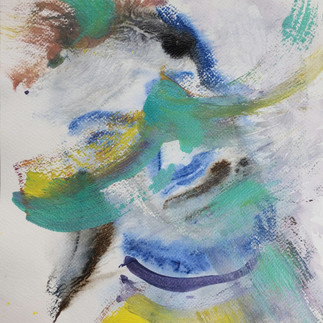
I chose one of the five pieces selected in my first monotypes of Vix. I was unconfident this would be a strong outcome but I persevered.
Original monotype
Vix in colours- Water based oils on A4 Card

I added blends of ochres, naples yellow, napthol red and white oils to the face and hair. I tried to leave some of the underlying textures and brush strokes.

I'm a little lost, so I have stopped.
I'll come back to this piece as I can't seem to see where to go next. Why does that happen, I can't see my work objectively sometimes, leaving it for a few days I can then see more clearly and with fresh eyes. At the moment I know this looks very strange and disjointed but it has textures and qualities in it that could marry together.
I think I am trying to hard sometimes. I want things to work and I have ideas in my head but I can't seem to realise them.
I need to think and make some marks in my sketchbook, read and look through books and images of other artists and see what I like and how they have been achieved.
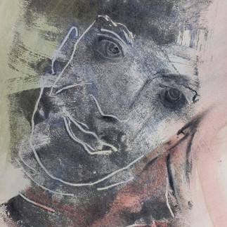
I started to play with the direction of features. Underpinned by Yuko Nasu and her directional marks but mine more one directional than swirled.

Reflection.
The piece was looking better but odd. I do quite like odd though.
I added dry brush and Artgraf to the eyelashes and face (I had forgotten that this was oils and Artgraf wasn't really the best medium to place over the top fat over lean etc..) Because these oils were water based the Artgraf seems to be absorbed into the paper and underneath layers well so that was a good result. The dry brush marks swept over the face, bring energy and dimension. The heavy black eye sweeps could be worked over as they heavy and I getting a superhero type feeling from the image. Not unhuman but with powers that change Vix into something quite extraordinary!
There is a lot going on here though, the monotype seems to be playing second fiddle and far from the star of the show. Maybe that's the point to layer and use this process for all purposes?

I do really like the movement in these marks. By cropping the piece I could see more clearly that they reminded me of reading about Gerhard Richter's smudged or blurred techniques. Am I trying to make Vix anonymous with these marks?
Should I add some Yuko Nasu swirls also? I decided to stop.
After a period of reflection I was rather happy with this piece. Why?
It has a variation of brush stroke as seems more contemporary.
The gaze and composition are intriguing.
The earthy palette (using an influence from Marlene Dumas) seems to bring a warmth to the work.
The crop makes the work seem intimate, I can see devotion mixed with mischief.
I called the crop Vixter a marriage of Vix and Richter and the slight blurring/swipes of the brush.

Vixter
Monotype crop with oil and Artgraf on paper.
Sasha the Vampire 2 - A4 Diluted Oil on card.

I added;
Charcoal drawn on then brushed out to blend in some areas.
Biro to dig into the small detailed areas of the face and add interest in the background.
Acrylic sweeps for shadows in brown umber and Cerulean blues mixed/unmixed hues.


The Croatian Vampire
Monotype with oil, acrylic and charcoal on A4 card.
If I'm honest I liked it more before I added anything.
The hair is over processed the eyes are too dark and the only part I think is worth a mention is the swirled stroke of the ruffle at the left lapel of the shirt.
Broken 4 - Water based oil paint on A4 brown card

I knew that this was going to be a challenge.
I liked the piece but it needed some definition.
I took a photo and made the picture black and white on my phone, I could then see more clearly how to make the values darker and where it needed them.

I added;
Pastels
Watercolour pencils
I diluted them with water to cause stains for shadows and white highlights.

Warped and Broken.
Monotype -Oil, pencil and pastel on A4 brown card.
Result
The card needs laying flat (under a heavy weight) as it has cockled/warped, does this add to the mood and narrative though?
Using some lighter brighter colours to freshen the piece, but not take detract the intention of the narrative, like Eleanor Moreton in Gillian, seems to have brought the piece to life.
If I had used more absorbent paper this piece could have been a triumph, I think.
The brief had asked for three pieces but I wanted to experiment some more.
Below are some of the pieces I created by adding a little colour or a drawing line.

Roid Lime
Trace monotype with oil and diluted acrylic on A4 card.

Vix in Pink and Green
Monotype with oil, watercolour pencil and acrylic on A4 watercolour paper

Trace Roid
Trace monotype in oil, acrylic and ink on A4 white smooth card.

Zombie Roid
Monotype with oil and diluted acrylic on A4 Black paper.

Jetlag
Monotype with diffused open acrylics and charcoal on brown A4 paper.

Roid 1 in mauve.
Monotype in open acrylics on A4 white card.
Various Jared prints and process images with added media.


A video of some of the marks made from play and print.


My favourite was this image.

Ja-red-blue-green-yellow
Monotype /trace monotype acrylic and ink on A4 card.
References
Figure 1 Dumas, M. (2006) The Pilgrim. Available at: https://www.phillips.com/detail/marlene-dumas/UK010118/13 (Accessed: 12 June 2021).


Comments