Exercise 4.4 Adding thicker paint to previous paintings.
- martine75
- Jul 29, 2021
- 10 min read
Updated: Sep 7, 2021
Using the paintings you made in Exercise 4.1, look at the scene you painted and add thicker paint to these thinly painted works. Leave areas of the thinly painted work visible. What effects have you created by applying areas of thicker paint?
Spanish and travel books.
Materials.
Circular cake board support (gesso ground).
Watercolour and charcoal diffused base layer.


Process.
Taking a slow approach I built up layers of diluted acrylics.
I used;
Diluted purple acrylic for the shadows.
Broad flat brushes for the outline of the book spines.

Vincent van Gogh had painted books. My books were more ordered and stacked. I took inspiration from the red 'focal book' in his works.


Figures 1 & 2
Result.
By adding thick short sweeps of acrylic paint I made the book cover stand out. Not only does the colour stand out but the texture.
I used the same technique on other books in a dark lilac colour.
Using a fine liner I could create the book pages and delicate lines that I couldn't with a paint brush.

Libros de viaje
Mixed media on 10 inch cake board.

Reflection
I feel the composition is quite strong.
The perspective works well with the shadow.
The writing is poor on the spine of the book.
There is no sheen on the work; it needs varnish, or I could have used a medium to add to the glossiness of the surfaces of the book.
There isn't much of the underlayer that is visible, have I been to heavy handed?
Japanese teapot.
Materials.
Initially, I started painting the whole scene of picture plant and teapot.
I had used ;
Textured gesso on two pieces of joined khadi paper.
Dilute pale blue ink.


Adding more contemporary colours, pinks and teals and greens I was getting some great fern leaf marks using;
A slanted acrylic brush with dilute acrylic.
I hated the composition and lost heart. I tried to add yellow to brighten up the image and leave the white of the teapot to pop out.
Eventually I stopped, it wasn't working because of the content. I need to hone in and try the Tori Day 'Beryl' concept.


Reflecting and leaving the piece for a while I returned to it and realised that the teapot was too small and looked out of place somehow.
I used gesso and covered over the teapot then using a selection of acrylic inks and water spray.
I swirled and swished the ink and let it dry.
I added plant leaves using the pipette in the ink and a slanted brush.
I added some white acrylic ink to where the teapot was supposed to be, to make it a ghostly, misty area.
The textured area of paint underneath from the previous application is slightly showing through. I like the fact that it was there, and kind of still is, in a way.
I'm happier with the colours and marks made, layer over layer.

This wasn't my best effort but I would finish my ghost teapot.
I added ;
Fine liner marks for the fern fronds, delicate and scratchy for variation of mark making.
Charcoal blends for the horizon line of the shelf.
I was looking at the surfaces Tori Day had used for her work and although I'm not quite there with the composition I think I am getting more comfortable with the surfaces I can work on. I know that developing these techniques can improve my practice. Experimenting with surfaces seen in Day's works was inspiring.


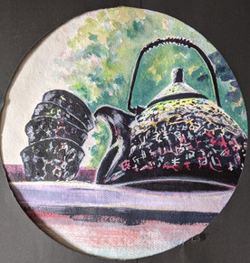
Yurei Teapot
Mixed media on 13 inch khadi paper.

Reflection
This piece has hidden meanings; for instance, the title Yurei means ghost in Japanese. There are three lines of prominent texture, and three is lucky in Japanese. Will three be fortunate for me, though?
The fern plant itself has some pleasing semi-abstract markings.
I like the colour pallette and the variety of lines in the work.
The composition is poor but has potential.
Beryl in Japan
Materials.
Initially I thought a tondo circle would be the best option. I reflected an chose an oblong to create more lift and with a wider perspective, that of looking upward.
I used;
Pastel watercolours
Magenta, yellow, lime and mixed paynes grey/cobalt blue combination of fluid/heavy body acrylics applied with various flat brushes.
Masking fluid to create Japanese patterns, leaving diluted marks beneath to peep through.
Diluted green shades of acrylic applied with a mop brush for the background foliage.
Support-khadi paper.


I felt I had created the illusion of looking up. The underlying colours of magentas were evident underneath the patterns. I considered the viscosity, sheen and opacity to make the teapot's surface seem ceramic.
The fluid acrylics are self-levelling, and when I used a flat synthetic brush I got a smooth outcome. Using diluted heavy body acrylics with dry brush techniques gave me rough markings over the texture paper. These varied marks all culminated nicely together for the surface of the teapot and cups.
I made large round and oval viewfinders from black paper to decide on the best crop for the piece of work.
Result.
Beryl in Japan
Watercolour and fluid acrylics on khadi paper -27 ins by 13.5 inches


Beryl in Japan
(Digital frame)
Watercolour and fluid acrylics on khadi paper -27 ins by 13.5 inches

Reflection
The piece is quite striking at first hand, possibly because you feel as if you are lower than the piece looking up to it.
Is it a little twee? I am unsure.
My colour choices were the winners here (in my opinion anyway) whilst looking at several old masters and their use of light; I wanted to gain that yellow luminosity but without glazing. So I used a fluorescent yellow at the top of the teapot near the lid. In addition, I have used complementary green/red, yellow/purple, which I feel give harmony to this work.
The original sketch and the warmth of the diluted red is present throughout the piece.
I prefer the first oval crop, because it has more of a narrative and pushes the viewer down giving the teapot 'an authority' if that makes sense?
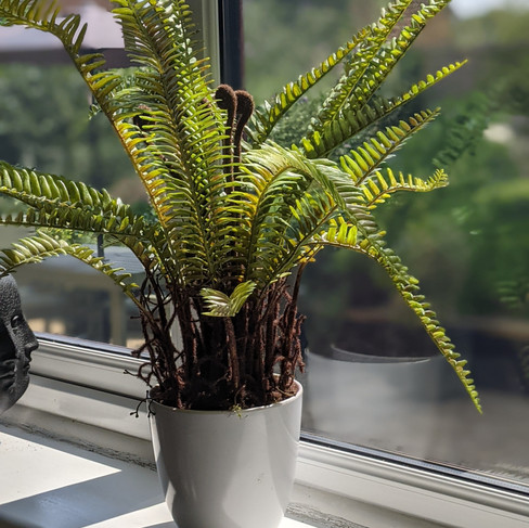
Fern 1
Materials.
I used;
Diluted blue inks and watercolours.
Thicker blue/black Artgraf on top of the initial sketch.
Umber and teal green inks using the side of a slanted brush for the leaves.
Water based oil paints for the top layers.
Charcoal for fine lines.


Process images.


I didn't think about any particular artist for this piece; I just painted. I knew that building layers would develop my fern gradually.
Initially, adding dark umbers and blues would have a rich earthy undertone to the fern. Maybe this was where I feel I went wrong. This plant is an artificial fern, and that was the narrative. It was good to practise, and I enjoyed creating the fronds and layers of the plant. I built thick layers of oils over the top and added some bright glints of colour, but it wasn't my best work, it felt clunky and unexpressive somehow.
Result.
Fern 1
Mixed media with oil paint on khadi paper -27 ins by 13.5 inches

Reflection
I enjoy the underlying visibility of the watercolour and ink in places, peeping through.
The surface tension reminds me of the abstract expressionists broad brush strokes which my tutor had suggested might be something to develop. I like that tension.
I feel I have been too heavy handed again.
Fern 2
I wanted to attempt another fern as wasn't happy with the outcome of the last piece.
First, I played around with a couple of smaller cake boards. I wanted to be expressive though and decided to take another larger piece of khadi paper.


This time with Marlene Dumas's blurred ink approach (one which I favoured) I put down some artificial colours for a fern. That's what I wanted to say after all, the plant was artificial for a reason. The colour used needs to imply the narrative. Blues weren't associated with nature, blues are rare in nature.
Materials.
Inks
Fluorescent acrylics
Diluted gouache
Various filbert and flat brushes
Slanted synthetic brush (medium and small)
Kitchen paper towel.
Charcoal line work.
Process images.


It's such fun seeing the inks bleed and flow across the paper, diluting and absorbing the paper's surface. I used a piece of kitchen paper to mop up and erase some of the fluid, which causes some intriguing marks.
I knew from looking at Giorgio Morandi's work that an underlayer of colour could be painted over to bring that colour through, to pop out around a shape. Another artificial colour maybe?
Fluorescent colours, yes! Lime green and vivid oranges and they would work well with the blue. It was a big step to block in this bright colour but my instinct told me it was the correct. I was excited about this piece much more than any other on this course so far.

I looked through my art books and back through photos of galleries and exhibitions for inspiration to develop my piece of work. Reflection and research were becoming part of the process for me now. It wasn't until I found a contemporary artist whilst browsing the internet that I felt ready, excited and driven to finish the picture.
That artist was Lisa Noonis . When I look at her work for example Say it again Slowly I can see fragility in line and the underlying colour from beneath. I tried to incorporate the line with charcoal because what did I have to lose it could be erased eh?

I slowly and tentatively built up shapes and added areas of colour with a flat dry brush technique. I used gouache for some of the fronds, looking at Roxy Walsh's applications and the opaque matte finish it easily easily covers the ink.


Rare blue (Fern 2)
Mixed media with oil paint on khadi paper -27 ins by 13.5 inches

Reflection
I like the fragility of line created with the charcoal.
I have left areas of the original sketch visible, this fits the brief and I feel maybe because I liked the marks I made more this time and was reluctant to cover them ?
This piece has tension.
The composition is quite strong.
I like the diffusion and intrigue with the variation of tone, mark making and colour.
Should I have left more of the orange layer showing?
Is this too semi abstract for the brief?
I feel this is one of my favourite paintings so far because of the overall feeling, narrative and the use of expressive techniques influenced by Dumas and Noonis.
I did attempt to develop the other two smaller cake boards (12 inch) and have included them even though I am not too impressed with the final pieces because they don't hold my gaze and have not really been thought through in depth or detail.
Adding a glossy pouring medium to the purple-hued piece and made a mess of it. The thought process was adding texture, but this was a mistake. The outcome, though, was a precise placing of raised glossy areas. Using a squeezy bottle to apply the medium had introduced this technique which may come in useful later. Thinking of Chris Ofili's resin also when viewing these raised areas of liquid appearance, this could translate to the support as rain or water possibly? There is always a positive outcome!
The yellow and red piece was a doodle. David Hockney used these thin paint lines in some of his pieces, and I wanted to play around with this application. I would not say I liked the outcome because it looked more old fashioned for this picture.


Orchids
Many of the Great Masters were influenced by Japanese ink drawings. Could I try to achieve some sort of painting from starting with one?
Materials.
Inks
A3 watercolour paper
Various brushes including mop and rigger.
Diluted acrylics
Diluted acrylic inks.
Charcoal
Process images.


This piece was a fusion of Giorgio Morandi and Pablo Picasso (I think).
Flicking through books and looking at the Great Masters was in my subconscious. I wanted to use the shapes of the ink to influence the piece. Some parts of the ink marking were exciting, and I wanted them to remain visible.
What basic influence did I want to take from these masters?
Morandi had cut his work into two background sections.
Picasso had used geometrics and line.
Result.
Orchids 1
Mixed media on A3 square round watercolour paper.

Reflection
Have I achieved what I wanted to?
That's a tricky question to answer because I do like this piece.
Why?
Is it the colour behind petals with the colour that pops through?
Is it the calmness of the colours?
Are the geometrics mixed with those fragile charcoal lines working well in my developing techniques?
Could the background be darker and less muddy hued?
Could the colours be purer like those of Henri Matisse?
Can I work and develop this. I think so.
I played little with my paper plates, in a kind of Morandi and Picasso 'funny five minutes'.
These are playful and although they took minutes to complete I think they are expressive.
Orchandi
Acrylic on paper plate - 9 inch diameter

Orchid Platter
Gesso and acrylic on aluminium platter- 17 ins x 11inches.

Orchids 2
A3 acrylics on watercolour paper.


I know that I will rework this piece at some point. It has the thicker applications of acrylics and a variation of mark making. At this point in time I can't change anything without painting over the whole image. Luckily I know that with a reflective period of time I can come back and resolve the piece.
Other less successful tondos.
I have experimented with several other tondos and ovals on different supports. Below are the processes and outcomes in image form. None of these make my heart sing.
Open Window
Painted from life, looking out of the window of my art room (raining)


Open Window
Mixed media on 9 inch watercolour paper

Using drips and diffusion for rain and with matt gouache in the sky area give variation of materials and surface tension. The colour choice is too bright to evoke the storm and narrative.
Inside my cupboard.
I have unfortunately misplaced the original dilute paint sketch.
The second (middle image) has the dark bottle,most prominent, in the foreground and this is strong.
The last picture has more of the background I favour. This piece would benefit from a realistic and precise approach but is not something I am excited about developing.
I like the Morandi technique for outlining the bottle in the background and think that works well. Unfortunately, this image's fluorescent colour looks out of place; a pastel Naples yellow hue may have been better here. Practice and experimentation are all adding to the toolkit.


The unmade bed
Inspired by the colourful paintings of Pierre Bonnard I seem to have made a clumsy mess of the bed on 10 inch watercolor paper with acrylics.


Orchids on the shelf.

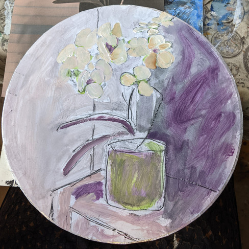

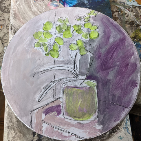


Orchids on the shelf.
Open acrylics and gouache on a 12 inch gesso primed cake board.

This piece feels heavy handed.
The fast paced strokes of the purple in the background bring energy to the work.
The open acrylic paint with the retarder for the white orchid petal brings translucent layers which remind me of the mark making of Cecily Brown.
The colour palette is quite pleasing but, the shelf and charcoal markings seem cumbersome and misplaced.
Ceiling light.
Gesso ground in a circle on cardboard 9 inch diameter.
I somehow knew this wasn't going to work and so I abandoned it. The size of the ceiling light was too small to be able to gain the detail required. A note to myself would be to think about this before I start a piece. I should really know this by now though!


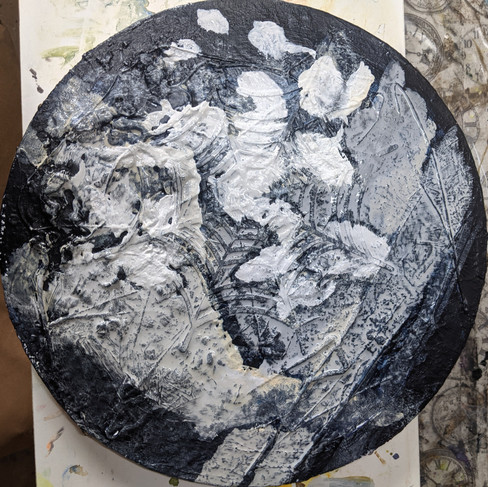
Frank Auerbach's orchids.
Seeing Frank Auerbach's work at first hand a few weeks ago, I wanted to try think paint. I had a found canvas and it was circular. It has built up paint covering the surface. I painted it with black acrylic and then made a loose sketch of orchids.
This was abandoned too as it was difficult to apply paint to the surface with so many textured bumps and crevices to work on tip of. If I were to paint a composition I would build it up specifically for the piece.


Keeping in mind these ‘failures’ may have qualities that I don't see yet. I will reflect and leave the work for a few days to enable fresh eyes to critique them. I will review all my work so far in the next blog post.
References.
Figure 1 Van Gogh, V. (Arles: October 1888) The Paintings (Still Life: French Novels). [ Oil on canvas 53.0 x 73.2 cm.] At: http://www.vggallery.com/painting/p_0358.htm (Accessed 19/08/2021).
Lisa Noonis (s.d.) At: https://www.artsy.net/artist/lisa-noonis/works-for-sale (Accessed 25/08/2021).


Comments