Exercise 5.3 Make a study of a corner of your room
- martine75
- Sep 25, 2021
- 4 min read
Updated: Dec 23, 2021
Make a study of a corner of your room. Choose a corner where the light changes a lot throughout the day. Using watercolour on A5 watercolour paper, make a study from life in the morning, at midday and during the evening. Repeat this on another day if you enjoy the results. The work of Pierre Bonnard, Lee Maelzer, Hayley Field and Walter Sickert is relevant to this study.
I had researched Pierre Bonnard’s interiors earlier in the course and, I wanted to include some of the intrigue and variation of colour, composition and directional mishaps, in my work.
The Danish artist Vilhelm Hammershoi had taken my eye also for the atmospheric light in work. The spatial structure that he uses combined with the line is fundamental to his practice. I note that he uses pale lemons, umbers, mauves and whites mostly in his works of interiors.

Fig 2
Lee Maelzer was intriguing with her ghost-like abandoned places and discarded objects.
In Petrified, I can feel the neglect. The colour palette reflects the abandoned subject. The light is subtle, soft, and I smell a mustiness in the air.
The angled lines of the corner create a focal area that works very well and is a standout part of the piece. I would like to introduce that area into my work somehow.

Fig 2.
Hayley Field's work was an exploration of colour and shape. She uses her interest in colour and composition by collaging different ideas in her paintings, extending the process through layering and re-working. Could I document the colours I see at other times of the day in a light diary? Could I layer the colours into the work in a semi-abstract way? In her piece Boatyard detail (below) she has used the oil paint smoothly and with visible texture to express her environment. I am intrigued by the outline, the space between space that makes the subject almost float on the canvas.

Fig 3.
What interested me about Field was the way she had curated and displayed her works. Elegant, simple, but effective. Using the interior as a sort of frame for the viewing experience works well.


Figs 4 and 5.
Making a study from life and looking at the subject is vital as it gives me an understanding of depth and space in my work. I take photographs to refer to, but the subject's proximity may lead to an interest in a particular area or colour choice.
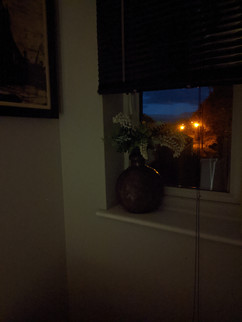
I chose a window overlooking my garden. So there is a lot of light in the morning as the sun moves throughout the day, it diminishes.
The Landing Window.


Before I began, I thought back to my weeds painting in watercolour (exercise 5.1). So I asked myself a few questions before I started.
Had I made enough investigation into the watercolour medium?
Do I know what colour palette I am going to use for the different times of the day?
Could I use my sketchbook to experiment with techniques first?
Should I make colour palette choices for the various times of the day?
Should I look at contemporary artists use of watercolour?
The answer was yes to all the questions.
I made some investigations in my sketchbook into watercolour and the variety of marks I could make with the medium.

I made a quick study on A5 watercolour paper.

The process.
I perched on a stool and began, not the easiest of exercises for me, and the small size felt constricting. The results weren't great. I wanted to swish and bleed the watercolour, and this was difficult on such small paper. However, I love the movement and versatility of watercolour. It's an underestimated medium, like ink, in my opinion.
The experiments had taught me to;
Blend with washes.
Add salt for a mottled look.
Use a brush to lift out parts of the colour.
Use a paper towel for sky or cloud effects.
Use stamps to add contrast and pattern.
Blow the medium with a straw.
Use masking fluid with a second layer or glaze.
Look at the colours at different times of the day at first hand and try to emulate them in my palette.
Using a pin to make sgraffito marks.
I started with the morning picture. Unfortunately, I had not read the brief properly and used an A3 piece of watercolour paper. No matter, I would put a crop frame over the paper in an arty fashion!
Results.
The Landing Window (morning)

(Cropped to A5 size)

The Landing Window (afternoon)

The Landing Window (evening)

The three images all together.


What worked well?
In all, I feel the colour choices are good. I get a feel of the different times of the day. Bright and light in the morning with yellows, pinks and lilacs.
The afternoon is umber and purples with teal undertones in the shadows. The evening is dark and mysterious, with midnight blues and mixed blacks from complementary colours and dark purples and browns.
New techniques that worked well were the salt for the mottled look of the foliage in the garden. Sgraffito marks for the blind's cord worked well, and dry-brush techniques in the evening piece gave a grainy distressed look. The blends and bleeds and transitions of colour were exciting and glazing over the top with another colour.
I like the afternoon piece the most because of the movement and bleeds.
The shadow on the wall on the left is interesting. The rainbow type wash/bleed in the off centre of the work brings another area of interest but does it work? I think it produces a recessed corner.
What didn't work so well?
The composition isn't strong enough, and although I have tried to gain depth with the background garden landscape, I fear again my images are too flat.
Lifting out in the evening picture of the street lights in the background looks more like a fire.

In the morning study I haven't captured the light as well as I wanted to on the wall. It seems flat and dull.

I think that the sketchbook study has more potential if I overglazed some areas and added details. Maybe it is because the reduced palette and marks?

References.
Fig 1.Hammershoi, V. (1906) ‘Interior, Sunlight on the Floor’,. [Oil paint on canvas 518 × 440 × 23 mm frame: 628 × 546 × 78 mm] At: https://www.tate.org.uk/art/artworks/hammershoi-interior-sunlight-on-the-floor-n04509 (Accessed 09/11/2021).
Fig 2 . Maelzer, L. (2002) Paintings : leemaelzer. [Oil on canvas, 49. 7 x 31 cm] At: http://www.leemaelzer.com/index.php?/recent-paintings/paintings/ (Accessed 09/11/2021).
Fig 3. Field, H. (2017) Boatyard detail. [Oil on gesso] At: https://www.hayleyfield.com/paintings?pgid=irngfjsm-26628222-ac20-4e6e-a58a-2ca63c79de01 (Accessed 09/11/2021).
Figs 4 and 5.Exhibitions (s.d.) At: https://www.hayleyfield.com/current-exhibition (Accessed 09/11/2021).


Comments