Exercise 5.4 Make a study of packaging or rubbish
- martine75
- Sep 26, 2021
- 8 min read
Updated: Nov 13, 2021
Make a study of packaging or rubbish from something you’ve bought or rubbish that you’ve found near your house.
The designer Philippe Starck, on arrival in any new city, looks in the bins he finds in the street. This, he says, tells him more about the city and its people than anything else could. Starck’s activity combines the archaeological and anthropological approaches that Mark Dion and Daniel Silver employ in their work.
Make three oil or acrylic studies of some packaging or rubbish. It would be tonally interesting to choose something of fairly neutral colour like Alex Hanna’s pill packets and bubble wrap or Giorgio Morandi’s bottles and ceramics. Place the packaging or rubbish onto a piece of white paper in strong light. An anglepoise-type lamp is good for this but you could use strong natural light too.
The Tags.
I felt the influence of Andy Warhol for the first piece. I wanted to attempt screen printing, something which I hadn't done before.
The blocks of colour with some sort of texturising excite me, and I was keen to try this process.
I ordered the correct materials and started to think about how I would make my piece of work.
What is screen printing?
Screen printing is the process of transferring a stencilled design onto a flat surface using a mesh screen, ink and a squeegee. Fabric and paper are the most commonly screen-printed surfaces. You can use specialised inks. It's also possible to print onto wood, metal, plastic, and even glass. The primary method involves creating a stencil on a fine mesh screen and then pushing ink through to imprint your design on the surface beneath.
The stencil can be created in various ways, depending on the materials used. Different stencilling techniques include:
The use of masking tape or vinyl to cover the desired areas of the screen.
By painting the stencil onto the mesh using 'screen blockers' such as glue or lacquer.
Using a light-sensitive emulsion to create a stencil, which develops similarly to a photograph.
Materials & process.

Now all I needed was a subject, a stencil of that subject and lots of patience.
These tags are on everything (see below image). They tell us everything about an item from a consumer point of view. Tags tell us what's inside, what something is made of or where something is going.
Warhol had taken the consumer item for his subject, I was taking the information and 'throwing away part' for my image. I want to make the unseen seen if that makes sense. It travelled the same distance as the item, so why overlook it?

I used my digital cutting machine to make some stencils. Unsure if this was going to work, I created digital designs on my laptop.

The stencils are on an A4 brown card and came out well.

I also used tracing paper and a pencil to make the first block painted areas, from a photocopy.


I roughly coloured in the tag with acrylics.

Initially I tested my stencil and printing technique.


What was I learning so far?
The screen needed more ink than expected.
I needed to be aware to print over the stencil and nowhere else to keep a clean look to the print underneath.
Using the squeegee at 45 degree angle to the paper, gave the best flow of paint onto the screen.
I could use the stencil to make a reverse print. Why waste the ink?
This ink dried slowly and, in hindsight, would be suitable for monotypes. So I made a mental note.
It would be better to complete all the images that need the colour on the screen while using that colour. I can make several pictures at once, as screen cleaning is a laborious procedure.
If I were going to print over my painting, I would be covering detail, so I think I will try both experiments. i.e. paint before and paint afterwards and see which is more successful.
I also want to take time to reflect and let the ink dry properly overnight. I am finding that taking my time and looking at what I have achieved before adding, adding, adding is to my benefit. Tutor feedback was on my mind, and so I would stop.
After a day, the congealed ink was still wet on the some of the prints.
What had I done wrong?
With further research, I can add pouring medium or dilute the ink with water.
I decided to use the undried ink to my advantage and use a paint brush to tease the ink and make dilute marks around the print. I ruined it (see below).

I decided that the cutting machine had given me an excellent first silhouette for my stencil, but I would manually cut my following stencils . I cut small areas out of a photocopy with a small blade. I could then choose where I wanted the colour and print to be.


I mixed ink pouring medium, and it gave a glossy, quick-drying result.
I thought of Kurt Schwitters and his collages of tickets etc. So, I decided to use the actual stencil and glued it to the picture along with the tag string.
What has worked well so far?
I think this piece has potential if I took the time to plan the palette and tone for the screen print.
Adding collage, string etc. has worked well, but I feel it needs to be on a bigger scale to assist with small details.
I like the glossy print surface of the grey tag part.
What hasn't?
It needs more details so you can see what it is.
I want to overpaint it with translucent media to form shapes and also add lines.
It's boring and dull.
Tag 1

I went back to the painted tag and decided that I would add some pencil marks to gain detail and move on. Unfortunately, the labels were not my best work at all.
Tag 2.
Crop from an A3 pastel paper with acrylic and pencil.

Although I was learning a new process with screen printing, I wasn't getting a good outcome. I wonder whether my subject could be garden rubbish? Leaves were garden waste, and I had collected many in Canada and on walks here in the U.K. I had put them under a book to press them.
Ideas;
Could I produce cyanotypes of leaves and then print over them?
Could I screen print the leaves negative space, the space in between I had seen at the Agnes Etherington Gallery in the poplar/poplar video installation?
Could I stick the leaves on the actual piece and recycle them?
Yes, I could do all of these things, but that's not what the brief says. But, I could use a leaf and place it on a white piece of paper and paint it.

I made a white shadow box from white pieces of paper. The shadows were cast and I was ready to paint. I wanted to use impasto techniques like those of Tom Thompson this time as the subject is organic and natural.


I made an A3 sketch of the leaf in paint, thinking I would cover it with thick impasto paint.

I stopped and reflected. I wasn't thrilled with this subject choice and knew that the leaves could be put to better use at some stage, just not now.
I went to the local tip, I photographed my recycle bin in the sunlight, I gathered some photographs to inspire me. The refuge truck in a Canadian street had also been snapped for inspiration.


In a previous module, I had used the inside of a restaurant bin. I liked the exciting colours and textures.

So, I decided to look in my wheelie bin. Looking down from that aerial perspective again was more exciting for me, and there it was, my subject.

I wanted to somehow print that glossy plastic with the screen print technique. The tag exercise had introduced me to the process and so the tag outcome hadn't been a waste of time after all!
In the Great Masters of Art Techniques, pages 512-513, Andy Warhol's (Marilyn Diptych) screen printing is on a horizontal surface and plain white canvas. Pushing the paint through the screen depends on the amount of colour and the pressure exerted. The book details some of the mistakes Warhol has made during his printing and six separate colour applications.
For example, overloading, blotting and marring of the squeegee. This information made me feel a little more confident.
I also knew that using acrylics for the screen print of the bin was the suitable material for the subject. I had read about Hockney in the Techniques of the Great Masters, too, pages 528-529. He felt the same way about the blue Californian swimming pools and palm trees in his A bigger Splash painting.
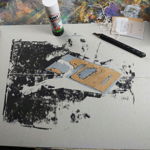
I cut out a stencil and printed the blue glossy hard plastic bin on a piece of Fabriano paper and a piece of metallic bubble wrap (packaging).. I was very unsure if this would be a success.


The base of the piece was a better outcome than I expected. I may crop the works, but I was undecided.
The screenprints weren't perfect, but I liked that effect because the bin print was dirty and, well, a bin! The bubble wrap had an industrial feel, and the minor marks protruded through the surface. The process is working well so far.

I liked that Andy Warhol had been expressive in some of his work and used his fingers to spread the paint. For example in Ladies and Gentleman. He had also used complimentary colours here. I may try to include some of these raised marks in my piece.
(My own images referenced before)


I let the screen print dry and played in my sketchbook with the rubbish. It was paper and cardboard for recycling.

I added acrylic rubbish and shaded the bin by,
Rubbing media with my fingers.
Using plenty of white paint for the tissue so it had a raised texture.
Smooth flat brush marks for cardboard areas.
Using small brushes for lines and detail.

After a period of reflection I added more shadows.
Result.
Down in the Dumps 1.
Screen print and acrylic on fabriano paper.

The second piece was less controlled and faster. I used the acrylic more fluidly and didn't attempt to form the structure of the rubbish inside the bin.

Down in the Dumps 2.
Screen print and acrylic on metallic bubble wrap.

What had worked well?
The screenprint base worked well, and although the actual stencil had taken a long time to cut out (and several attempts), it had been worthwhile.
I was using the material qualities of the acrylic to the rubbish, for example, fluidly placing undiluted excess paint to form the tissue and flat blocks of colour for the boxes.
The bin base print was textured, and by rubbing paint into it with my fingers, I made a more grimy look which was perfect for a rubbish bin.
The bubblewrap had a textured surface and was pleasing against the complimentary coloured bin.
The colour palette works well.
In Dumps 1 the abstract broad strokes in the background are seen under the rubbish and are layers of media, which I feel, adds dimension.
What hadn't worked so well?
In hindsight, I could have paid more attention to the shading of the bin to make it more 3D.
The Dumps 2 image is relatively flat in the background, and I prefer the first piece.
Should I have made several layers of screen print to keep the piece all the same application?
What had I learnt?
I'm learning that reflection and care, not rushing and thinking, gaining inspiration and looking, is beneficial and fundamental in my practice.
I'm learning that screen printing worked well for me as a base, and the research and experimentation had taken me to new places with unknown media. My growing skillset was developing, and by consistent enquiry, I can always find new ways of working and applying paint.
I have enjoyed the screen printing technique and want to find new ways to develop and grow with its possibilities. If I hadn't visited Andy Warhol's exhibition in Canada, I would not have considered using this technique. Travel certainly broadens your horizons!


Comments