Exercise One Painting thin and small.
- martine75
- Feb 9, 2021
- 15 min read
Updated: Mar 17, 2021
Using your found images, make some small, quick painting experiments using thin paint on small surfaces. Use HP (hot pressed) smooth watercolour paper of any weight. Remember, the thicker the stronger. You can use cartridge paper for this as they’re only exercises but you’ll find it rolls up because it’s not thick enough to remain flat. Cut the paper into 20 rectangles of roughly A5 size (148x210 cm).These don’t have to have perfectly straight edges. Use watered down acrylic/gouache/poster/watercolour paint – at least one of each if you have them all – or just use the paints you have. These will be the backgrounds for your paintings and you will return to them when they are dry. Backgrounds/grounds Paint splodges on three pieces of paper. Paint them however you like. It’s surprisingly hard to make a non-descriptive shape but have a go. Then make two of each of the following surfaces, covered entirely in: • black paint • white paint (don’t just use the white of the paper) • grey • varnish (spray/paint – you might have to wait a while to use this one so prepare it in advance). • very pale watercolour watered down (load the brush heavily) • thin black ink • very thin acrylic or gouache paint. Paint your image When your backgrounds are dry, use the following materials in any order to make a painting of your found image. Try mixing materials creatively – for example, a matt acrylic or gouache paint onto a shiny background. Make 20 paintings. • black paint • white paint • grey • coloured paint • very pale watercolour (water the paint down a lot but don’t load the brush too much) • thin black ink • very thin acrylic or gouache paint • varnish (i.e. used as a paint to depict your found image).
I researched a few of the recommended artists from the brief and chose works that appealed to me.
'Good artists to look at for this project are: Luc Tuymans, Gerhard Richter, Annie Kevans, Eleanor Moreton, Alli Sharma, Cathy Lomax, Walter Sickert, Andy Warhol, Edgar Degas, Keith Tyson, Kurt Schwitters'.
Keith Tyson:
His interest is in how art emerges from the combination of information systems and physical processes that surround us every day.
I found an article about his studio wall images.
This is an ongoing series he began in 1997, exploring big ideas in a minimal studio space and mapping his daily process. Tyson says;
'I enjoyed the free space they provided me with – existing somewhere in-between a sketchbook, a journal, a poem and a painting – I found that I could work unhindered by the self-conscious restraint I'd often felt while working on canvas'.
I like this concept and process to produce his work because he says it ;
'Exists somewhere in-between a sketchbook, a journal, a poem and a painting – I found that I could work unhindered by the self-conscious restraint I’d often felt while working on canvas'.

References.
Tate (no date) ‘Studio Wall Drawing: 5th June 2006 - High Resolution - “Large Field Array” (14x14x3 pixels)..... (300)’, Keith Tyson, 2006. Available at: https://www.tate.org.uk/art/artworks/tyson-studio-wall-drawing-5th-june-2006-high-resolution-large-field-array-14x14x3-pixels-t12554 (Accessed: March 2021).
Kurt Schwitters:
He used tickets, rubbish, paper print and wood to produce collage. I like the random and eclectic sources for his artworks.


Figures 3 & 4
References.
Figures 3 and 4 Schwitters, K. (no date) Merz Blauer Vogel (Blue Bird) (1922), www.tracesproject.org. Available at: https://www.tracesproject.org/kurt-schwitters/ (Accessed: March 2021).
Schwitters,K.Kleine Dada Soirée (1922). Available at: http://www.artnet.com/artists/theo-van-doesburg-and-kurt-schwitters/kleine-dada-soir%C3%A9e-NbdTrB8Yw2FgLPocGZPGzw2 (Accessed: March 2021).
Luc Tuymans:
He explores people's relationship with history and World War II is a recurring theme in his work. Often working in series, a method which enables him to generate one image from another and another etc.


Heritage I is the first of series of ten, each stereotypically American images, muted monochrome colors. The images have political undertones with an underlying narrative.
I have researched his work before and find his work intriguing but sinister. I like his style but feel it needs 'an added energy' for my taste. I know that's not what he wants to portray though.


The Heritage VI as Luc Tuymans continues to depict his version of the dark side of America.
References.
Tuymans, L. (1995) The Heritage I,1995, oil on canvas, 145 x 79.5 cm, 57 1/8 x 31 1/4 in. Courtesy David Zwirner Gallery, New York. Available at: http://www.artnet.com/magazine_pre2000/reviews/ziegesar/tuymans2.asp (Accessed: March 2021).
Luc Tuymans The Heritage VI, 1996. Oil on canvas (no date). Available at: https://mcachicago.org/Exhibitions/2010/Luc-Tuymans (Accessed: March 2021).
Gerhard Richter:
Abstract as well as photorealistic paintings, Richter a German visual artist, who works on paper, overpainted photographs Atlas a collection of photographs, newspaper cuttings and sketches that the artist has been assembling since the mid 1960s. A few years later, Richter started to arrange the materials on loose sheets of paper.
A series of a figures in different positions give the impression of movement.
One of my favourite artists for his abstract works.
On his website he quotes about Atlas;
'A student researching into my work has actually traced the newspapers and magazines where I found theses images and has found out that many of them illustrate a collection of gruesome stories, murders and suicides which contrast with the images used. There is a contrast between the message carried by the text and that suppressed by the illustration.'
This reminded me of Annie Kevan and her Boys series.


Palermo Richter
1971
References
Richter, G. (1971) Palermo - Richter 36.7 cm x 51.7 cm Atlas Sheet: 42. Available at: https://www.gerhard-richter.com/en/art/atlas/palermo-richter-11622/?&p=2&sp=32 (Accessed: March 2021).
Quote- Atlas (no date). Available at: https://www.gerhard-richter.com/en/quotes/atlas-4 (Accessed: 8 March 2021).
OCA Lisbon Study Group Collaborative.
I am going to include an entry into the OCA Edge-zine publication which I and 5 other students were lucky enough to be published in; Issue no. 10 (Page 33)
Wanting to include this entry and being a fan of the ARTY publication by Cathy Lomax, I was pleased that the OCA had a student led 'Zine'. Although this is a series of images that make up a complete photo, I tasked each student with one section. No brief as such, to creatively complete their section in any medium, and then I arranged them together and revealed the piece to the group.
The below images are the original photo (divided into 6) and the whole group, students and tutors.
We have kept in touch and have regular Zoom meets to discuss our progress/workshop/share ideas.


The finished work, 3D florist sundries on an acrylic blue base (my work top left) The other students incorporate acrylic, line, watercolour and textile elements.

Exercise One Painting thin and small.
All 21 pieces are on smooth hot pressed 300GSM watercolour paper.
Number 1.
Background/ground.
Very light dilute magenta ink and water.
Materials used.
Diluted black watercolour
Round sable and rigger brushes
Dabbed excess water around face with a baby wipe.
Found Image & Result.
Original picture from a magazine cutting. I like the texture and perspective view.
Very quick loose free marks, getting a feel for watercolour and how it moves on the surface. I haven't achieved the perspective in this quick painting. Ink and watercolours blend and bleed together well. Using a variety of brushes for application varies the mark making.


Number 2.
Background/ground.
Entirely white gouache base.
Materials used.
Diluted gouache and watercolour black blue and red.
Various sable brushes.
Found Image & Result.
A striking image of one of my teenage musical icons.
Thinking more of a Cathy Lomax style whilst producing this piece, quite tight work with no real expressive mark making. The gouache is chalky and dry to work over. The eyebrows are a little misplaced and the shading on the left side needs to be darker.


Number 3.
Background/ground.
Entirely white heavy body acrylic
Materials used.
Diluted red and black watercolor and thinned sculpture gel.
Various sized sable brushes
Found Image & Result.
My own small paper print from a market in Bangkok. I like the style of the image.
The flowers are too small and lost, but the process was rewarding as the watercolour swept easily over the shiny acrylic base.


Number 4.
Background/ground.
Peat brown ink sprayed and diffused with water
Materials used.
Black watercolour and grey acrylic ink
Found Image & Result.
A magazine clipping that reminded me of my travels. Asian architecture.
I like the vague dreamy painting with the dispersed media. The sandy colour gives an Eastern feel. I should have been more economic in the distance (with less paint) to bring depth. Sometimes less is more, building up layers of paint would have been the key to a better result here. It's a 'pre composition work' or a sketch in paint.


Number 5.
Background/ground.
Entirely black gouache
Materials used.
Layered white gouache
Medium filbert acrylic brush
Found Image & Result.
Flat, quick, sweeping strokes of layered paint built up to create the illusion of bamboo. I think it's quite effective and could be the base of a composition, maybe?
Gouache has a dry, matt and flat application. Bamboo is shiny. I need to think about these things before I start a piece of work it affects the outcome.


Number 6.
Background/ground.
Entirely covered in black acrylic
Materials used.
Diluted gouache yellow and white
Various sable brushes, rigger for the honeycomb.
Found Image & Result.
Pinterest image - Bees on Honeycomb
Building up the layers, over the black background, could have been taken further to lighten the image. A white starting ground may have been a better choice, building up the darks I feel would have given more depth and punch to the piece.
The bees are lost and muddled in the composition. The highlights in the honeycomb need to be much lighter to bring the bees forward. Overworked and disappointing.


Number 7.
Background/ground.
Diluted red ink swept across the paper with a mop brush.
Materials used.
Watercolour paint
Various sable brushes
Found Image & Result.
Pinterest image Butterfly
Very loose sketch of the original using zig zag and pointed mark making for the wing patterns. I was tempted to add some dark black delicate line markings to the wings but resisted as these are quick sketches. The diffused muted background is banded rather than discs of media. I feel this could be the underlayer for a composition to be worked into with thicker paint. The background was the start of a Carole Benzaken layered style piece but the butterfly had dominated the scene.


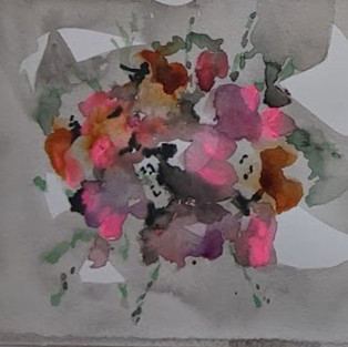
Number 8.
Background/ground.
Very diluted ink, washed over the paper but leaving parts raw and uncovered, leaving an intriguing mark pattern background.
Materials used.
Various watercolours dabbed with sable brushes to form floral bloom shapes. Layered over with neon pink gouache undiluted to bring a slight texture.
Found Image & Result.
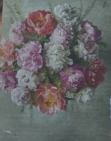
Newspaper cutting image. Flower bouquet.
Using the tip of a filbert for contrast in the washed green foliage marks. I like this piece it has fragility and a delicate semi abstract feel. The bouquet is loosely recognisable but has a unique energy because of the breaks of colour in the background.


Number 9.
Background/ground.
Diluted acrylic pale green wash
Materials used.
Watercolour and gouache washes over the base
Rigger brush with black gouache for road markings, blue watercolour with a round sable brush for rivers , various green washes and stripe marks for fields.
Found Image & Result.
Aerial image 'found' from my memory of working on an aircraft.
I like the different perspective and the way of looking at aerial landscapes.
I think I have over processed this piece and a more delicate approach may have given the small painting more balance. Less is more and the title of the exercise is 'thin and small' (look for the clues Martine!)
The borders of the fields are too heavy handed and dark.


Number 10.
Background/ground.
Pale Lemon diluted watercolour
Materials used.
Pink/magenta diluted watercolour and ink
Sculpture gel and red and white gouache mix
Various brushes sprayed water and drips
Found Image & Result.
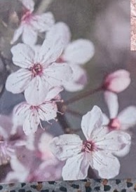
Cherry blossom - my own image taken in Japan. Who doesn't love cherry blossom?
I have added too much texture to this with the sculpture gel, it's not thin, but it's small. You can't have everything eh? Stick to the brief Martine.
I like the chaotic layered feeling, the difference in shiny and matt surface and it's interesting because I can see my visible brush strokes.


Number 11.
Background/ground.
Diluted black and green gouache
Materials used.
Thin pools of of white gouache
Rigger brush for white edges of the jellyfish
Bleeds pools and diluted water gouache puddles (leave to dry and add more layers)
Found Image & Result.
Jelly fish in the Toronto aquarium (one of the best aquariums in the world, if that's your thing by the way) my own image.
Something is captivating about these underwater gelatinous sea creatures.
On reflection, I would use ink to remake this piece. I feel the surface needs to be more diffused -ink, neon blue/ white mixed, Quink medium possibly. I have used Quink before. It seems to diffuse on Khadi or watercolour paper particularly well. I would make the work neon bright as these creatures are unique, and that need to be a factor when reproducing their dangerous but alluring existence. Scaling this piece up to really delve into the internal layers of the creatures would be exciting for me.


Number 12.
Background/ground.
Thick black gouache base
Materials used.
Swept diluted white and yellow ochre gouache
Layer over with diluted black gouache
Large round sable brush
Found Image & Result.
Crumpled metal architecture on Toronto building-my own image.
I have over processed this again. I am finding gouache quite dry and matt. Do I prefer the rich creamy texture of paint more? Does this affect my outcome?
There are some pleasing dry brush marks towards the bottom right area, they have a grainy look but that's not shiny metal marking. Would I have been better to use gloss medium with the gouache? Retarder and a wet in wet technique. The composition is not the best choice for this exercise then. I need to plan more and reflect before stating the exercises and think about what I am about to undertake.


Number 13.
Background/ground.
Drips of diffused black ink
Materials used.
Watercolours yellow/browns and neon orange gouache.
Large round sable brush to form outer petals.
Small sable and rigger brushes for inner floral head (dotted markings)
Found Image & Result.
Sunflower magazine clipping. I could have spent hours digging deeper into the seeds and flower head, building the layers up. I like the layers of bleeding and mix of the gouache and watercolour. The organic shapes are pleasing, and your eye focuses on the centre of the flower. I want to build this up and create textures with mediums to create intrigue and a tangible feel to develop further.


Number 14.
Background/ground.
Neon orange diluted gouache, swept with large round sable brush.
Materials used.
Black ink, red watercolour, a small amount of white gouache (for white if the eye).
Found Image & Result.
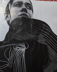
Siouxsie (from Siouxsie and the Banshees British punk band from my youth).
I am surprised how much I like this.
I managed to use the dilution to gain a sensitive but still gothic Siouxsie. The hand is quite clumsy, the face is flat, but the markings around the edges are layered and ghostly, which divert my attention away from those disappointing parts of the work. I feel this has some sort of potential, somehow, I am unsure. Reflection is key, leaving the work and stepping away is always a good plan. Let's revisit it later.

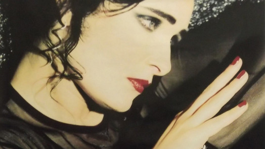


When I came back to the image I feel that it is quite flat and the forehead is long. The jaw line could be lengthened backwards and the face needs some sculptured marks to make it 3D. Overall though it has a mystery about it.
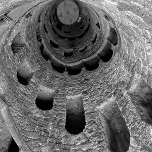
Number 15.
Background/ground.
Splodges of yellow ochre/brown diluted poster paint and water
Various sable brushes
Materials used.
Diluted black and white gouache
Found Image & Result.
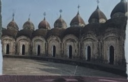
Inside of a tower in Barcelona (looking down) my own image.
This seems to be quite powerful, from a depth point of view. If you didn't see the source image I doubt you would realise the composition. I am pleased with the mark making layered and spiral effect, maybe the underlayer could be more diffused, but it certainly has a 'pulling you down/in' feel. The impression of decreasing geometric shapes is something I hadn't thought of before. If I scaled this up, in a semi abstract style, and used multi layers, it could be a strong piece of work maybe?


Number 16.
Background/ground.
Pale pink and green acrylic ink and gouache, dabbed with a baby wipe to remove excess fluid and create unique marks.
Second base layer of petal type shapes created with wash of diluted peat brown ink
Materials used.
Negative painting of dark shadows and branches with black watercolor.
Found Image & Result.
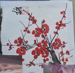
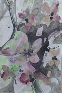
Magazine clipping of Cherry Blossom.
A less complicated image of the blossom and a more fluid attempt from the previous one.
A very diluted blurred and soft interpretation of the flower petals, which I feel would act as a base layer to work on top of for a composition. Layers of thicker paint, translucent layers with visible paint strokes could create an organic abstraction Maybe added luminous highlights would bring punch and energy otherwise it would be a little twee?


Number 17.
Background/ground.
Diffused and diluted black gouache
Materials used.
Brown and grey diluted watercolor
Various sized brushes to guide the paint in branch like shapes.
Found Image & Result.
Imagined image of a tree, I like a tree!
Spending most of my career/life in an aircraft cabin, the natural world is so beautiful and I appreciate the organic lines of every plant that I see or feel. The layers work well, allowing to dry inbetween. Over painting to develop the depth and atmosphere. Ghostly and eerie, I'm in the wood looking up through those branches!


Number 18.
Background/ground.
Diluted acrylic magenta and black
Materials used.
Various sable brushes
Diluted white and black gouache
Found Image & Result.
Photograph of a rose in a friends graden, my own image.
Disappointing and a poor painting, but, there are parts of this that excite me.
The cloudy translucent ghostly layer over the base and second layers. Why is it exciting? Because the paint brings a dreamy mystery and this rose is definitely a familiar image. I have introduced myself to a process here, building up many darker layers and then a top wash of very dilute white gouache can be used to evoke mystery. I have used a glaze before with white paint and medium, but the gouache is matt and has a smokeness to it's effect. It leaves the paper porous which is another factor to consider.
So that's good. Another string to my bow!
I can use this process as a 'sort of filter' like you would on your mobile phone's camera.
Could I have used this media for the wings of the bees attempted earlier? Or the inside of the jellyfish?
I would like to work into the forms of the petals with watercolour pencils and achieve a better outcome and more of a believable 3D piece.


Number 19.
Background/ground.
Diluted neon orange gouache applied with an acrylic fan brush swept across the page.
Materials used.
Watercolour washes various colours.
Found Image & Result.
Magazine clipping.
I'm not sure what attracted me to this image initially.
Was it the unusual seating position in a hollowed-out recess in the wall? Probably yes!
The quick, and I mean quick sketch took no time at all. I wasn't going to get involved with details. The wide surround of the circle muted and has bands of depth. This curve sits nicely on the bars of the underlying neon gouache. I had a Marlene Dumas application in my minds eye, a less is more approach.
The figure nestled in that recess, the circle, we don't understand as the viewer what we are looking at without the source image for reference.
The figure has skin tone limb like watercolour shapes, which lead us into the composition. I don't want to work into it or touch it. I want to learn from this that sometimes just being with paint in quick exercises can produce pleasing outcomes from instinctual practices.


Number 20.
Background/ground.
Black acrylic and gouache mix
Materials used.
White gouache and sculpture gloss gel.
Several layers of white gouache applied with various acrylic brushes.
Top layer application with added sculpture gel.
Found Image & Result.
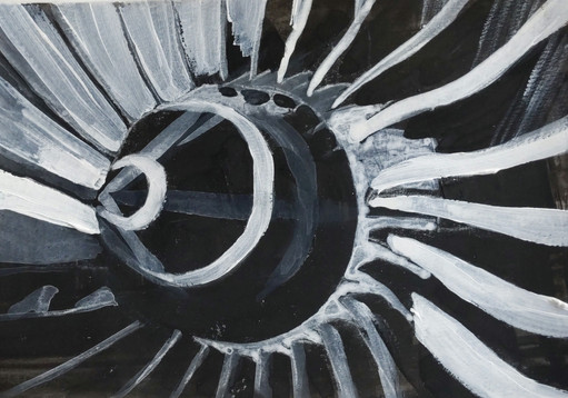
Jet engine Pinterest image of an aircraft engine.
The engine is the most striking of the series, in my opinion. It's bold and powerful and packs a punch. I have used diluted washes, and I feel it works in this piece to generate the depth of field. What I mean by that is the central inlet cone looks pointed and 3D. The composition follows the rule of thirds etc. If I scaled this image up, I could see this becoming a powerful piece because I could get some energy and movement into the larger brushstrokes. Am I thinking along the lines of the Abstract Expressionist mark-making, perhaps?


Number 21
(Yes, I know- I can't count!)
Background/ground.
Clear varnish painted and dripped over original paper
Materials used
Watercolour wash of greens and purples over dried varnish applied with the side of a mop sable brush.
The small round sable brush point used to apply thorns of the cactus in deep mauve watercolour.
Found image/ result.
Cactus - a magazine clipping.
I was happy about this experiment because the watercolour paint puddled into the varnish drips' crevices. The mottled effect over the varnish was so pleasing to my eye. The cactus plants are flat, and there is no depth or perspective, but the result is like the rose image earlier. I have found another process to apply for more applicable textures, i.e. for a landscape or even animal skin. Just the abstract effect is pleasing to me. The tangibility of these two media together excites me. The background needs to be darker and all the values generally are too light.


Note the materials you used, which you liked or disliked using and why.
I didn't dislike any of the materials, they all play a part in achieving various atmospheres and have different properties. I enjoyed a limited palette because I wasn't distracted by many colour choices.
Which combination of media would you like to return to?
Definitely varnish base layers and watercolour/ink diluted top layers. As stated I enjoy the texture effects.
Ink and watercolour diffusion and bleeds. I like the muted bleeds and feel of that effect.
What would you do differently if you did this project again and how would you like to develop it further?
I would plan what I was painting and which media would produce the desired outcome. For example bamboo is shiny, gouache wasn't the best choice.
Scale would develop some pieces. The advantage of a gestural approach and more room to gain energy and movement would enhance some pieces i.e. the jet engine.
Looking at, and having a specific artist in mind assists with direction sometimes. I do however like to experiment and learn myself, then apply the influences later. This way of learning works for me.
Having a base of non representational shape breaks the initial barrier of a blank canvas to work on.
Would you change the materials/the subject?
And how might that change the outcome?
Adding glazes and texture gels, amongst other additives, for me, adds variety and tactility to paintings. In a digital world, 3D work is what separates it and makes it unique.
I feel abstractifying pieces would allow me to focus on the process rather than image representation.
The base layer and markings will greatly influence the top layers and are a starting point for the piece. Choosing the forms and shapes along with the media is important.
Alongside additives,applying some discernment with composition of the found image and what to include/exclude would positively affect the outcome.


Comments